 Example of a Causal Treatment Model
This example shows how to use the Causal Treatment personality in the Fit Model platform to analyze the effect of a new blood pressure medication on systolic blood pressure (SBP) levels. Data for this example are simulated to represent an observational study where biological and behavioral information are collected from each subject. The Treatment variable shows whether a subject received the medication. It is assumed that the treatment was not assigned randomly.
1. Select Help > Sample Data Folder and open Blood Pressure Treatment.jmp.
2. Select Analyze > Fit Model.
3. Select Post Treatment SBP from the Select Columns list and click Y.
4. From the Personality list, select Causal Treatment.
5. Select Treatment from the Select Columns list and click Treatment.
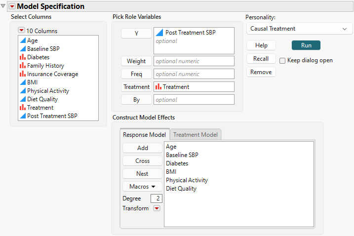
6. Select Age, Baseline SBP, Diabetes, BMI, Physical Activity, and Diet Quality and click Add on the Response Model tab.
Figure 14.2 Completed Fit Model Launch Window Showing Response Model Tab
7. Select the Treatment Model tab.
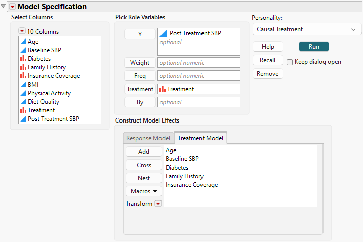
8. Select Age through Insurance Coverage and click Add.
Figure 14.3 Completed Fit Model Launch Window Showing Treatment Model Tab
9. Click Run.
The Model 1 report contains the Analysis of Causal Effects table that shows two Potential Outcome Mean estimates and an ATE estimate. The Potential Outcome Mean estimate at Intervention Level 0 shows the expected value of SBP had no observation in the sample received treatment. The Potential Outcome Mean estimate at Intervention Level 1 shows the expected value of SBP had every observation received treatment. The ATE is the difference between these two values. The ATE estimate is -9.25 with a 95% confidence interval of -10.46 to -8.042. Under the proper causal assumptions, you conclude that, on average, the new medication lowers SBP by 9.25 millimeters of mercury compared to the control.
Figure 14.4 Causal Effect Estimate Table in the Model Report
10. Click the Fit Causal Treatment red triangle and select the Show Tips and Interpretations option.
A similar interpretation appears below the table and at the top of the Model 1 report under Analysis Findings.
In the Causal Assumptions Check section, the Positivity density plot shows the propensity score distributions for the treatment and control groups. The interpretation text below the plot describes how to use the plot to check for positivity violations. Be cautious of propensity scores that are close to 0 or 1. You should consider whether to include observations with extreme scores.
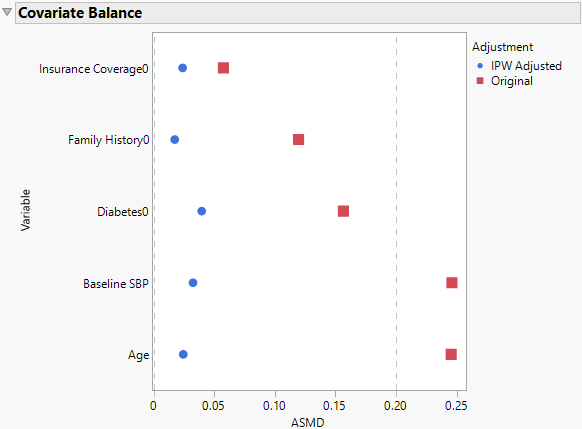
The Covariate Balance plot in Figure 14.5 shows the absolute standardized mean difference (ASMD) between the control and treatment groups for each variable that is specified in the treatment model. The red Original points show that the control and treatment groups have different profiles with regard to these covariates. The blue points show how these differences are reduced by IPW adjustment. After IPW, the treatment and control groups should be similar on all levels of the covariates (besides the treatment), as if treatment were assigned randomly.
Figure 14.5 Covariate Balance Plot from the Model Report


