Example of Graph Builder
The following example gets you started with some of the Graph Builder features. This example uses fuel economy data that were collected for hybrid and non-hybrid cars. You want to get an understanding of miles per gallon (MPG), a measure of fuel economy, and to see which factors might be influencing MPG. This example shows you how to plot several factors of interest:
• Get an Overall Picture of Combined Miles per Gallon
• Plot Mileage Stratified by Engine and Driving Type
• Find the Relationship between Hwy and City MPG by Engine Type
• Find the Relationship between Hwy and City MPG by Engine Type
Get an Overall Picture of Combined Miles per Gallon
1. Select Help > Sample Data Folder and open Hybrid Fuel Economy.jmp.
2. Select Graph > Graph Builder.
3. Select Comb MPG (combined miles per gallon) and drag it to the Y zone.
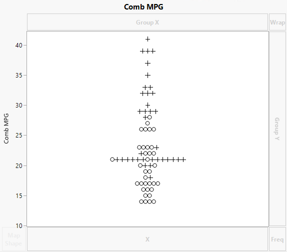
Figure 3.4 Initial Graph of Combined MPG
Because markers are assigned to rows in the data table, points are represented by those markers. The value of Comb MPG for each row is plotted at its value on the vertical axis. To avoid over-plotting points that correspond to observations with the same Comb MPG values, JMP automatically jitters the points.
You can get a cleaner picture of the distribution by plotting a histogram.
4. Click the Histogram icon (![]() ).
).
You want the histogram to be vertical, so you must move Comb MPG to the X zone.
5. Hover over Comb MPG in the Y axis.
The cursor turns into a hand. Select and drag Comb MPG into the X zone.
6. Click the Caption Box icon (![]() ) to show the mean Comb MPG on the graph.
) to show the mean Comb MPG on the graph.
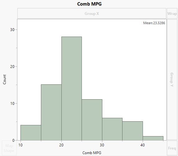
Figure 3.5 Histogram of Combined MPG
The histogram shows that Comb MPG can range widely, from approximately 10 to 45. However, many vehicles get mileage between 15 and 30. The mean MPG is 23.3286.
Plot Mileage Stratified by Engine and Driving Type
1. Click Start Over.
2. Select City MPG, Hwy MPG, and Comb MPG.
3. Hover over the Y zone, press Shift, and click in the Y zone.
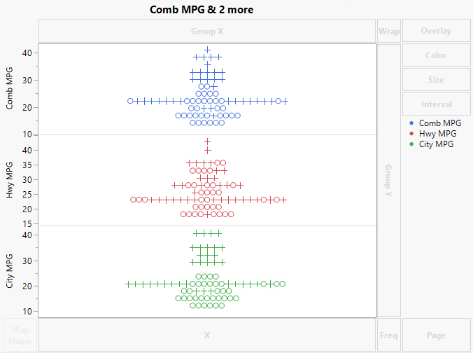
This creates separate Y axes for City MPG, Hwy MPG, and Comb MPG.
Figure 3.6 MPG Variables with Separate Y Zone Axes
In the legend at the right side of the graph, markers are colored according to the driving type.
Tip: To change the color that is assigned to a driving type, right-click the marker in the legend.
4. Drag Engine to the Group X zone.
5. Click the Box Plot icon (![]() ).
).
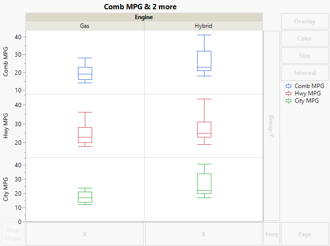
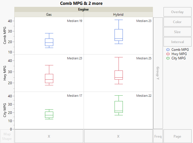
Figure 3.7 Box Plots of MPG Variables by Engine Type
The box plots show the distributions in a very compact form. Notice that all three types of MPG values are substantially lower for the gas vehicles than for the hybrids in the study. From the horizontal lines in the centers of the two City MPG box plots, you can estimate that the median difference is approximately five miles per gallon. However, you can use the Caption element to be sure.
6. Click the Caption Box icon (![]() ).
).
7. In the Caption Box options at the left side of the plot, select Median from the Summary Statistic list for Comb MPG, Hwy MPG, and City MPG.
Figure 3.8 Box Plots of MPG Variables with Captions
The median city MPG for gas engines is 17 and for hybrid engines is 22.
Find the Relationship between Hwy and City MPG by Engine Type
1. Click Start Over.
2. Select City MPG and drag it into the X zone.
3. Select Hwy MPG and drag it into the Y zone.
4. Select Engine and drag it into the Overlay zone.
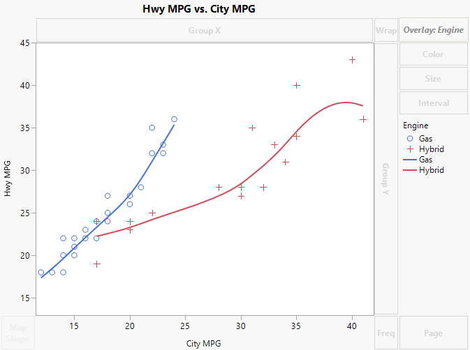
Figure 3.9 Hwy and City MPG by Engine Type
A Smoother appears for each type of engine.
Tip: To change the line properties (color, width, and so on), right-click a line in the legend.
5. Click the Line of Fit icon (![]() ).
).
For each engine type, the smoother is removed, and a least squares line, together with confidence bands for the predicted mean, is added.
Tip: To add the y = x line, right-click in the graph, select Customize, click +, and then select Templates > Y Function. Replace _function_of_x_ with y = x and click OK.
6. Drag a rectangle around the “o” marker with the smallest value of City MPG and check the number of rows that are selected in the Rows panel of the data table.
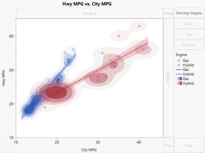
Notice that two rows are represented by this marker. You can check that overplotting happens for other markers as well. When there is overplotting of observations, namely when several observations are represented by a single point on a plot, density contour plots can help you see the density of points.
7. Drag the Contour icon (![]() ) into the graph.
) into the graph.
Dragging the Contour icon into the graph retains the Line of Fit for each engine type.
Figure 3.10 Density Contour for Hwy and City MPG by Engine Type
The contours indicate that for both engine types, there are more vehicles in the study with lower MPG values than higher MPG values.
