Interpret Parallel Plots
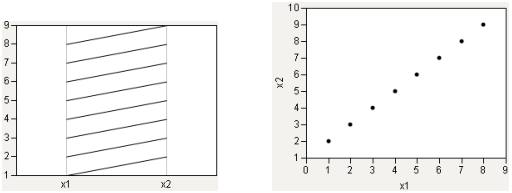
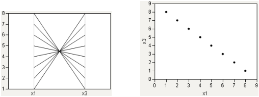
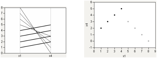
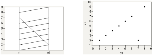
To help you interpret parallel plots, compare the parallel plot with a scatterplot. In each of the following figures, the parallel plot appears on the left side of the figure, and the scatterplot appears on the right side of the figure.
Strong Positive Correlation
The following relationship shows a strong positive correlation. Notice the coherence of the lines in the parallel plot.
Figure 7.6 Strong Positive Correlation
Strong Negative Correlation
A strong negative correlation, by contrast, shows a narrow neck in the parallel plot.
Figure 7.7 Strong Negative Correlation
Collinear Groups
Consider a case that encompasses both situations: two groups, both strongly collinear. One group has a positive slope, and the other group has a negative slope. In Figure 7.8, the positively sloped group is highlighted.
Figure 7.8 Collinear Groups: Parallel Plot and Scatterplot
Single Outlier
In the case of a single outlier, the parallel plot shows a general coherence among the lines, with a noticeable exception.
Figure 7.9 Single Outlier: Parallel Plot and Scatterplot
For more examples, see Additional Examples of the Parallel Plot Platform.


