Use Regression with One Predictor
If you have a continuous Y variable and a single, continuous X variable, you can build a simple regression model.
Scenario
This example uses the Companies.jmp data table, which contains financial data for 32 companies from the pharmaceutical and computer industries.
It is reasonable to assume that companies with more employees can generate more sales revenue than companies with fewer employees. A data analyst wants to predict the overall sales revenue for each company based on the number of employees.
To accomplish this goal, do the following tasks:
Discover the Relationship
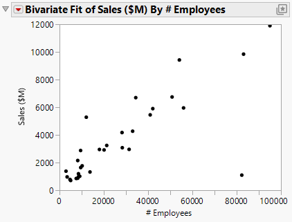
First, create a scatterplot to see the relationship between the number of employees and the amount of sales revenue. This scatterplot was created in “Create the Scatterplot”. After hiding and excluding one outlier (a company with significantly more employees and higher sales), the plot in Figure 5.12 shows the result.
Figure 5.12 Scatterplot of Sales ($M) versus # Employees
This scatterplot provides a clearer picture of the relationship between sales and the number of employees. As expected, companies with more employees can generate higher sales. The scatterplot visually confirms the data analyst’s guess, but it does not predict sales for a given number of employees.
Fit the Regression Model
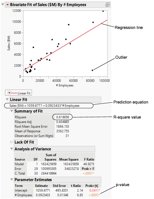
To predict the sales revenue from the number of employees, fit a regression model. Click the Bivariate Fit red triangle and select Fit Line. A regression line is added to the scatterplot and reports are added to the report window.
Figure 5.13 Regression Line
Within the reports, look at the following results:
• the p-value of <.0001
• the R-square value of 0.618
From these results, the data analyst can conclude the following points:
• The p-value for the # Employees model term is small. This supports that at the 0.05 significance level, the coefficient for # Employees is not zero. Therefore, including the number of employees in the prediction model significantly improves the ability to predict average sales over a model without the number of employees.
• The R-square value of 0.618 indicates that this model explains approximately 62% of the variability in sales. The R-square value is the coefficient of determination and indicates the proportion of the variance in the dependent (response) variable that is explained by the model. R-square can range from 0 to 1. A model with an R-square of 0 has no explanatory power. A model with an R-square of 1 predicts the response perfectly.
Predict Average Sales
Use the regression model to predict the average sales that a company might expect if they have a certain number of employees. The prediction equation for the model is included in the report.
Average sales = 1059.68 + 0.092*employees
For example, in a company with 70,000 employees, sales are predicted to be approximately USD 7,500 million.
$7,499.68 = 1059.68 + 0.092*70,000
In the lower right area of the current scatterplot, there is an outlier that does not follow the general pattern of the other companies. The data analyst wants to know whether the prediction model changes when this outlier is excluded.
Exclude the Outlier
1. Click the outlier.
2. Select Rows > Exclude/Unexclude.
3. To fit this model, click the red triangle next to Bivariate Fit of Sales (SM) By # Employees and select Fit Line.
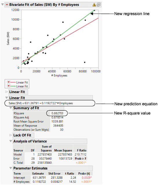
The following items are added to the report window (Figure 5.14):
• a new regression line
• a new Linear Fit report, which includes:
– a new prediction equation
– a new R-square value
Figure 5.14 Comparing the Models
Interpret the Results
Using the results in Figure 5.14, the data analyst can make the following conclusions:
• The outlier was pulling down the regression line for the larger companies and pulling the line up for the smaller companies.
• The new model for the data without the outlier is a stronger model than the first model. The new R-square value of 0.88 is higher and closer to 1 than the initial analysis.
Draw Conclusions
Using the new prediction equation, the predicted average sales for a company with 70,000 employees can be calculated as follows:
$8961.37 = 631.37 + 0.119*70,000
The prediction from the first model was approximately USD 7,500 million. The second model predicts a sales total of approximately 8,960, or an increase of 1,460 as compared to the first model.
The second model, after removing the outlier, describes and predicts sales totals based on the number of employees better than the first model. The data analyst now has a good model to use.


