This example uses the AdverseR.jmp sample data table to illustrate an ordinal logistic regression. Suppose you want to model the severity of an adverse event as a function of treatment duration value.
|
1.
|
|
2.
|
Right-click on the icon to the left of ADR SEVERITY and change the modeling type to ordinal.
|
|
3.
|
Select Analyze > Fit Y by X.
|
|
4.
|
|
5.
|
|
6.
|
Click OK.
|
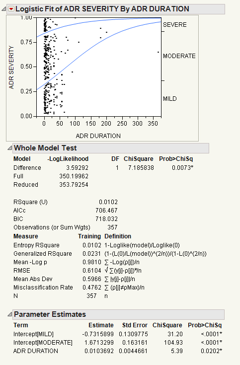
In the plot, markers for the data are drawn at their x-coordinate. When several data points appear at the same y position, the points are jittered. That is, small spaces appear between the data points so you can see each point more clearly.
Where there are many points, the curves are pushed apart. Where there are few to no points, the curves are close together. The data pushes the curves in that way because the criterion that is maximized is the product of the probabilities fitted by the model. The fit tries to avoid points attributed to have a small probability, which are points crowded by the curves of fit. See the Fitting Linear Models book for more information about computational details.
For details about the Whole Model Test report and the Parameter Estimates report, see The Logistic Report. In the Parameter Estimates report, an intercept parameter is estimated for every response level except the last, but there is only one slope parameter. The intercept parameters show the spacing of the response levels. They always increase monotonically.
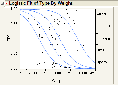
This example uses the Car Physical Data.jmp sample data table to show an additional example of a logistic plot. Suppose you want to use weight to predict car size (Type) for 116 cars. Car size can be one of the following, from smallest to largest: Sporty, Small, Compact, Medium, or Large.
|
1.
|
|
2.
|
|
3.
|
|
4.
|
From the Column Properties menu, select Value Ordering.
|
|
6.
|
Click OK.
|
|
7.
|
Select Analyze > Fit Y by X.
|
|
8.
|
|
9.
|
|
10.
|
Click OK.
|
|
•
|
Markers for the data are drawn at their x-coordinate, with the y position jittered randomly within the range corresponding to the response category for that row.
|
If the x -variable has no effect on the response, then the fitted lines are horizontal and the probabilities are constant for each response across the continuous factor range. Examples of Sample Data Table and Logistic Plot Showing No y by x Relationship shows a logistic plot where Weight is not useful for predicting Type.
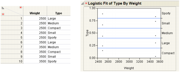
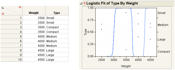
Note: To re-create the plots in Examples of Sample Data Table and Logistic Plot Showing No y by x Relationship and Examples of Sample Data Table and Logistic Plot Showing an Almost Perfect y by x Relationship, you must first create the data tables shown here, and then perform steps 7-10 at the beginning of this section.
If the response is completely predicted by the value of the factor, then the logistic curves are effectively vertical. The prediction of a response is near certain (the probability is almost 1) at each of the factor levels. Examples of Sample Data Table and Logistic Plot Showing an Almost Perfect y by x Relationship shows a logistic plot where Weight almost perfectly predicts Type.
Note: In this case, the parameter estimates become very large and are marked unstable in the regression report.
|
1.
|
|
2.
|
Select Analyze > Fit Y by X.
|
|
3.
|
|
4.
|
Notice that JMP automatically fills in Count for Freq. Count was previously assigned the role of Freq.
|
5.
|
Click OK.
|
|
6.
|
From the red triangle menu, select ROC Curve.
|
|
7.
|
Select Cured as the positive.
|
|
8.
|
Click OK.
|
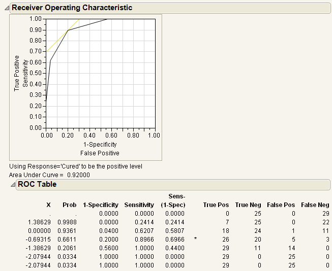
Note: This example shows a ROC Curve for a nominal response. For details about ordinal ROC curves, see the Recursive Partitioning chapter in the Specialized Models book.
The results for the response by In(Dose) example are shown here. The ROC curve plots the probabilities described above, for predicting response. Note that in the ROC Table, the row with the highest Sens-(1-Spec) is marked with an asterisk.
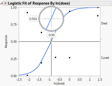
In a study of rabbits who were given penicillin, you want to know what dose of penicillin results in a 0.5 probability of curing a rabbit. In this case, the inverse prediction for 0.5 is called the ED50, the effective dose corresponding to a 50% survival rate. Use the crosshair tool to visually approximate an inverse prediction.
To see which value of In(dose) is equally likely either to cure or to be lethal, proceed as follows:
|
1.
|
|
2.
|
Select Analyze > Fit Y by X.
|
|
3.
|
|
4.
|
Notice that JMP automatically fills in Count for Freq. Count was previously assigned the role of Freq.
|
5.
|
Click OK.
|
|
7.
|
Place the horizontal crosshair line at about 0.5 on the vertical (Response) probability axis.
|
|
8.
|
Move the cross-hair intersection to the prediction line, and read the In(dose) value that shows on the horizontal axis.
|
In this example, a rabbit with a In(dose) of approximately -0.9 is equally likely to be cured as it is to die.
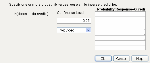
If your response has exactly two levels, the Inverse Prediction option enables you to request an exact inverse prediction. You are given the x value corresponding to a given probability of the lower response category, as well as a confidence interval for that x value.
To use the Inverse Prediction option, proceed as follows:
|
1.
|
|
2.
|
Select Analyze > Fit Y by X.
|
|
3.
|
|
4.
|
Notice that JMP automatically fills in Count for Freq. Count was previously assigned the role of Freq.
|
5.
|
Click OK.
|
|
6.
|
|
7.
|
Type 0.95 for the Confidence Level.
|
|
8.
|
Select Two sided for the confidence interval.
|
|
9.
|
Request the response probability of interest. Type 0.5 and 0.9 for this example, which indicates you are requesting the values for ln(Dose) that correspond to a 0.5 and 0.9 probability of being cured.
|
|
10.
|
Click OK.
|
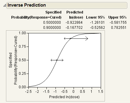
The estimates of the x values and the confidence intervals are shown in the report as well as in the probability plot. For example, the value of ln(Dose) that results in a 90% probability of being cured is estimated to be between -0.526 and 0.783.