|
1.
|
|
2.
|
Select Analyze > Fit Y by X.
|
|
3.
|
|
4.
|
|
5.
|
Click OK.
|
|
6.
|
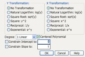
From the red triangle menu for Bivariate Fit, select Fit Special. The Specify Transformation or Constraint window appears. For a description of this window, see Description of the Specify Transformation or Constraint Window.
|
|
7.
|
Within Y Transformation, select Natural Logarithm: log(y).
|
|
8.
|
Within X Transformation, select Square Root: sqrt(x).
|
|
9.
|
Click OK.
|
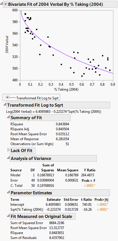
Example of Fit Special Report shows the fitted line plotted on the original scale. The model appears to fit the data well, as the plotted line goes through the cloud of points.
|
1.
|
|
2.
|
Select Analyze > Distribution.
|
|
3.
|
|
4.
|
Click OK.
|
|
5.
|
|
1.
|
|
2.
|
|
3.
|
|
4.
|
Click OK.
|
|
5.
|
From the red triangle menu, select Fit Line.
|
|
6.
|
From the red triangle menu, select Fit Orthogonal. Then select each of the following:
|
|
‒
|
Specified Variance Ratio and type 0.2.
|
|
‒
|
Specified Variance Ratio and type 5.
|
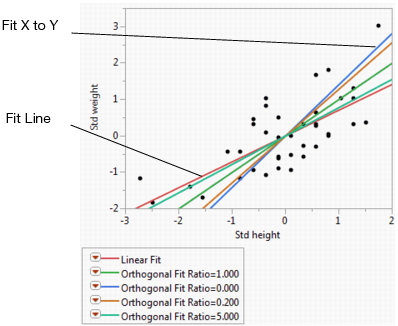
The scatterplot in Example of Orthogonal Fitting Options shows the standardized height and weight values with various line fits that illustrate the behavior of the orthogonal variance ratio selections. The standard linear regression (Fit Line) occurs when the variance of the X variable is considered to be very small. Fit X to Y is the opposite extreme, when the variation of the Y variable is ignored. All other lines fall between these two extremes and shift as the variance ratio changes. As the variance ratio increases, the variation in the Y response dominates and the slope of the fitted line shifts closer to the Y by X fit. Likewise, when you decrease the ratio, the slope of the line shifts closer to the X by Y fit.
The data in the Weight Measurements.jmp sample data table shows the height and weight measurements taken by 40 students.
|
1.
|
|
2.
|
Select Analyze > Fit Y by X.
|
|
3.
|
|
4.
|
|
5.
|
Click OK.
|
|
6.
|
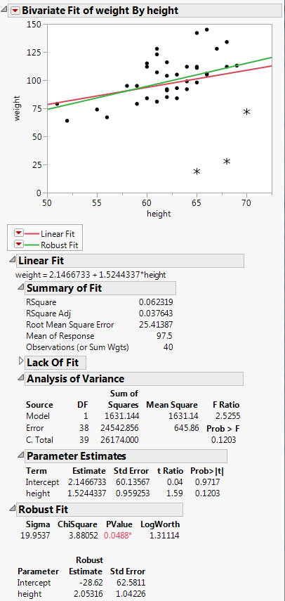
From the red triangle menu, select Fit Line.
|
|
7.
|
From the red triangle menu, select Robust > Fit Robust.
|
This example uses the Hot Dogs.jmp sample data table. The Type column identifies three different types of hot dogs: beef, meat, or poultry. You want to group the three types of hot dogs according to their cost variables.
|
1.
|
|
2.
|
Select Analyze > Fit Y by X.
|
|
3.
|
|
4.
|
|
5.
|
Click OK.
|
|
6.
|
From the red triangle menu, select Group By.
|
|
7.
|
From the list, select Type.
|
|
8.
|
|
9.
|
From the red triangle menu, select Density Ellipse > 0.90.
|
To color the points according to Type, proceed as follows:
|
10.
|
Right-click on the scatterplot and select Row Legend.
|
|
11.
|
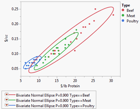
The ellipses in Example of Group By show clearly how the different types of hot dogs cluster with respect to the cost variables.
|
1.
|
|
2.
|
Select Analyze > Fit Y by X.
|
|
3.
|
|
4.
|
|
5.
|
Click OK.
|
To create the example on the left in Example of Regression Analysis for Whole Sample and Grouped Sample:
|
6.
|
Select Fit Line from the red triangle menu.
|
To create the example on the right in Example of Regression Analysis for Whole Sample and Grouped Sample:
|
7.
|
From the Linear Fit menu, select Remove Fit.
|
|
8.
|
From the red triangle menu, select Group By.
|
|
9.
|
|
10.
|
Click OK.
|
|
11.
|
Select Fit Line from the red triangle menu.
|
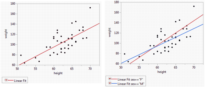
The scatterplot to the left in Example of Regression Analysis for Whole Sample and Grouped Sample has a single regression line that relates weight to height. The scatterplot to the right shows separate regression lines for males and females.