Normal Distribution
What is a normal distribution?
The normal distribution is a theoretical distribution of values for a population. Often referred to as a bell curve when plotted on a graph, data with a normal distribution tends to accumulate around a central value; the frequency of values above and below the center decline symmetrically.
How is the normal distribution used?
Many statistical analysis methods assume the data are from a normal distribution. If it isn't, the analysis might not be correct.
Can I check if my data is 'normal'?
Yes. You can do simple visual checks. Most statistical software will do a formal statistical test.
Defining the normal distribution
See how to assess normality using statistical software
- Download JMP to follow along using the sample data included with the software.
- To see more JMP tutorials, visit the JMP Learning Library.
The normal distribution is a theoretical distribution of values for a population and has a precise mathematical definition. Data values that are a sample from a normal distribution are said to be “normally distributed.” Instead of diving into complex math, let’s look at the useful properties of the normal distribution and why it is important in analyses.
First, why do we care about the normal distribution?
- Many measurements are normally distributed, or nearly so. Examples are height, weight and heart rate. Notice that all of these are measured on a scale with many possible values.
- Many averages of measurements are normally distributed, or nearly so. For example, your daily commute time might not be normally distributed. But the monthly average of your daily commute time is likely to be normally distributed.
- Many statistical methods depend on the data being normally distributed. In this case, you will read that the method “assumes data is normally distributed” or “assumes normality.”
One of your first actions for a set of data values should be to look at the shape of the data. The normal distribution has a symmetrical shape. It is sometimes called a bell curve because a plot of the distribution looks like a bell sitting on the ground.
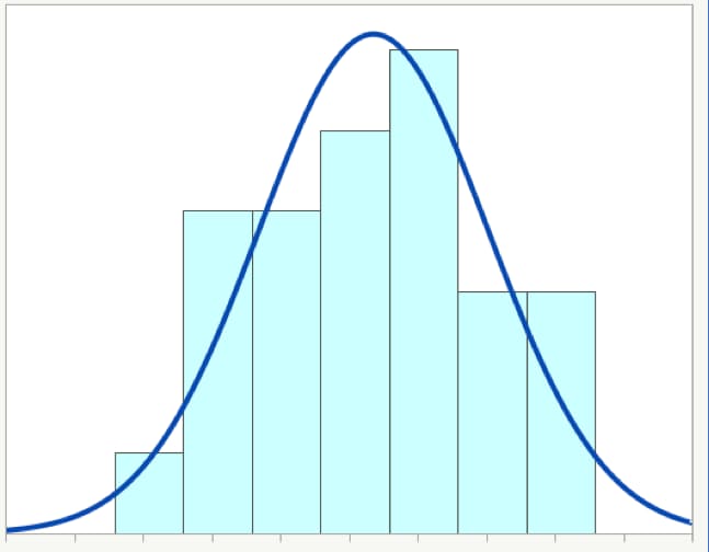
Figure 1 below shows a histogram for a set of sample data values along with a theoretical normal distribution (the curved blue line). The histogram is a type of bar chart that shows the frequency of data values. You can see that the data do not match up exactly with the curve, which is common. In fact, if you see data that exactly matches a theoretical normal distribution, you will want to ask a lot of questions. Real-life data rarely matches a distribution exactly.
Summary of features
The normal distribution has the following features:
- It is completely defined by the mean and standard deviation.
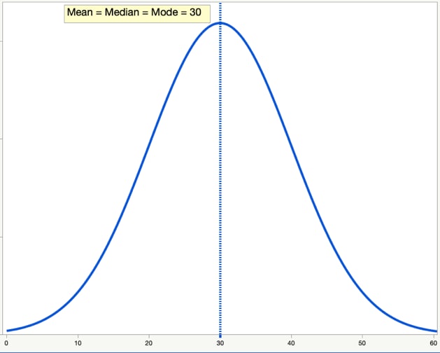
- The mean, median and mode are all identical.
- It is symmetrical.
- It is bell-shaped.
Each feature is significant and tells you something about your data. Let's take a closer look:
1. Completely defined by mean and standard deviation
We need only two values – the mean and the standard deviation – to draw a picture of a specific normal distribution. (To further explore the relationship between the mean and the standard deviation for normally distributed data, read about the empirical rule.)
The mean and standard deviation are referred to as the parameters of the normal distribution. All distributions have parameters, and some have more than two. In any situation, the parameters will define a specific distribution.
Let's look at some examples of normal distribution curves.
Figure 2 shows two normal distributions, each with the same mean of 30. The thinner, taller distribution shown in blue has a standard deviation of 5. The wider, shorter distribution shown in orange has a standard deviation of 10.
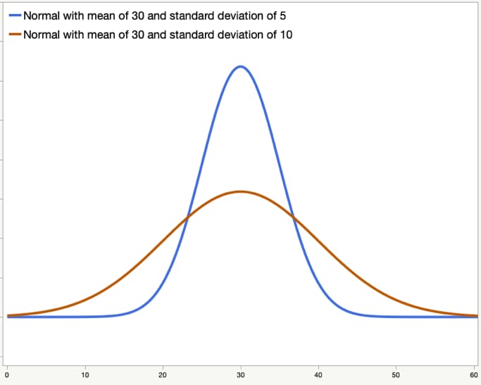
Figure 3 also shows two normal distributions, each with the same standard deviation of 5. The one on the left, shown in orange, has a mean of 20, while the one on the right, shown in blue, has a mean of 40.
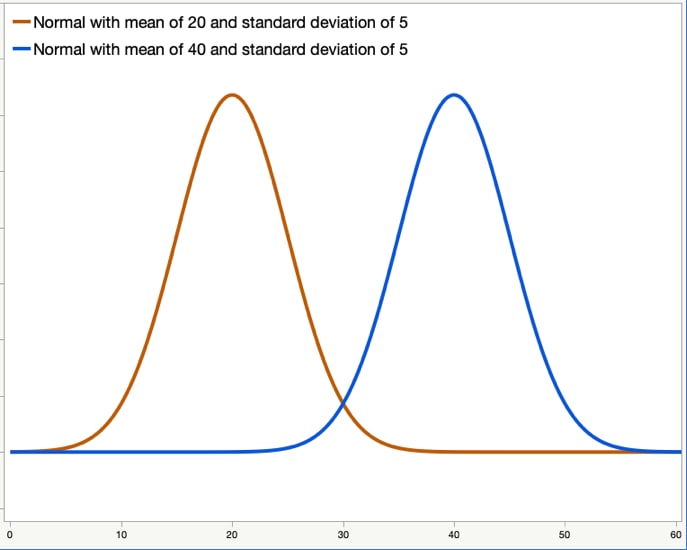
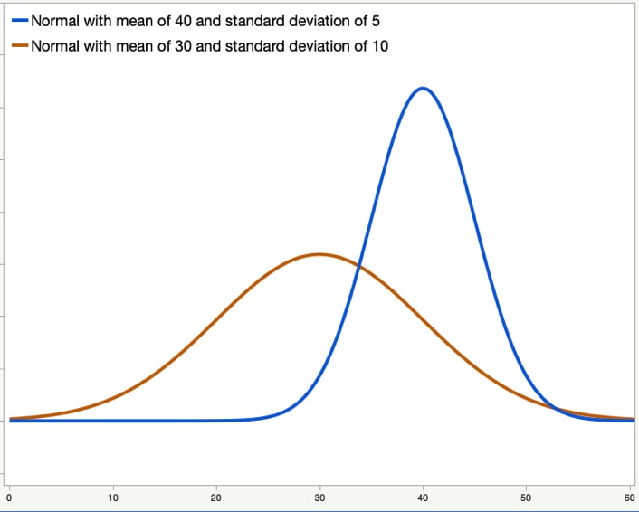
Figure 4 again shows two normal distributions. The distribution shown in orange has a mean of 30 and a standard deviation of 10. The distribution in blue has a mean of 40 and a standard deviation of 5.
2. Mean = median = mode
The mean, median and mode are three ways to measure the center of a set of data values. For a true normal distribution, these three are identical. In practice, your data is likely to be nearly normal. The mean, median and mode are likely to be very close to each other, but not identical.
3. Symmetrical
The normal distribution is symmetrical. If you think about folding the graph in half at the mean, each side will be the same.
4. Bell-shaped
The normal distribution is bell-shaped with one central “hump,” which can be seen in the examples above.
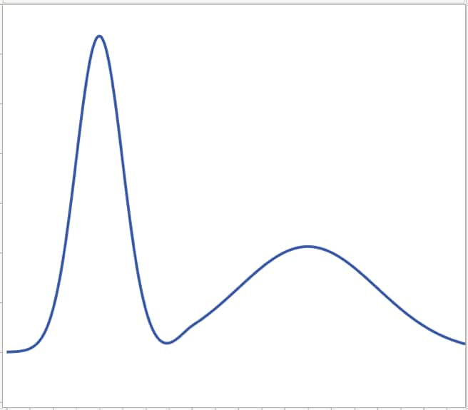
Figure 6 shows a distribution that is non-normal. It has two humps instead of one. A distribution with two humps could indicate that there are different groups that are mixed up in the data. For example, heart rates are usually normally distributed. But suppose, unknown to you, the data has the resting heart rate for two groups: athletes and inactive people. You might get a bimodal distribution like the one below.
If it’s not normal, is it abnormal?
If your data is not “normal,” does that mean that it is abnormal? No. Does it mean your data is bad? No. Different types of data will have different underlying distributions.
There are many possible theoretical distributions. Many statistical methods depend on the data coming from a normal distribution. When that isn't the case, there are other methods that you can use.
In practice, you will find that data is often “nearly normal.” There are some simple visual tools to check for normality, and most software packages have formal statistical tests for normality.
What are some examples of data that is not normally distributed?
- Individual throws of a six-sided die
- Coin flips
- Pass/fail checks in manufacturing
- Waiting time in a line
- Time to failure for batteries or other electronics
- File sizes of videos posted on the internet
Even though the examples are not normally distributed, there are analysis methods for these types of data.
Visual tools to check for normality
Using a histogram
As was mentioned above, a histogram is a special type of frequency bar chart for continuous variables. This chart can help you see if the data follows a general bell curve or not. With some software packages, you can also add a normal curve to your histogram as a visual comparison.
Figure 7 shows an example of a histogram for data that is not from a normal distribution.
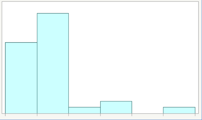
When you look at a histogram as a visual check for normality, see if the chart:
- Has extreme values or not.
- Follows a symmetrical curve that is almost the same on both sides.
- Is bell-shaped or not.
As you can see, Figure 7 has extreme values, is not symmetrical and is not bell-shaped.
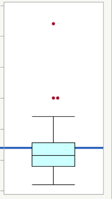
Using a box plot
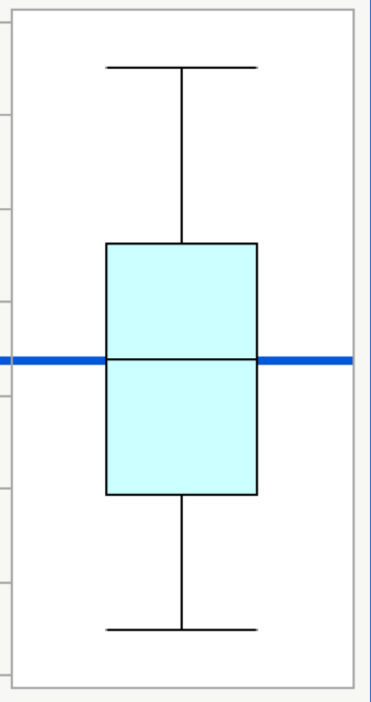
A box plot for a normal distribution shows that the mean is the same as the median. It also shows that the data has no extreme values. The data will be symmetrical.
Take a look at the two box plots in Figures 8 and 9 below. The data in Figure 8 is from a nearly normal distribution. The data in Figure 9 is from a non-normal distribution.
When you look at a box plot as a visual check for normality, see if the plot shows:
- Extreme values or not. The plot for the non-normal distribution in Figure 9 shows three outliers as red dots. The plot for the nearly normal distribution in Figure 8 shows no outliers.
- Symmetry or not. The plot for the nearly normal distribution (Figure 8) shows symmetry, while the plot for the non-normal distribution (Figure 9) does not.
- Mean and median nearly equal. In these box plots, the horizontal black center line in the box is the median, and the blue line is the mean. For the nearly normal distribution in Figure 8, the blue line for the mean is almost the same as the line in the middle of the box for the median.
Using a normal quantile plot
A normal quantile plot shows a normal distribution as a straight line instead of as a bell curve. If your data are normal, then the data values will fall close to the straight line. If your data are non-normal, then the data values will fall away from the straight line. The pattern of the data on the plot can help you understand why your data are not normally distributed.
Figure 10 shows a normal quantile plot for data from a normal distribution. You can see how most of the data values fall near the solid red line. The data values also all fall within the dotted red confidence bounds.
Figure 11 shows data that is not from a normal distribution. Some of the data values are near the solid red line, but most of them are not. Some of the data values are outside of the dotted red confidence bounds. There are also some extreme values in the upper right.
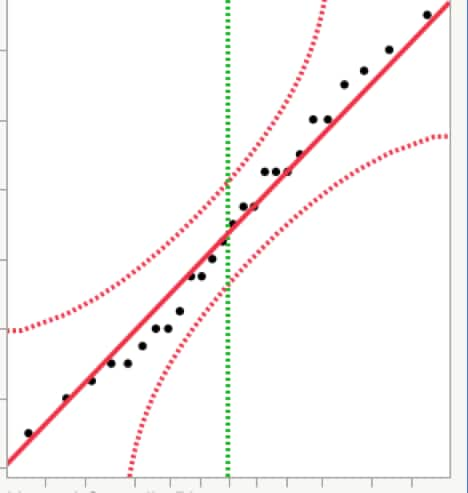
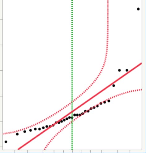
Most statistical software will create normal quantile plots. When you look at a normal quantile plot for normality, see if the data:
- Has extreme values or not.
- Follows mostly along the line that shows the normal distribution.
- Falls within the confidence bounds most of the time.
When to use the normal distribution
Continuous data: YES
The normal distribution makes sense for continuous data, since these data are measured on a scale with many possible values. Some examples of continuous data are:
- Age
- Blood pressure
- Weight
- Temperature
- Speed
For all of these examples, it makes sense to consider using methods that assume a normal distribution. However, remember that not all continuous data will follow a normal distribution. Plot your data, and think about what your data represents before you apply a method that assumes normality.
Ordinal or nominal data: NO
The normal distribution does not make sense for raw ordinal or raw nominal data since these data are measured on a scale with only a few possible values.
With ordinal data, the sample is divided into groups, and the responses often have a specific order. For example, in a survey where you are asked to give your opinion on a scale from “Strongly Disagree” to “Strongly Agree,” your responses are ordinal.
For nominal data, the sample is also divided into groups but there is no particular order. Two examples are biological sex and country of residence. You can use M for male and F for female in your sample, or you can use 0 and 1. For country, you can use the country abbreviation, or you can use numbers to code the country name. Even if you use numbers for this data, using the normal distribution doesn’t make sense.
Other topics
Testing for normality
Most statistics software packages include formal tests for normality. These tests assume that the data come from a normal distribution; the testing activity then uses the data to check if this assumption is reasonable or not.
Using a t-distribution
The normal distribution is a theoretical distribution. It is completely defined by the population mean and population standard deviation.
In practice, we almost never know the population values for these two statistics.
The t-distribution is very similar to the normal distribution. It uses the sample mean and sample standard deviation. Because it uses these estimated values, it needs one more parameter to be completely defined.
The additional parameter is the degrees of freedom, which is simply the sample size minus 1. If n is the sample size, then the degrees of freedom are shown as n-1. A simple way to remember this is that the t-distribution has a sort of “correction factor” in the degrees of freedom. This correction factor helps account for the fact that the distribution is based on the sample mean and sample standard deviation instead of the unknown population values.