Analysis Of Single Cell Sequencing Data
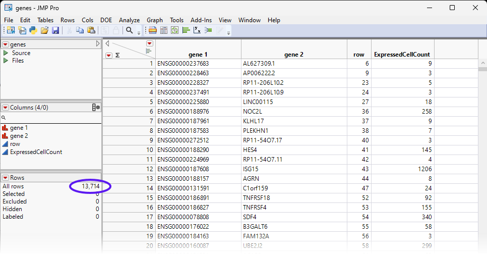
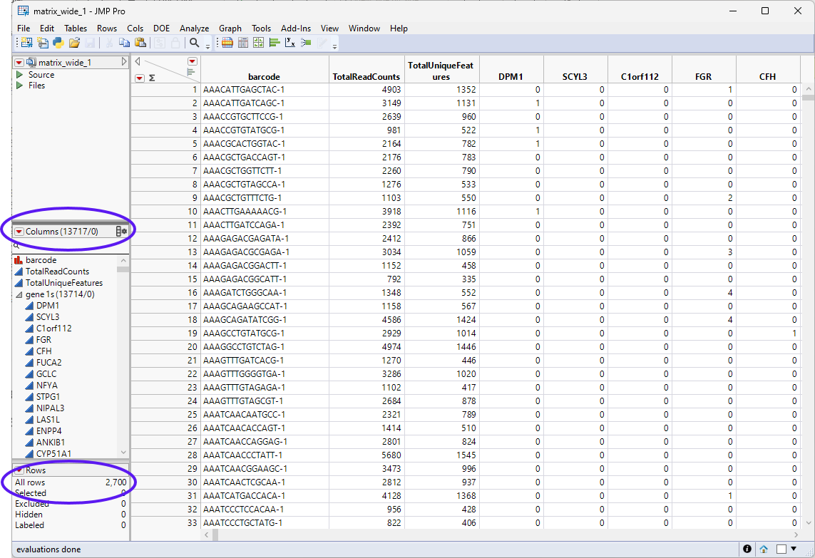
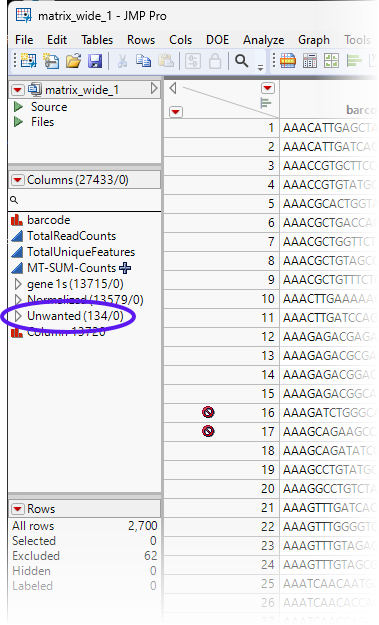
The data used in this chapter is from a study of Peripheral Blood Mononuclear Cells (PBMC). The data is freely available from 10X Genomics. There are 2,700 single cells that were sequenced on the Illumina NextSeq 500. The data set was downloaded and imported as described in Importing MTX Files. The resulting four data sets were saved as the matrix.jmp table (contains the sequencing counts in a three column format), the genes.jmp table (contains feature information), the barcodes.jmp table (contains samples information), and the matrix_wide.jmp table (the sparse matrix of the Matrix.jmp table). We will use two of these tables, the matrix_wide.jmp and genes.jmp tables, shown below, for this analysis.
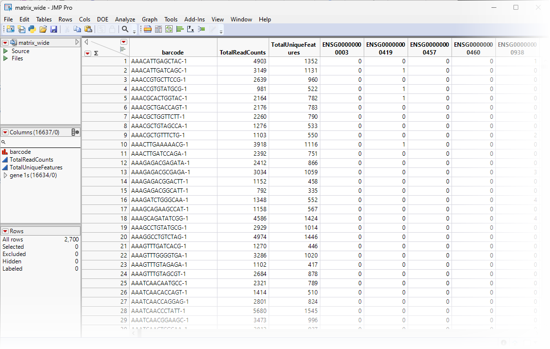
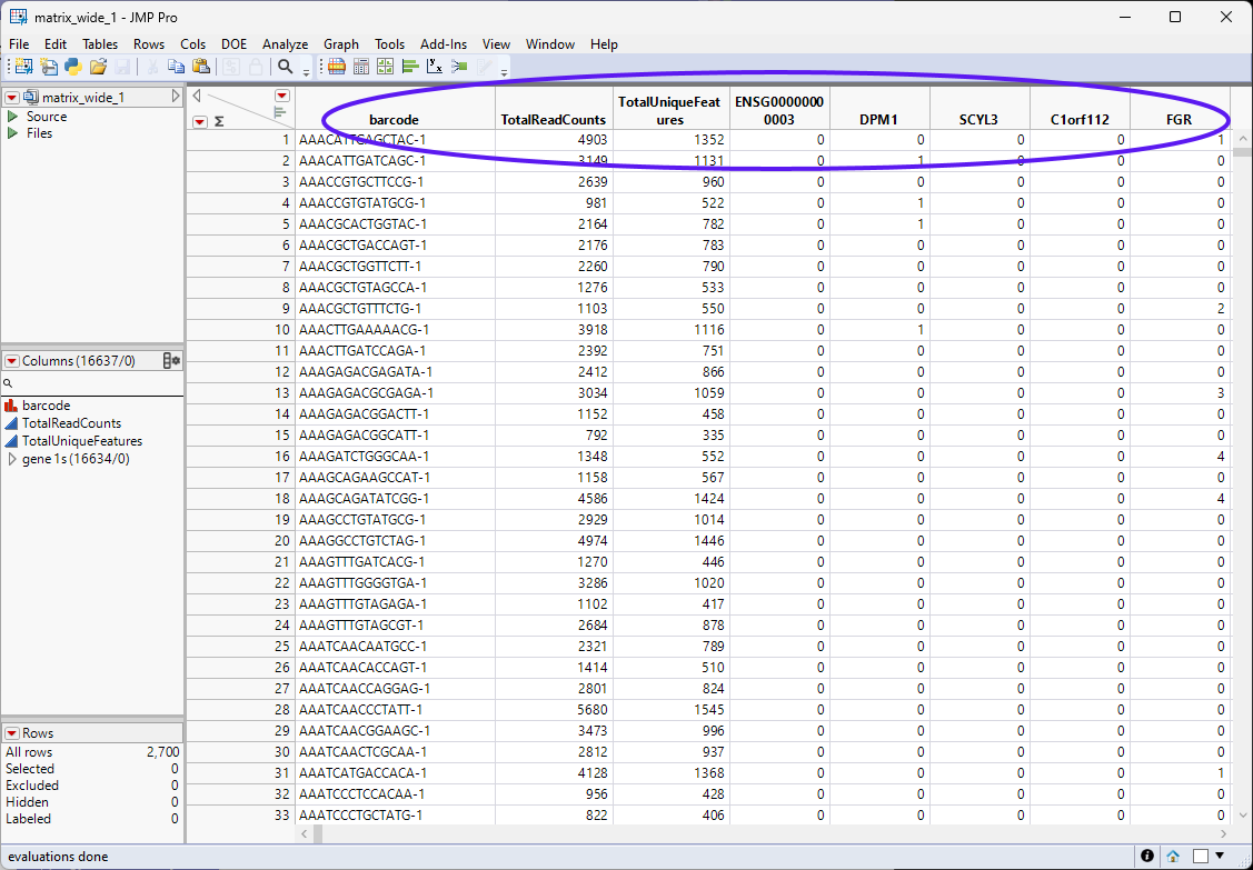
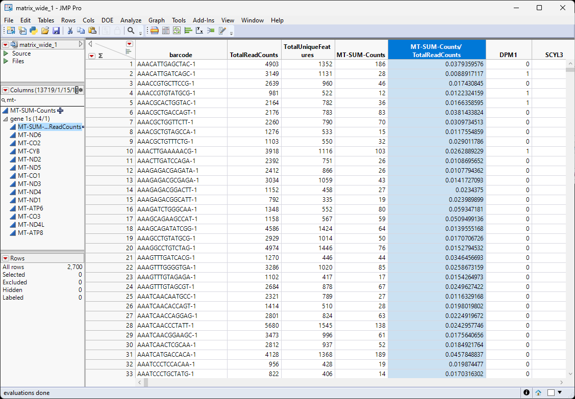
The matrix_wide.jmp table (below) is the data table and contains genes as the columns and barcodes (cell IDs) as the rows.
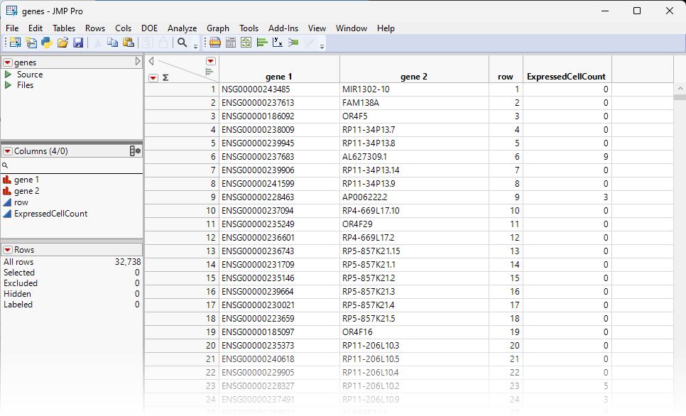
The genes.jmp table contains gene-specific information, such as gene annotation, gene length, pathway information, etc. In the importation step, we also summarize the number of expressed cells for each gene, and name it 'ExpressedCellCount'. For this example, the genes.jmp table contains the row labels of the sparse matrix (gene 2), representing the names of all the genes in the study.
Data Cleaning and Preparation
Before we can pursue any downstream analysis, we must filter and prepare the data to remove noises and optimize the usage of memory space and computational resource.
Filtering and Recoding the Data
The first step is to filter out any features that are not or barely expressed.
| 8 | Select the genes.jmp table. |
| 8 | Select Rows > Row Selection > Select Where to bring up the Row Selection window. |
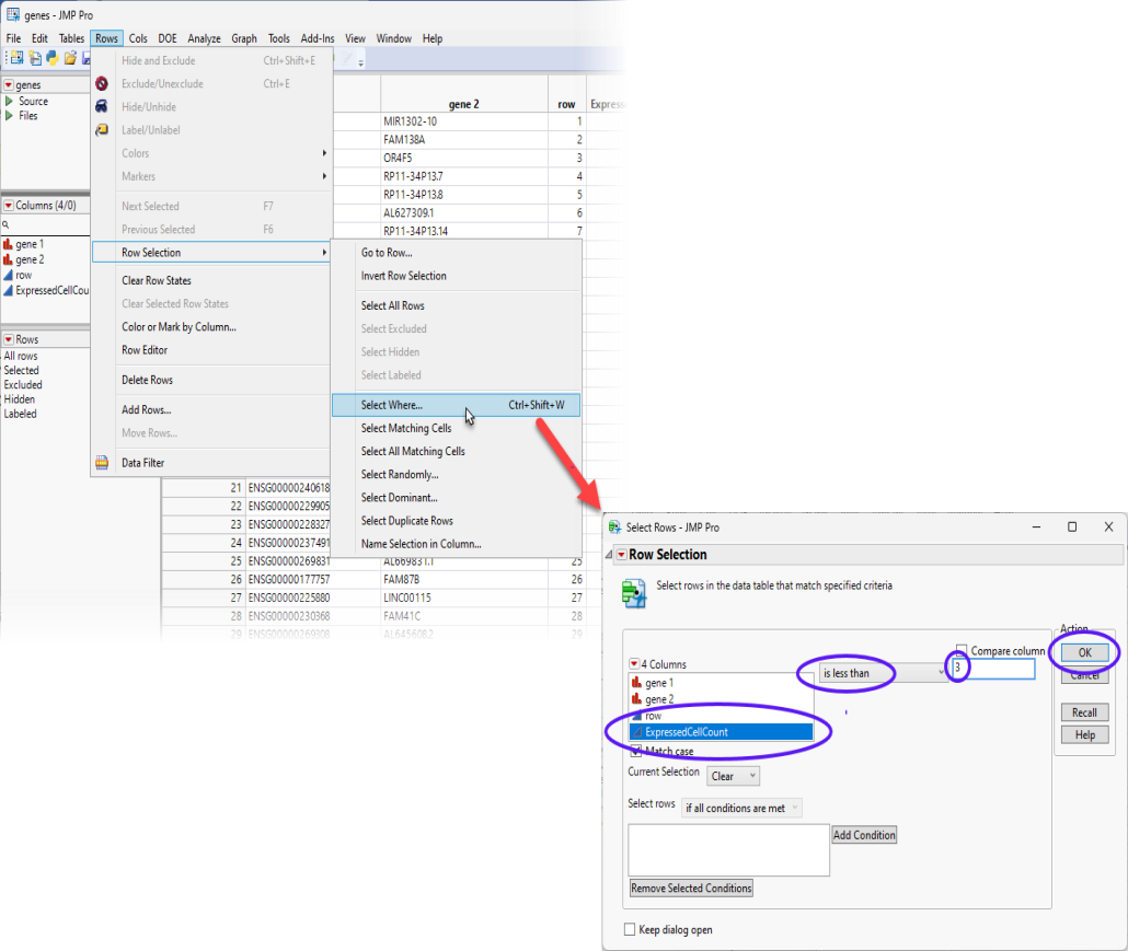
| 8 | Select the features that are expressed in fewer than 3 cells and click . Users can adjust this number according to research interests. |
This action highlights all of the rows in the genes.jmp table with values smaller than "3" in the ExpressedCellCount column.
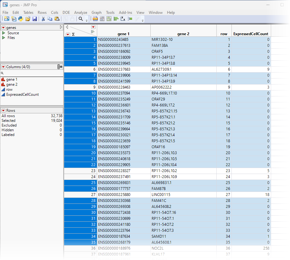
| 8 | Right-click on the highlighted row numbers and click Delete Rows. |
The highlighted rows are deleted and 13,714 rows (genes) remain, all of which are expressed in 3 or more cells.
| 8 | Save the table as genes_1.jmp. |
Let's now focus on the matrix_wide.jmp table. The gene names in this table are in the Ensembl Gene ID format 'ENSG00000123456'. We want to swap the names to gene symbols so that the downstream analysis and visualization are more intuitive. There are free gene symbols converter tools available online, and we will leave it to users to explore.
The first step is to recode the gene names.
| 8 | Select the matrix_wide.jmp table. |
| 8 | Select Cols > Column Names > Recode Column Names to bring up the Recode - Column Names window. |
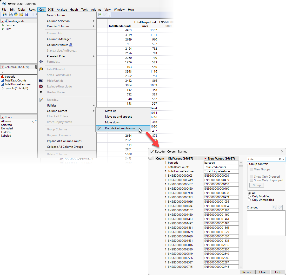
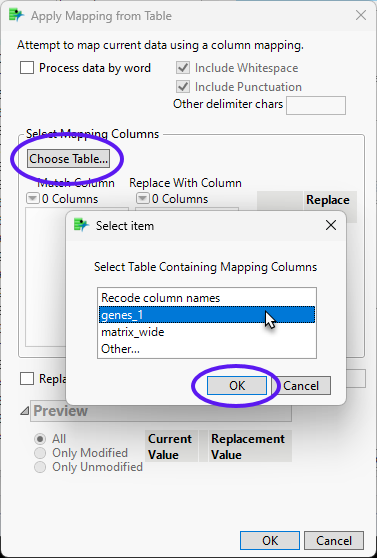
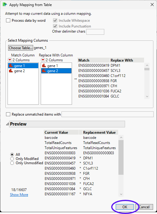
| 8 | Click the red triangle on the Recode window and select Advanced > Apply Mapping from Table to bring up the Apply Mapping from Table window. |
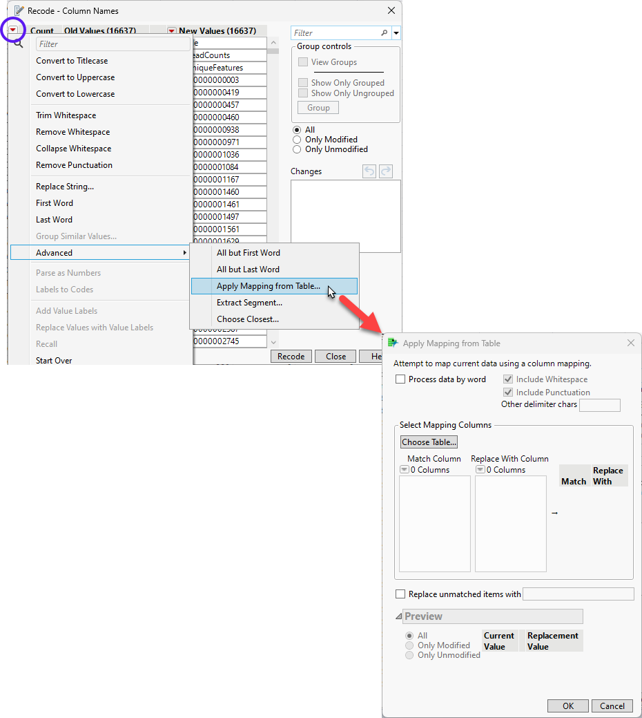
| 8 | Click to bring up the Select item window. Select genes_1 and click . |
| 8 | Select gene 1 as the Match Column and gene 2 as the Replace With Column. Click . |
The values in the New Values column of the Recode - Column Names window are replaced with the gene 2 values. This recoding may take several minutes, depending on the size of your table.
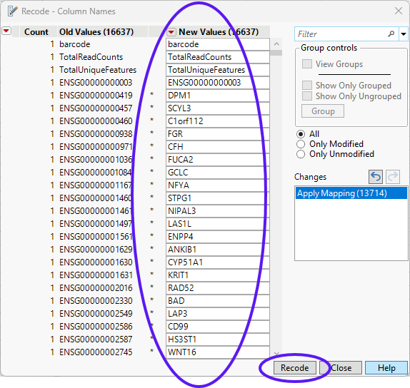
| 8 | Click to replace the column headers in the matrix_wide.jmp table. |
| 8 | Save the recodes table as matrix_wide_1.jmp. |
Note: Not all of the columns have been recoded. (See column 4, above) Recall that we filtered out all of the features in the genes.jmp table that occurred <3 times to generate the genes_1.jmp table. These genes either have all zeros across samples, or only expressed in a few cells, and thus are non-informative. These columns are still labeled with the ENSG00 Ensembl prefix. We use that prefix to remove these genes from the matrix_wide_1.jmp table.
Type ENSG00 in the Column Search box to the left of the table and click .
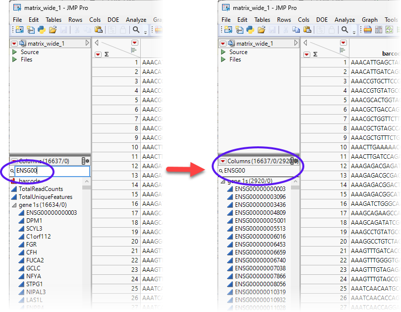
We see that 2920 genes have been selected. To make sure we do not accidentally delete other genes, click the search sign, and select Start with phrase.
| 8 | Select all 2920 genes. Right-click on the highlighted genes and select Delete Columns. |
| 8 | Save the table. |
We are left with 13717 columns and 2700 rows.
Calculating Percentage of Mitochondrial Genes in the Data
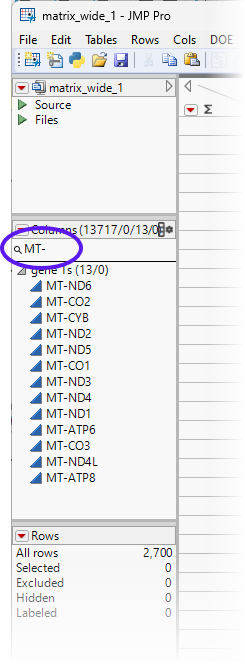
The percentage of mitochondrial (MT) gene expression is often used to evaluate the sequencing quality of a cell (sample). The higher the percentage of mitochondrial transcripts, the more likely that a cell is either of poor quality or dead. To calculate this percentage, we must first identify the mitochondrial genes.
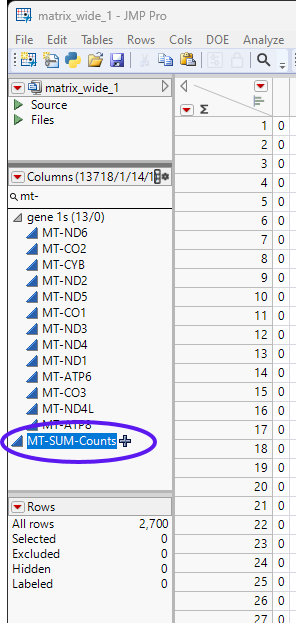
Mitochondrial genes typically start with the “MT-” prefix. If we search for columns beginning with mt-, as described above for ENSG00, we find 13 genes that begin with MT-.
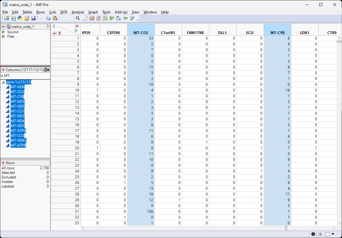
To calculate the percentage of the counts due to mitochondrial sequences, we need to derive both the sum of counts coming from mitochondrial genes and the sum of all the counts from all the genes.
Calculating Sum of Mitochondrial Gene Counts
Select all the MT genes listed in the search results. Selecting the names in the Columns list also highlights the respective columns in the table.
| 8 | Right-click on one of the highlighted columns and select New Formula Column > Combine > Sum. |
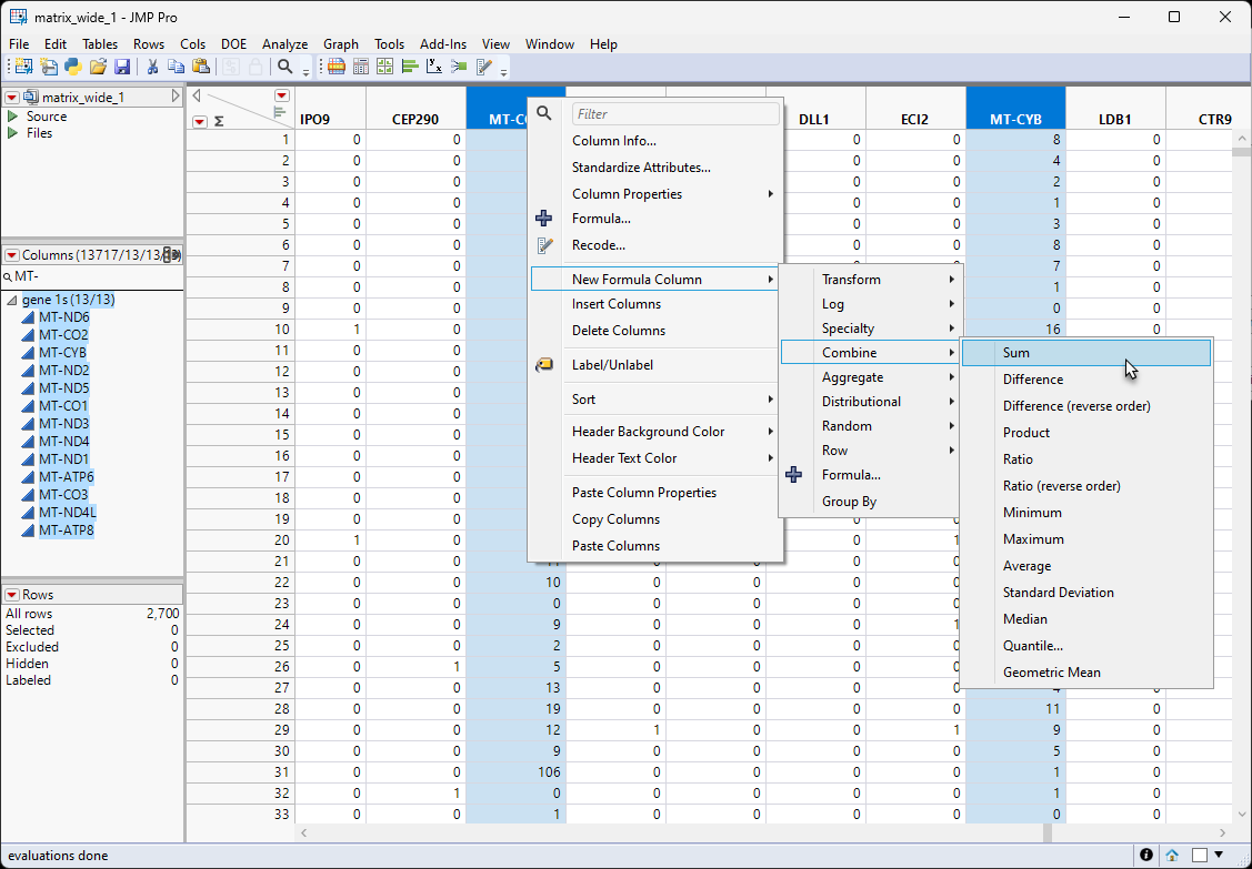
This action creates a new column that is the sum of all MT-gene counts.
| 8 | Rename the column. In this example the new column name is MT-SUM-Counts. |
| 8 | Select the new column and select Cols > Reorder Columns > Move Selected Columns... to bring up the Move Selected Columns window. |
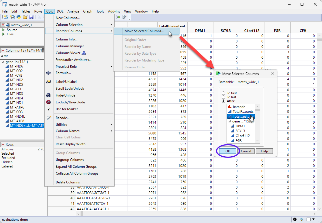
| 8 | Move the new column to the place just after the TotalUniqueFeatures column. |
| 8 | Save the table. |
Calculating the Percentage of Counts Coming from Mitochondrial Genes
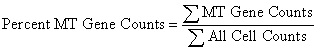
The percentage of counts coming from the mitochondrial genes is calculated as:
The new column we just created contains the counts from the mitochondrial genes. The total counts from all cells is listed in the TotalReadCounts column. All we have to do to determine the percentage of MT counts across all cells is to take the ratio of the two columns.
| 8 | Select both the TotalReadCounts and the MT-Sum-Counts columns. Right-click on one of the column names and select New Column Formula > Combine . Ratio (reverse order). |
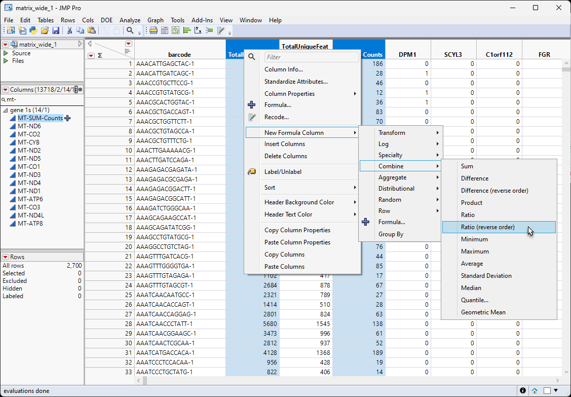
Note: We selected Ratio (reverse order) because, in the table, the column making up the numerator came after the column making up the denominator.
A new column containing the percentage of mitochondrial gene counts has been added to the table.
| 8 | Save the table. |
Removing Cells with Excessive/Low Counts or Excessive MT Counts
Often, in single cell experiments, samples with total unique features that are either too high or too low or possess very high percentages of mitochondrial sequences have been found to be unreliable sources of biological information. To remove these samples from the analysis, JMP Pro enables you to filter out those samples. In this example, we filter out any samples that satisfy the following conditions:
| • | Percent MT Gene Counts > .05 |
| • | Total Unique Features > 2500 |
| • | Total Unique Features < 200 |
Note: You can select different values, depending on your research conditions or interests.
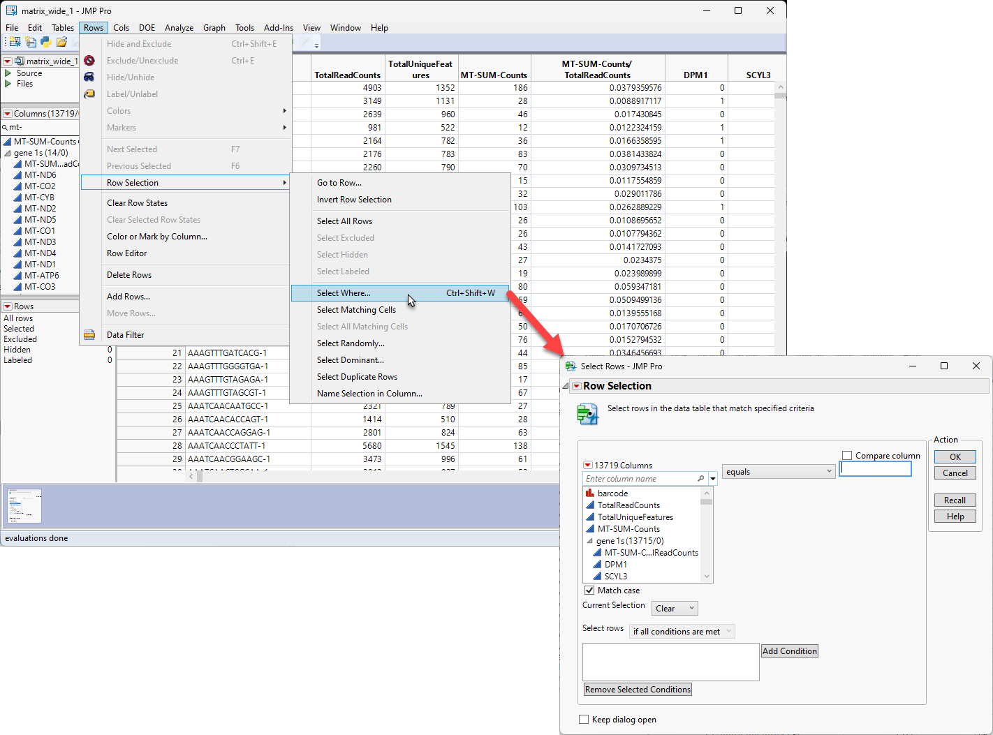
| 8 | Select Rows > Row Selection > Select Whereto open the Row Selection window |
| 8 |
| 8 | Enter the each of the following statements in the Conditions text box by selecting a column and an operator and entering the critical value at the top and clicking . |
| • | MT-SUM-Counts/TotalReadCounts is greater than .05 |
| • | TotalUniqueFeatures is greater than 2500 |
| • | TotalUniqueFeatures is less than 200 |
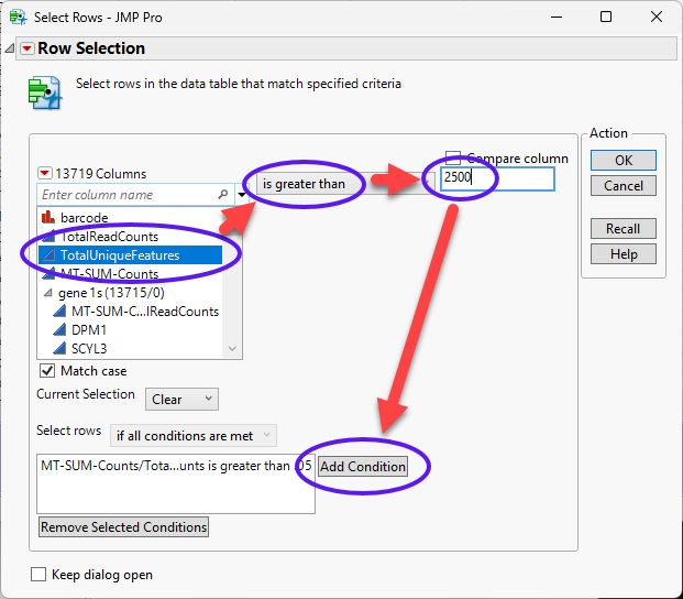
| 8 | Continue until all of the conditions have been specified. |
| 8 | Use the drop-down menu to specify if any condition is met. |
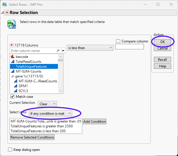
| 8 | Click . |
The filter has highlighted 62 rows meeting at least one of the specified conditions. These rows can either be deleted or excluded. In this example, the rows will be excluded.
| 8 | Select Rows > Exclude/Unexclude to exclude the highlighted rows. |
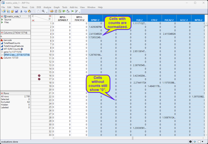
Normalizing the Data
| 8 | Select all of the data columns from the Columns list at the left of the table. Right-click in the ColumnName box of one of the selected columns and select Copy Columns. |
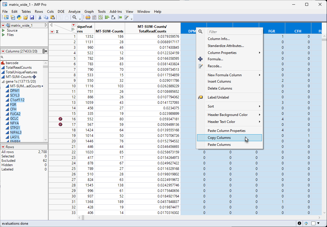
| 8 | Right-click after the last column and select Paste Columns, |
This will add new copies of the columns (with a "2" appended to end name of each columns) to the end of the table. This may take a few minutes, depending on the number of columns. The new columns will have the missing data symbol.
| 8 | Select all of the new columns and group them |
| 8 | Right-click in the ColumnName box of one of the selected new columns and select Standardize Attributes.... |
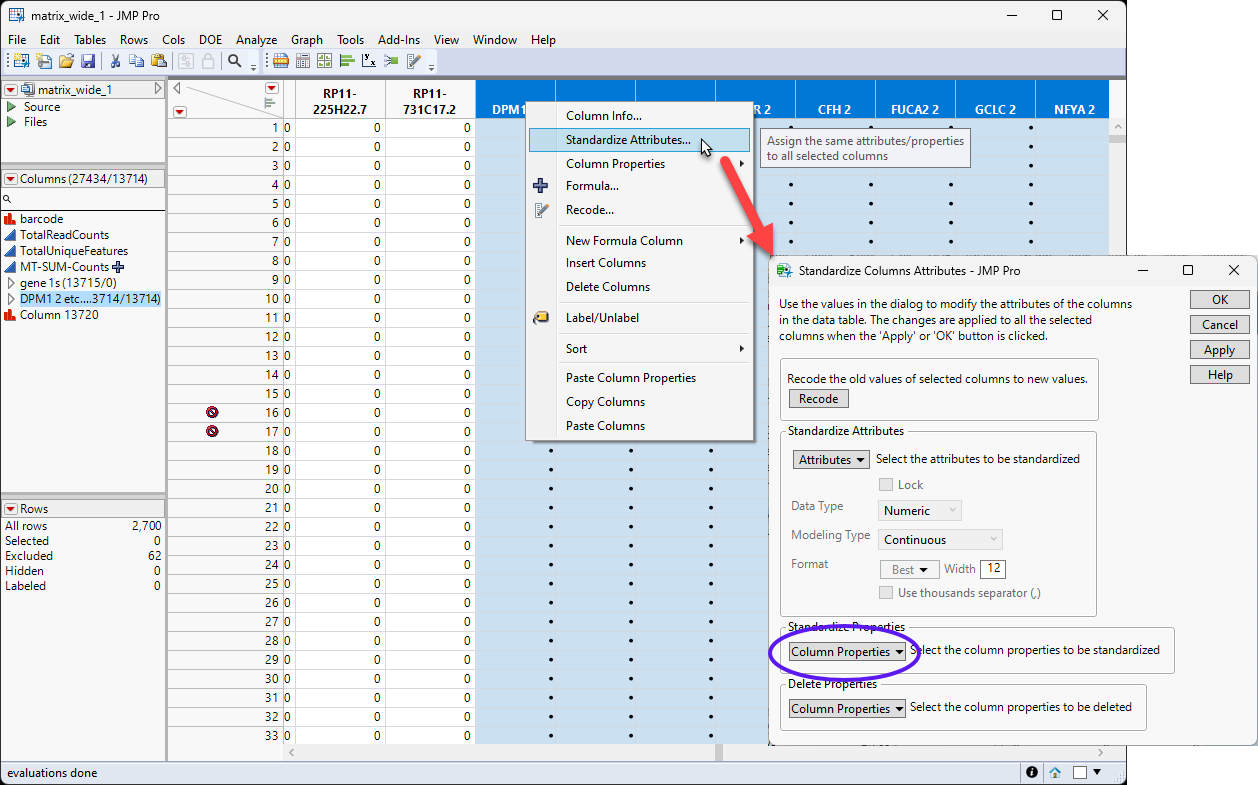
| 8 | Select Column Properties > Formula and then click . |
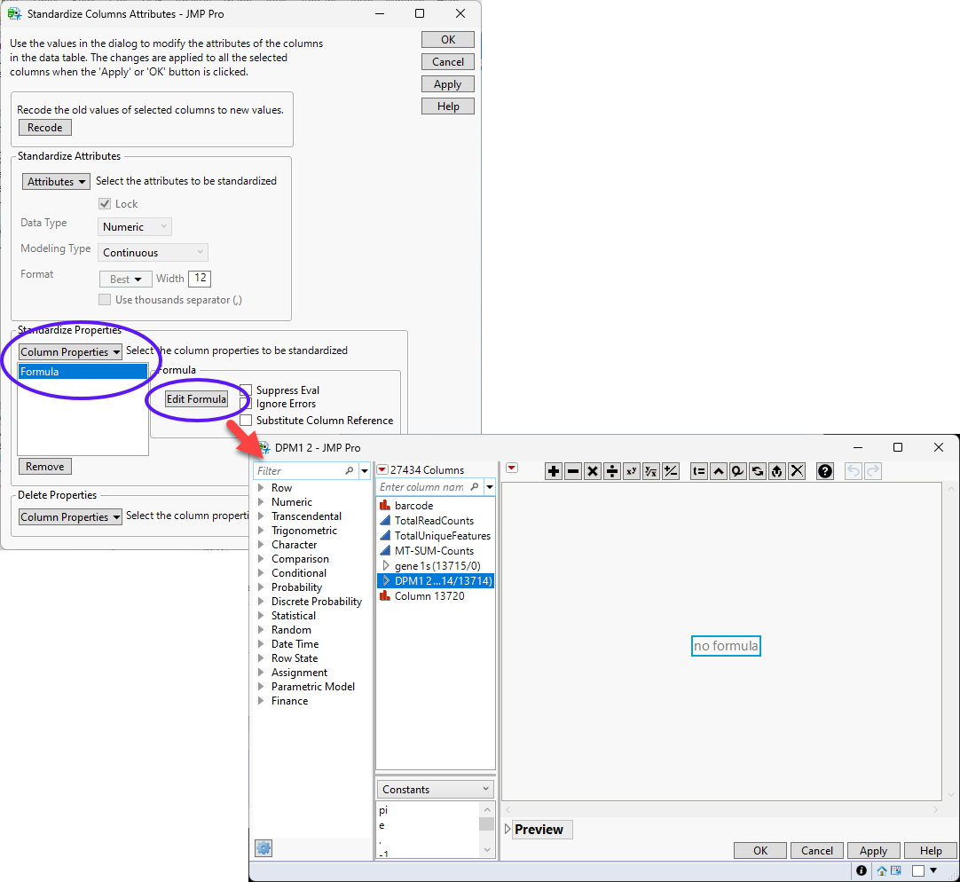
| 8 | Enter the desired formula in the formula editor and click . |
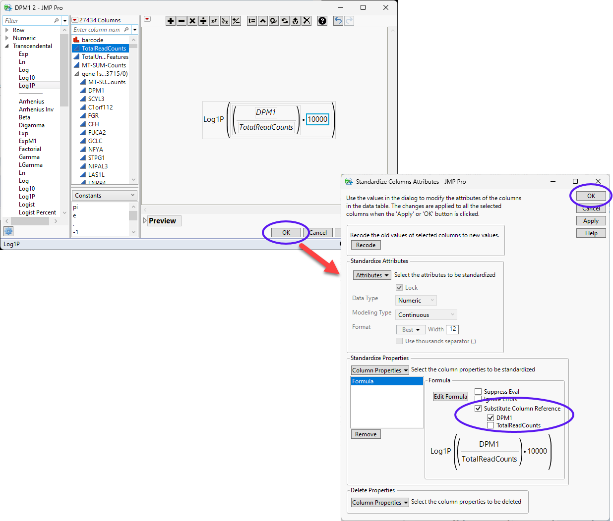
In this example, we log transform the counts.
| 8 | Check the Substitute Column Reference check box and make sure the DPM1 box is checked but the TotalReadCounts box is unchecked. |
| 8 | Click OK. |
The normalization may take several minutes, depending on the size of the data.
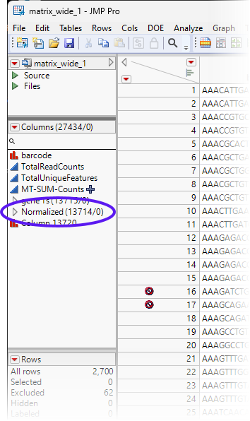
Note: The new, normalized columns have been grouped into a group called DPM1 2, etc....
| 8 | Change the name of the DPM1 2, etc.... group of normalized columns to Normalized. |
| 8 | Save the table. |
Filter Unwanted Genes
Depending on your research goals, you may find certain classes of genes to be uninteresting. These may include ribosomal gene, mitochondrial genes, heat shock protein genes, as well as others. Such genes can comprise a large percentage of the genes in your data and may unnecessarily complicate analysis of your genes of interest. It may be best to remove such genes before preceding with more complex analyses.
In this example, ribosomal, mitochondrial and heat shock protein genes are respectively identified by the RPS, RPL, MT- and HSP prefixes. This fact makes it easy to identify and filter out these classes of genes.
| 8 | Type RPS in the Column Search box. |
| 8 | Left-click on the Search symbol and check the Start With Phrase box. |
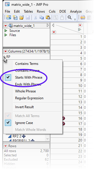
This displays all of the ribosomal small subunit genes.
| 8 | Scroll down to the Normalized column group. |
| 8 | Press the CTRL key and highlight all of the genes in the Normalized group.. Right-click and select Ungroup Columns to remove these columns from the Normalized group. |
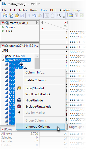
| 8 | Repeat for RPL, MT-, and HSP. |
All of the RPS, RPL, MT-, and HSP columns (genes) have been removed from the Normalized group. All of these unwanted genes can be grouped into an Unwanted group.
| 8 | Select all of the RPS, RPL, MT-, and HSP columns and group them into an Unwanted group. |
| 8 | Save the table. |
After data preparation, normalization and filtering, we are left with 13,579 genes of interest in the Normalized group. These will be used in all subsequent analyses.
Dimension Reduction
Principal Components
A classic technique used to examine the structure of expression data is principal component analysis (PCA). The purpose of principal component analysis is to derive a small number of independent linear combinations (principal components) of a set of measured variables that capture as much of the variability in the original variables as possible. Principal component analysis is a dimension-reduction technique, as well as an exploratory data analysis tool. Refer to Principal Components for more information.
For genomic data, which typically have a very large number of variables, the Principal Components platform provides an estimation method called the Wide method. The Wide method enables you to calculate principal components in short computing times.
| 8 | Make sure the Matrix_wide_1.jmp table is open and active. |
| 8 | Click Analyze > Multivariate Methods > Principal Components. |
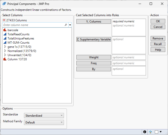
| 8 | Select the columns in the Normalized group as the Y, Columns. |
| 8 | Specify Wide Data as the Method Family. |
| 8 | Select Unscaled and Uncentered for Standardize. |
| 8 | Select Wide Data for Method Family. |
| 8 | Enter 50 as the Number of Components. |
| 8 | Select Fast Approximate for the Special Methods. This will run the Random SVD algorithm, and is much faster. |
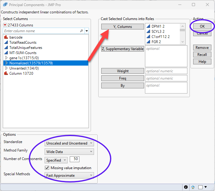
| 8 | Click to run. |
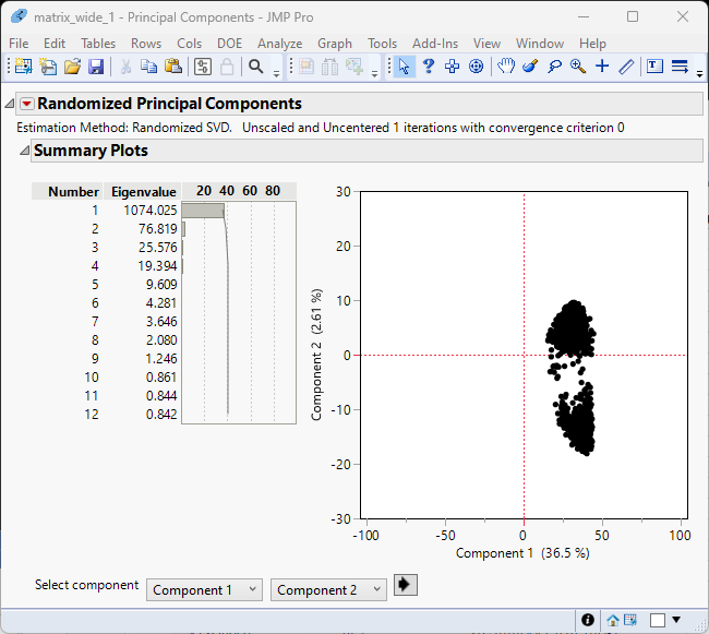
Examination of the summary plot (left) shows that the first two components account for 40% of the total variability. You can see from the principal components plot at right that the genes cluster into two fairly tight groups.
The principal component values will be useful later in the analysis.
| 8 | Click  and select Save Columns > Save Principal Component Values. and select Save Columns > Save Principal Component Values. |
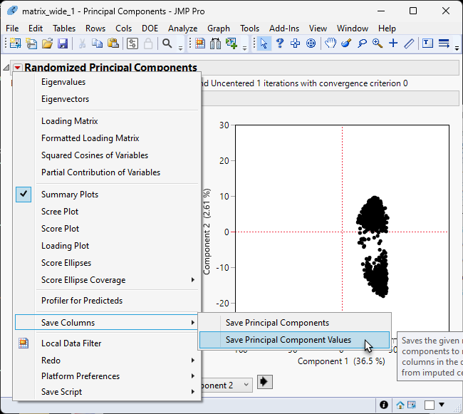
The Principal component values are saved in 50 (the number of principal components computed) new columns at the end of the data table.
| 8 | Save the table. |
Clustering
Another method that is traditionally used early in an expression analysis is to run a two-way hierarchical clustering of the expression data by the treatment to see whether any patterns in expression are evident. Refer to Hierarchical Clustering for more information.
| 8 | Click Analyze > Clustering > Hierarchical Cluster. |
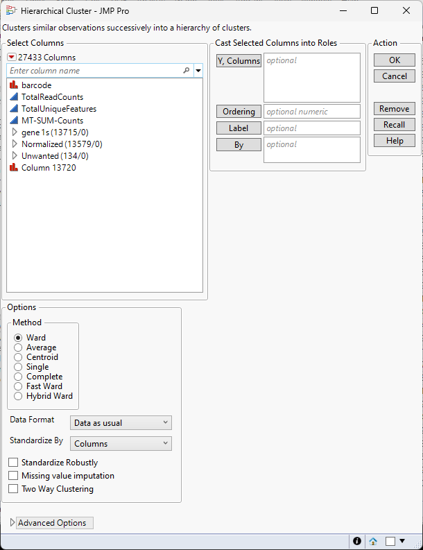
| 8 | Select the columns in the Normalized group as the Y, Columns. |
| 8 | Select Unstandardized using the Standardize by drop-down menu. |
| 8 | Check the Two Way Clustering check box |
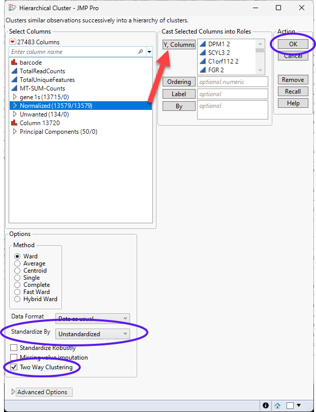
| 8 | Click to run. |
The clustering may take several minutes, depending on the size of the data.
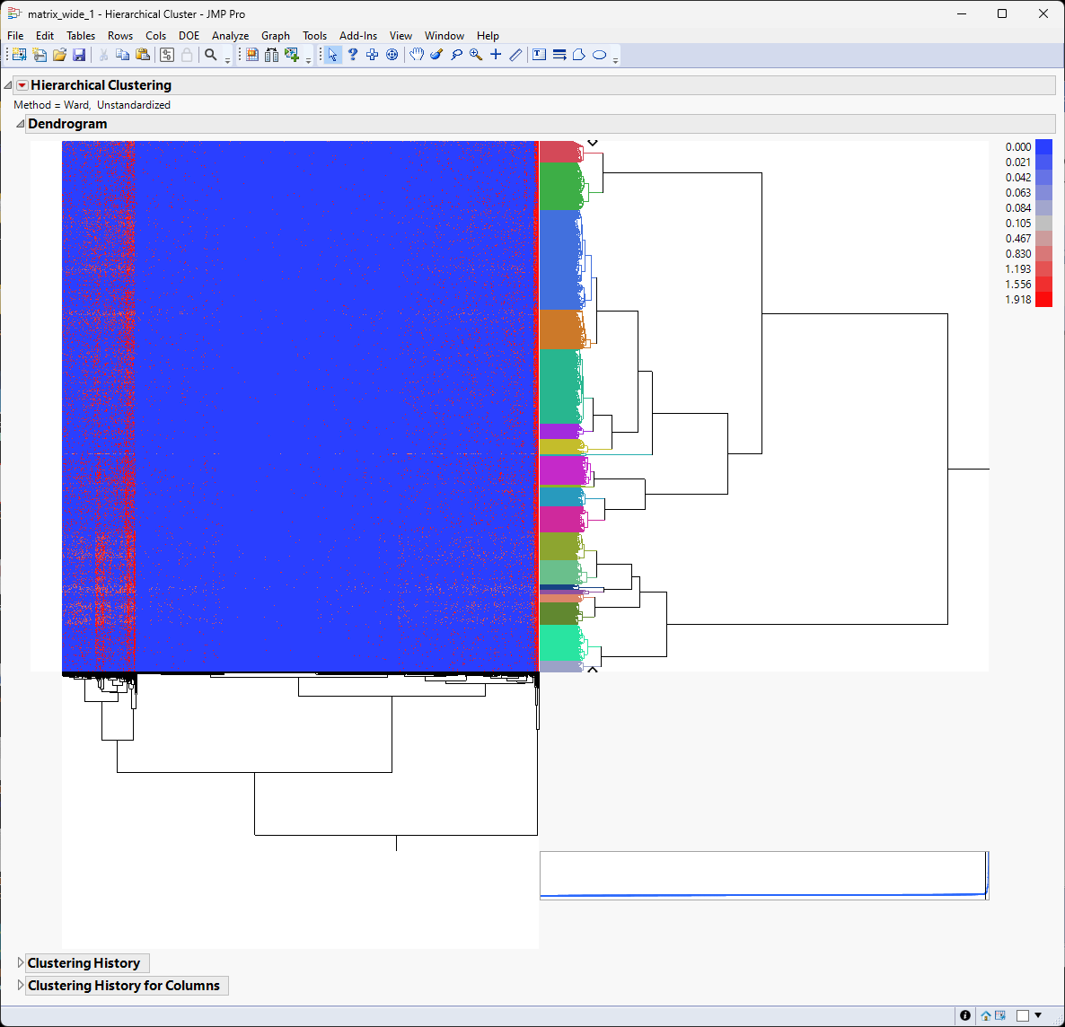
It appears that there are localized pattern differences in the plot suggesting that some clusters of genes are up-regulated while the vast majority of genes are expressed at lower levels. For example, examine the left side of the heat map. Genes illustrated in red show higher expression whereas genes illustrated in blue are down regulated.
To facilitate further analysis, it is useful to reduce the number of cluster from the default 20 to 10.
| 8 | Click and select Number of Clusters. |
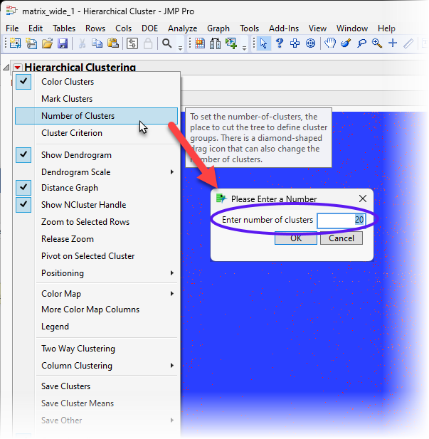
| 8 | Enter 10 for the number of clusters and click . |
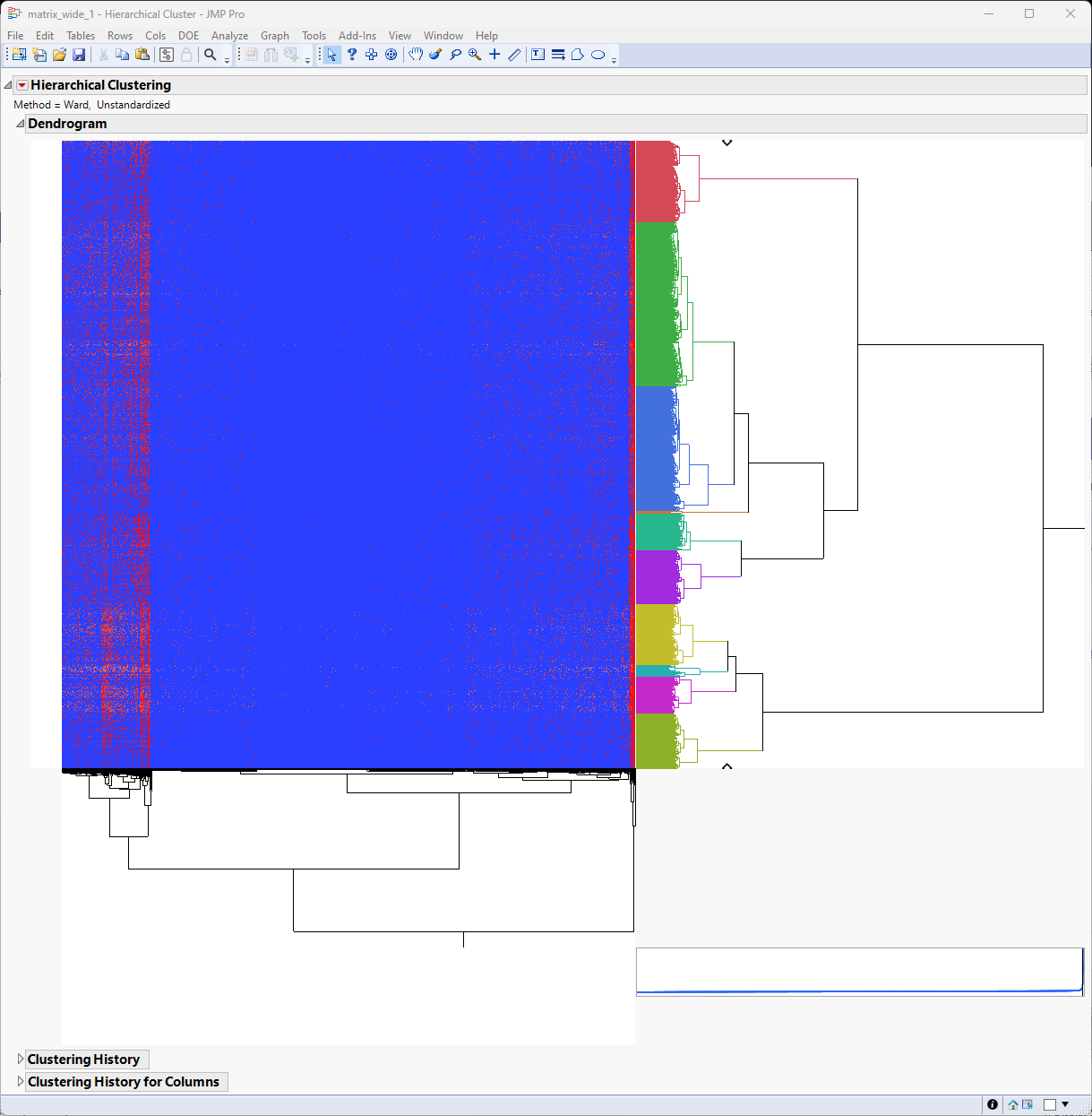
The most closely related clusters are successively merged until the total number equals 10. You see this most easily by comparing the color bar in this image with the one above. The dendrogram and heat map are unchanged, however.
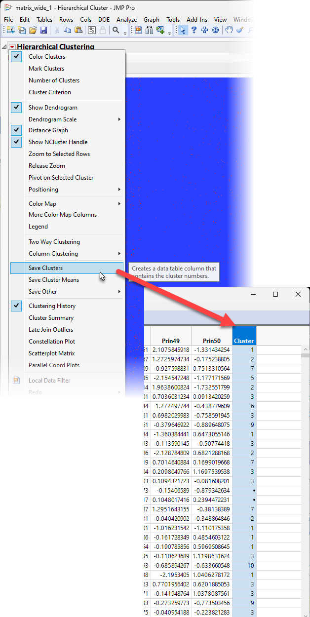
| 8 | Click and select Save Clusters to add a column to the end of the table identifying the cluster to which each sample belongs. |
Multivariate Embedding
The Multivariate Embedding platform enables you to map data from very high dimensional spaces to a low dimensional space. The Multivariate Embedding platform uses either the t-Distributed Stochastic Neighbor Embedding (t-SNE) or the Uniform Manifold Approximation and Projection (UMAP) methods. Refer to Multivariate Embedding for more information.
| 8 | Make sure the Matrix_wide_1.jmp table is open and active. |
| 8 | Click Analyze > Multivariate Methods > Multivariate Embedding. |
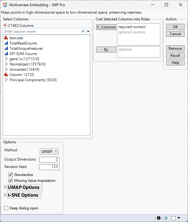
| 8 | Select the columns in the Principal Components group as the Y, Columns. |
| 8 | Leave all other settings set at the default settings. |
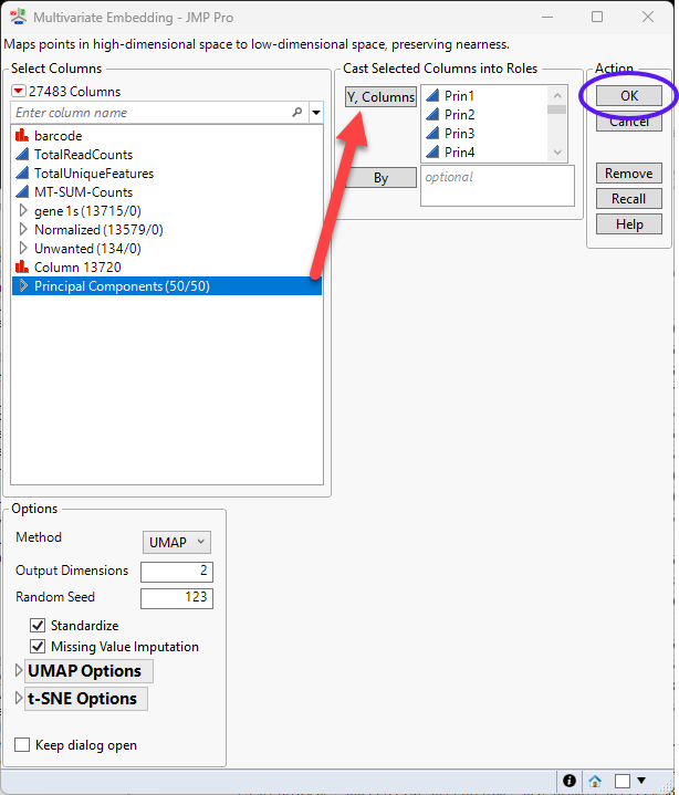
| 8 | Click to run. |
The clustering may take several minutes, depending on the size of the data.
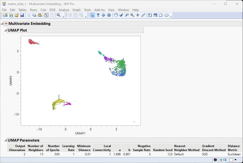
The colors of the clusters in the Hierarchical clustering above persist in the UMAP results seen here, enabling us to see how the clusters assort with each other. Users can adjust the clustering results per research interest, such as merging adjacent clusters or set different total number of clusters.
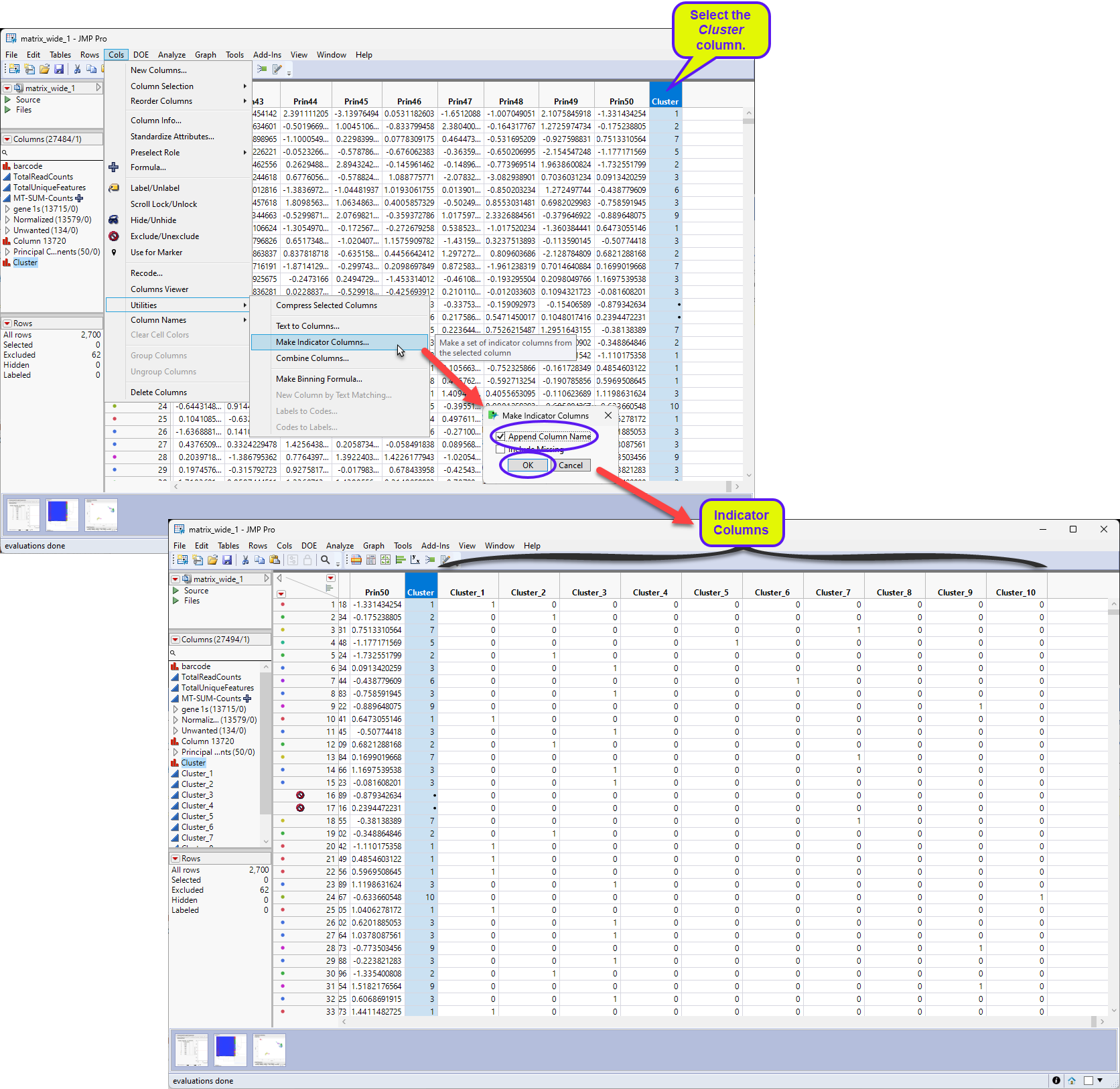
Identifying Differentially Expressed Genes
We will use the clustering results to explore the differentially expressed(DE) genes for each cluster in this example. The first step is to bin the cluster variable created above to generate binary predictors columns.
Select Cols > Utilities > Make Indicator Columns.
Check Append Column Names in the Make Indicator Columns window and click .
| 8 | Select Analyze > Screening > Response Screening. |
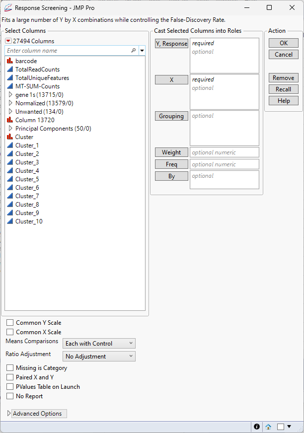
| 8 | Select the Cluster predictor columns (Cluster_1, Cluster_2, ..., Cluster_10) as the Y, Columns. |
| 8 | Select the columns in the Normalized group as the X. |
| 8 | Check both the Common Y Scale and Common X Scale check boxes. |
| 8 | Leave all other settings set at the default settings. |
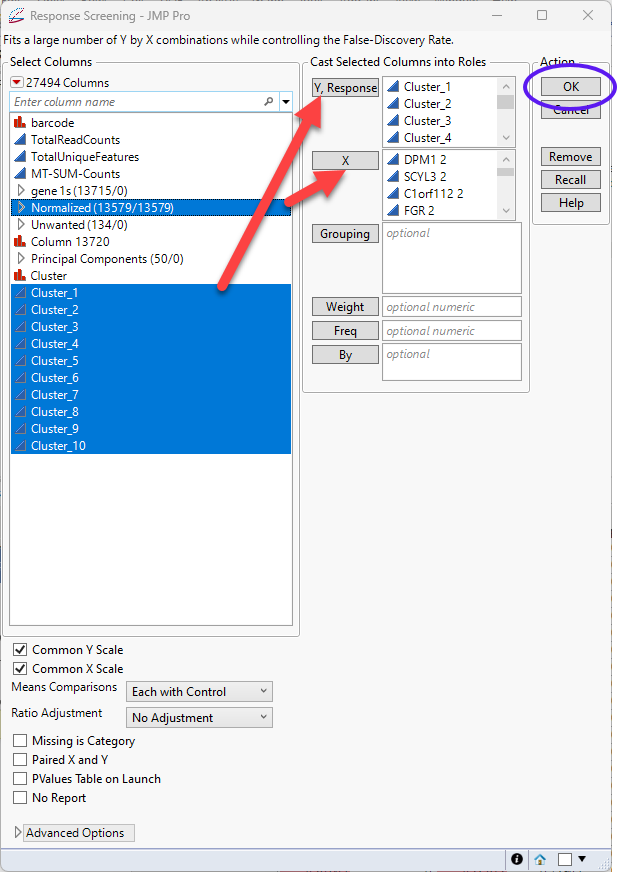
| 8 | Click |
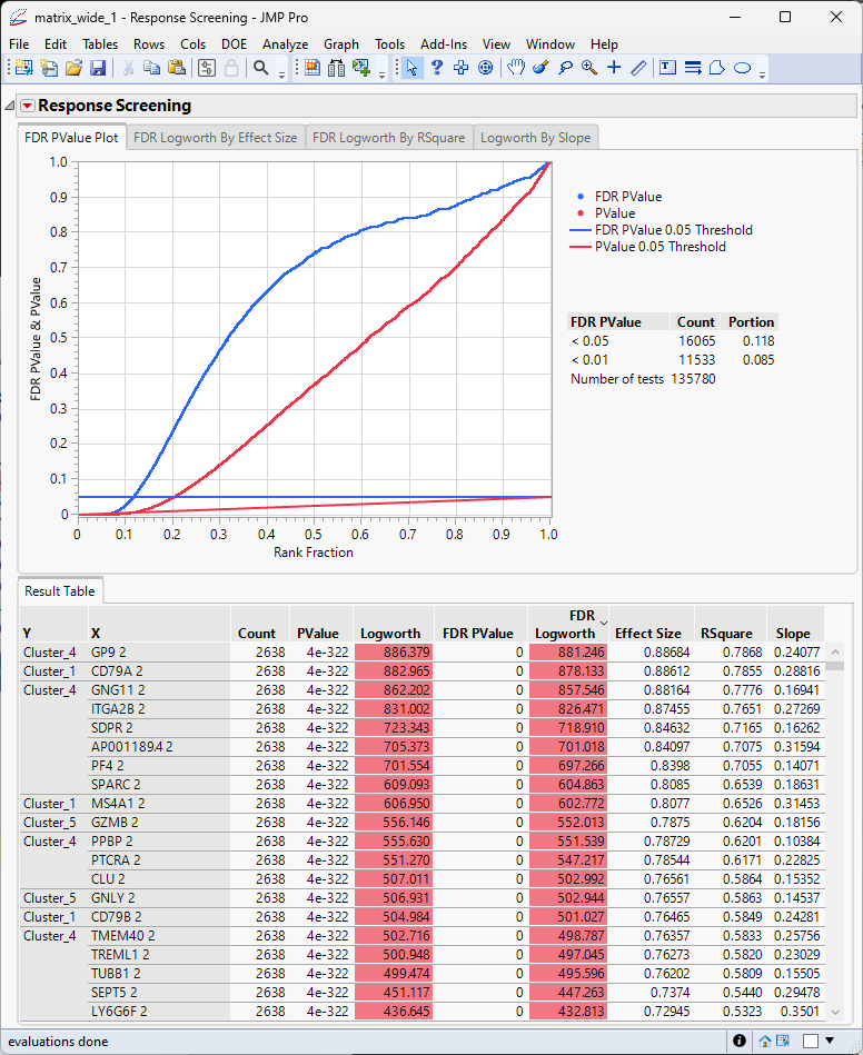
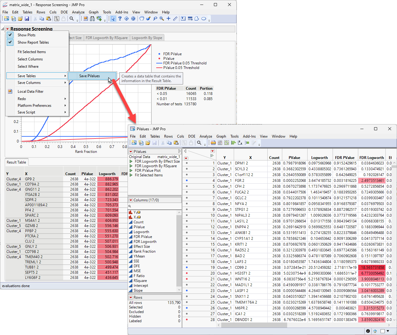
The results table generated here contains data needed in the next step and must be saved as a separate table.
| 8 | Click and select Save Tables > Save Pvalues to save out the Results Table as a separate Pvalues JMP table. |
The next step is to sort the table by the effect size and the Y values.
| 8 | Right-click on the Effect Size column header and select Sort > Descending |
| 8 | Right Click on the Y column header and select Sort > Ascending. |
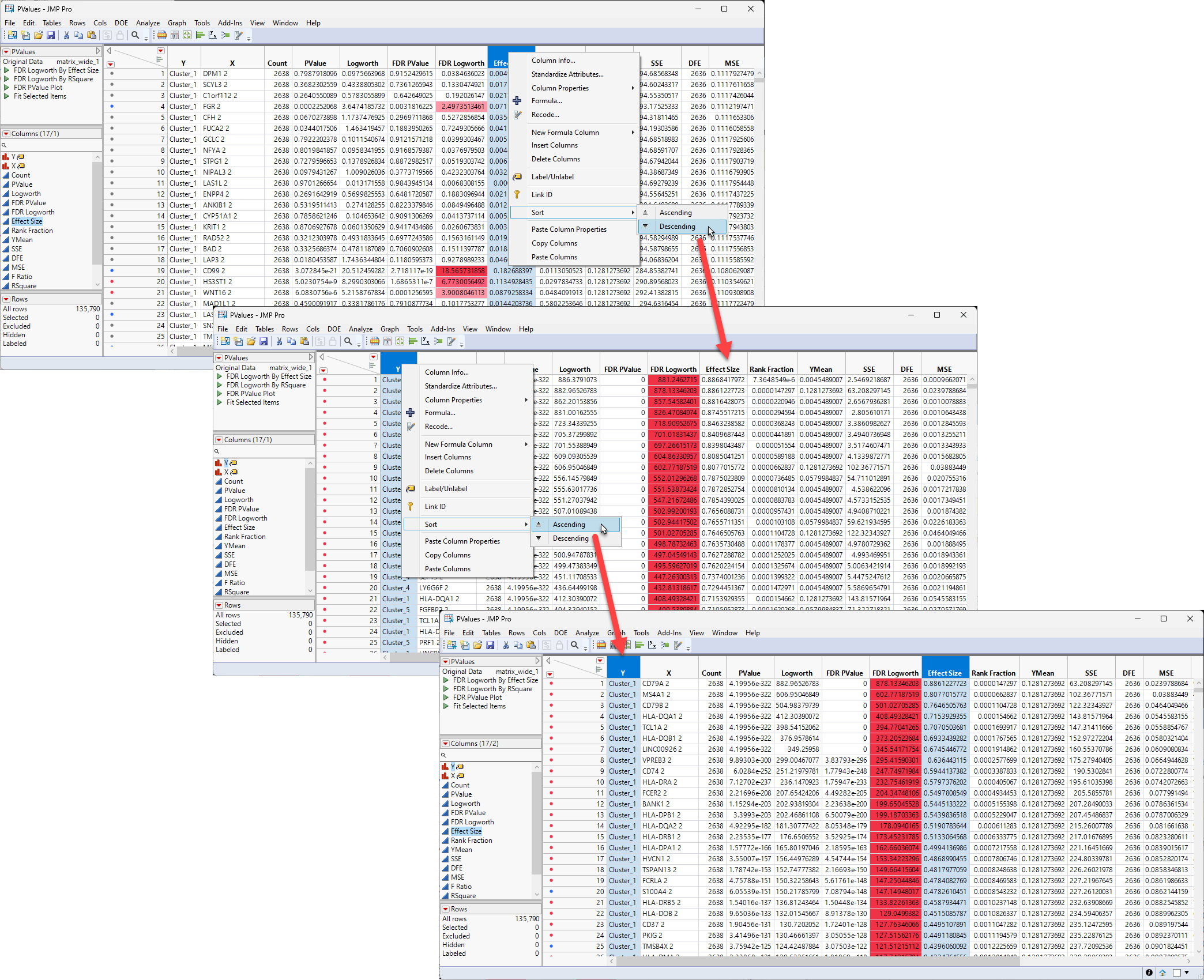
The first sorting sorts all of the rows by effect size from largest to smallest, regardless of cluster identity. The second sorting regroups the rows into clusters but with the order within each cluster now being from largest effect size to smallest.
At this point you can opt to just choose to take the top 10 genes from each cluster, subset them to a new table and proceed with your analysis. However, it is often advisable to visually inspect the genes and their expression.
Graphing Your Results
The sorting we just did makes it relatively easy to subset the genes we might be most interested in, such as the genes in each cluster with the largest effect size, for example. Let's look at one example.
| 8 | Make sure the sorted PValue.jmp table is open and active. |
| 8 | Click Graph > Graph Builder to open the Graph Builder window. |
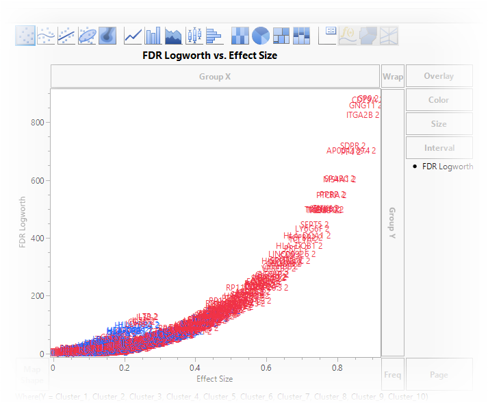
| 8 | Drag the FDR Logworth column to the Y axis. |
| 8 | Drag the Effect Size column to the X axis. |
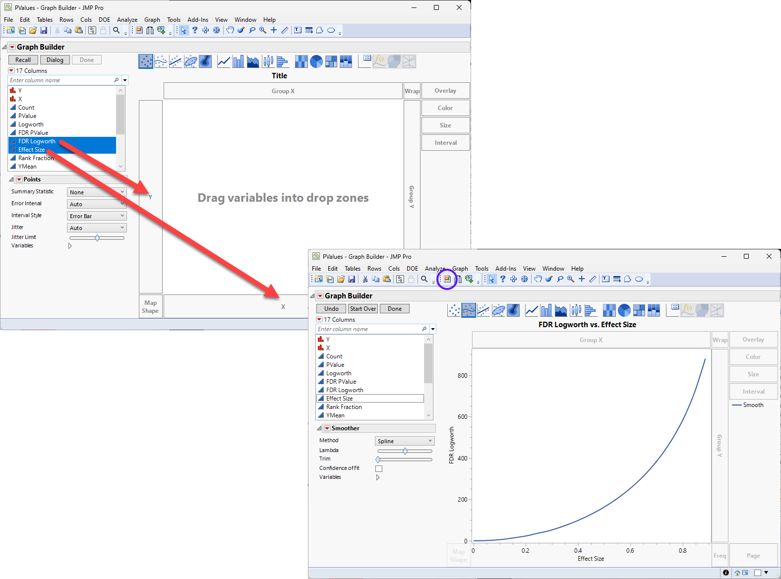
On this graph, higher and further to the right equals higher expression that is more likely to be significant.
The next step is to show the points instead of the curve.
| 8 | Right-click anywhere in the graph and select Add > Points. |
| 8 | Right-click anywhere in the graph and select Smoother > Remove. |
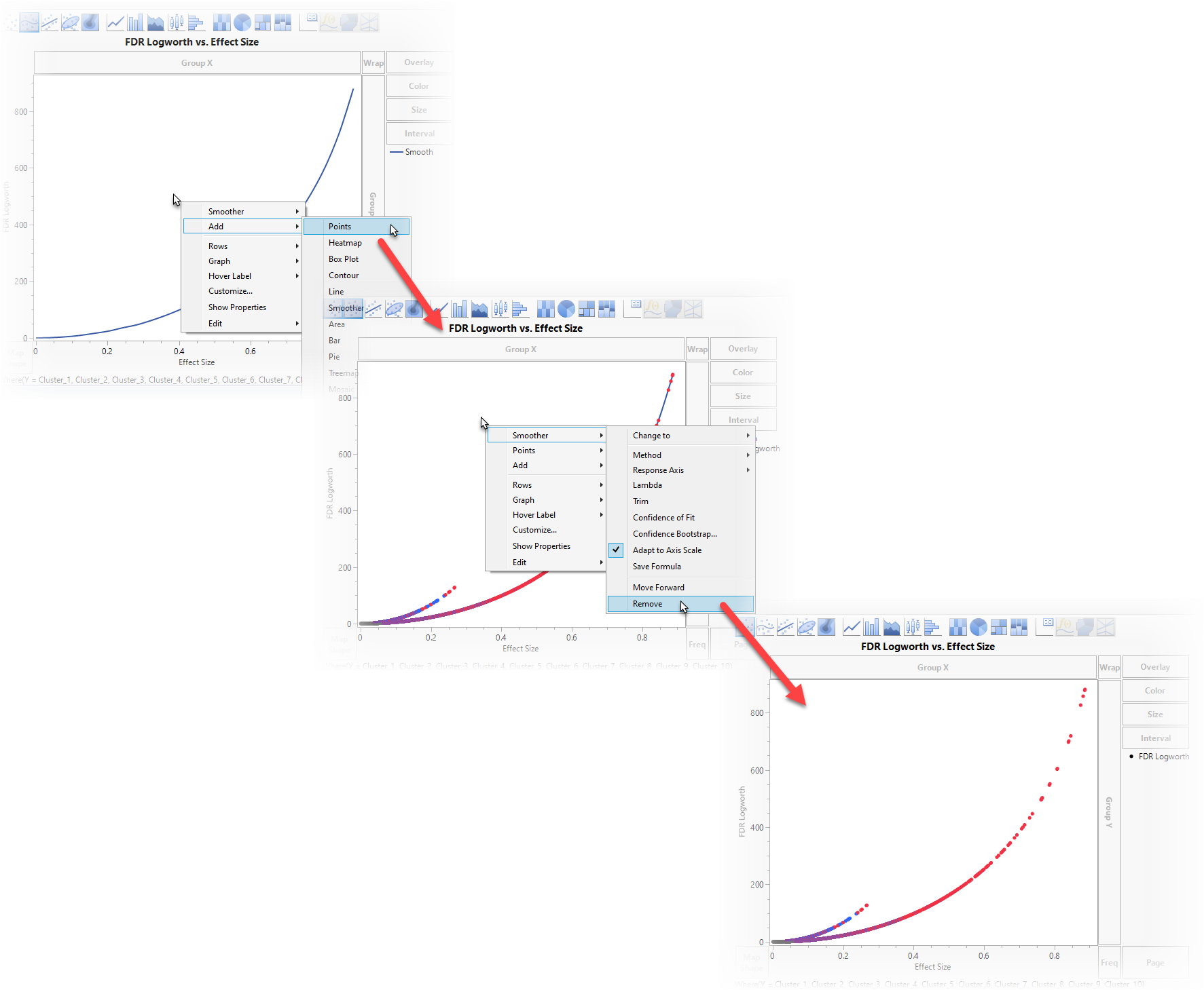
We can now see all of the points from all of the clusters. Unfortunately, as it stands now, the graph is not very useful. We don’t know where the genes are along the graph nor what cluster they fall into.
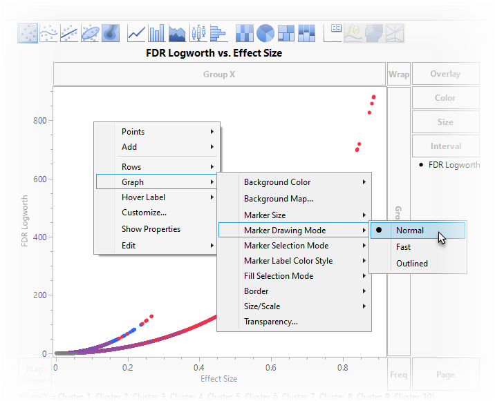
The next step is to replace the points on the graph with the names of the genes.
| 8 | Right-click anywhere in the graph and select Graph > Marker Darwing Mode > Normal. You may notice that the points appear larger. |
| 8 | Right-click anywhere in the graph and select Customize... to open the Customize Graph window. |
| 8 | Click to open the Column for Marker Shape window. |
| 8 | Select X and click . |
| 8 | Click on the Customize Graph window. |
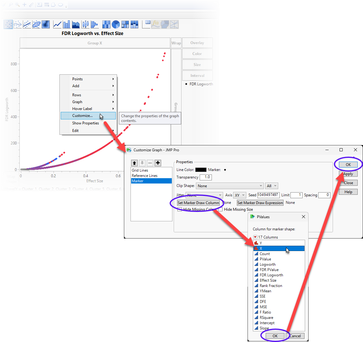
This replaces the marker points with the names of the genes listed in the X column of the table.
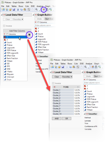
This view is helpful but the final modification needed is to enable us to look at each of the 10 clusters individually.
| 8 | Click on the Local Data Filter (circled above) to add the Local Data Filter to the graph. Select the Y column and click  to add the Y column as a filter. to add the Y column as a filter. |
By clicking on “Cluster_1” through “Cluster_10”, we can see the important genes for each cluster.
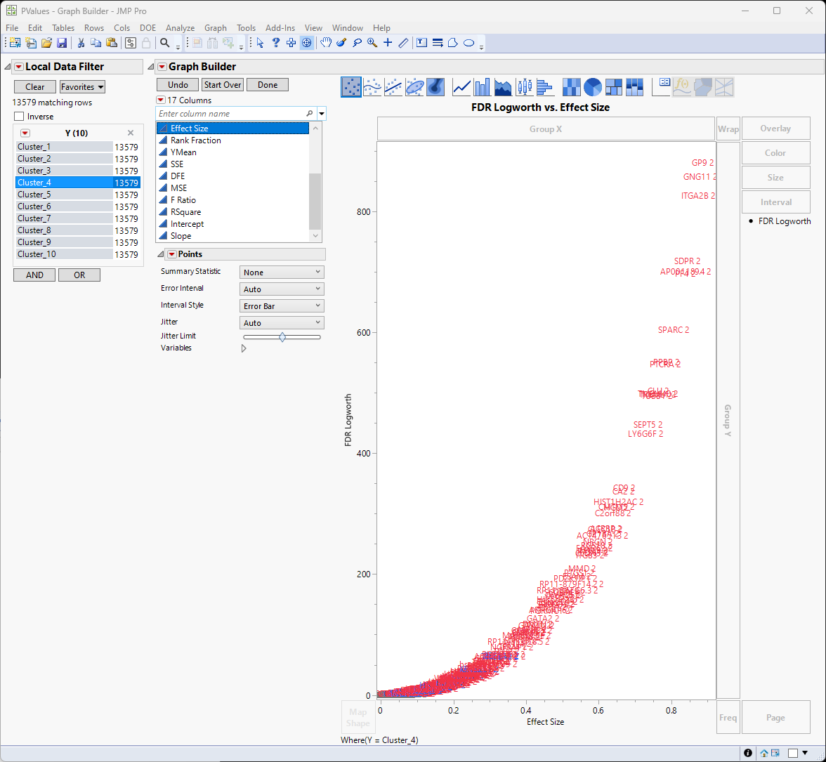
From here, we can identify the genes with the greatest effect sizes from each cluster, subset the most interesting from each cluster to focus on in greater depth. For example, are these genes associated with a specific cell type.
Use your mouse to select a group of genes.
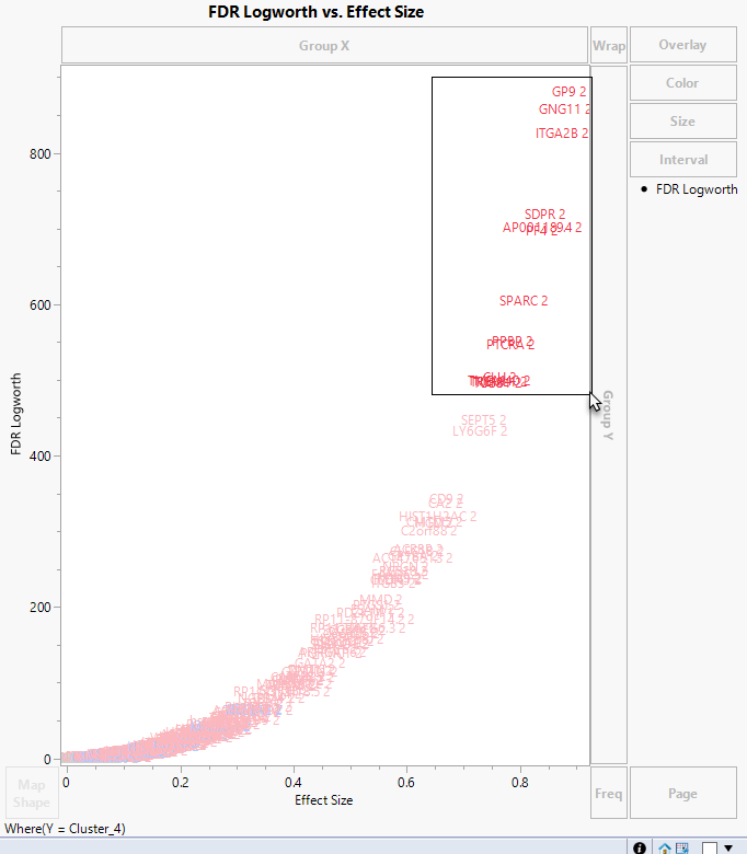
Because, in JMP, graphs and tables are tied together, selecting these genes in the graph also selects them in the table.
| 8 | Scroll down the PValues table until you come to the selected rows. |
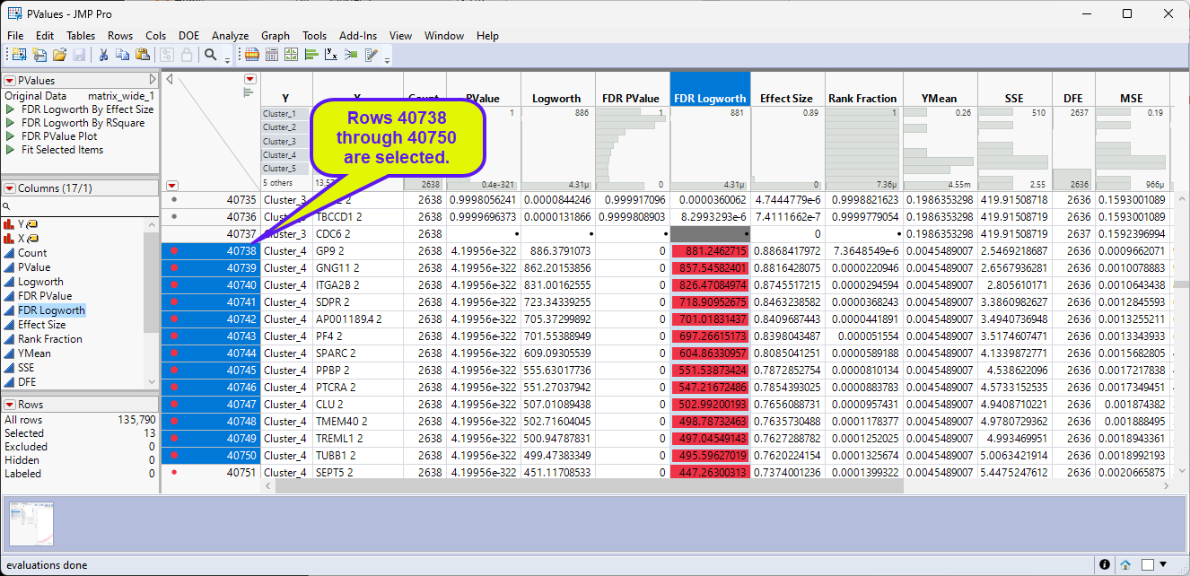
| 8 | Select Tables > Subset to open the Subset window. |
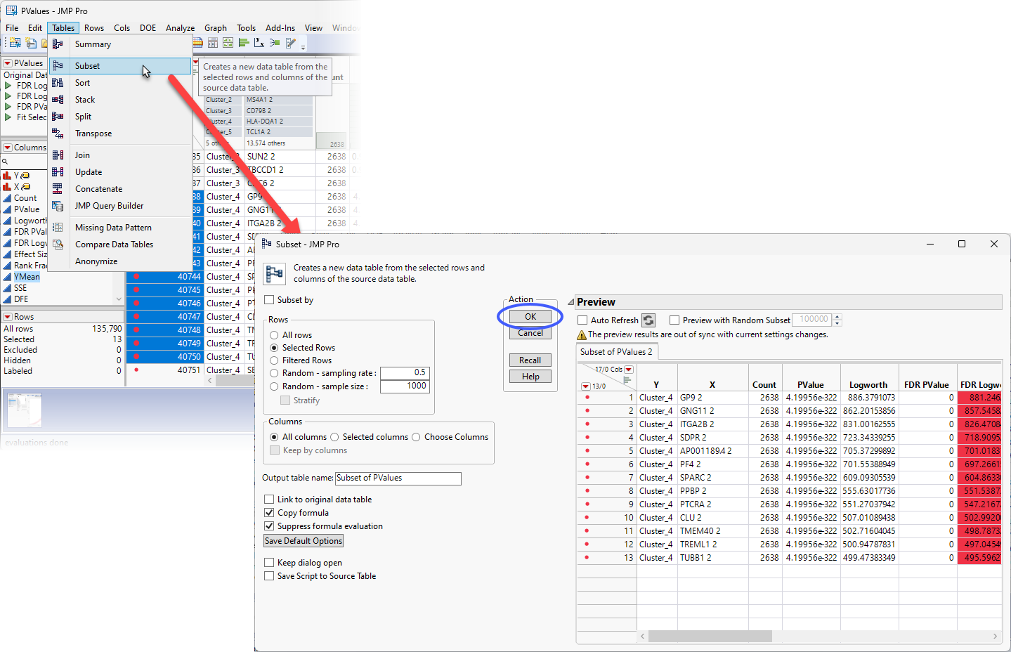
Note that the 13 selected rows are displayed in the Preview pane.
| 8 | Click to generate the subset table. |
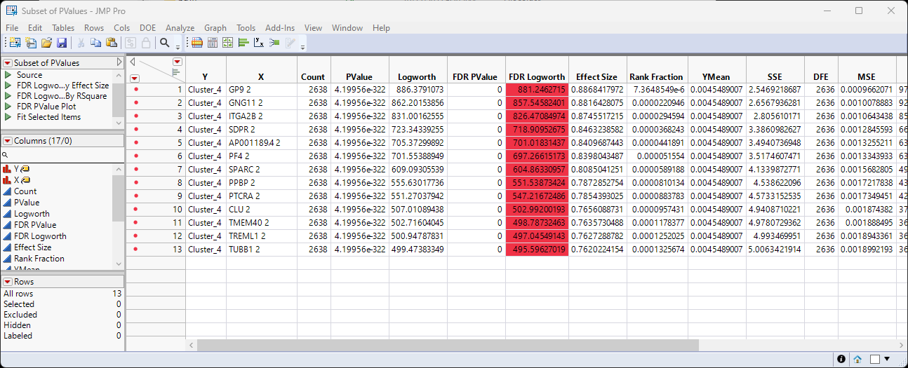
Now you have the genes of interest from Cluster 4 in a small easily manipulable table. You can repeat these steps for each of the clusters as desired. In the meantime, let's continue with the analysis of Cluster 4. Can we identify the cell type(s) in which these genes are active?
| 8 | Right-click on the X column header and select Copy Columns. |
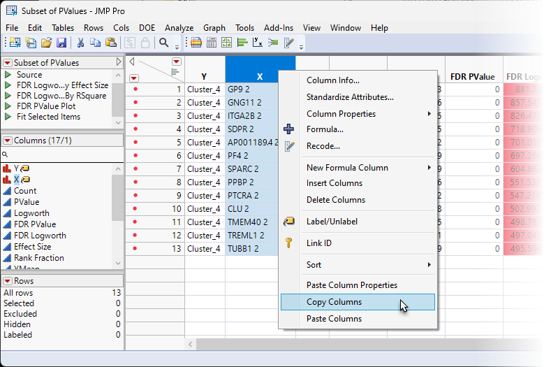
| 8 | Open a browser and navigate to one of the on-line AI utilities, such as ChatGPT and post the following query: Is there a cell type that expresses the following genes? and then paste the contents of the X column. |
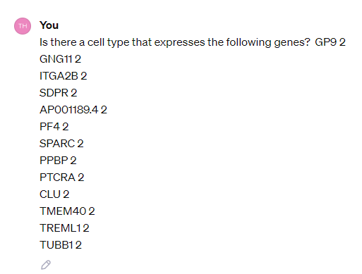
| 8 | Click <Return>. |
According to the ChatGPT search, all of the genes are involved in platelet structure and function. You can use JMP's column recode function to label the rows of the subset table.
| 8 | Right-click on the Y column header and select Recode to open the Recode window. |
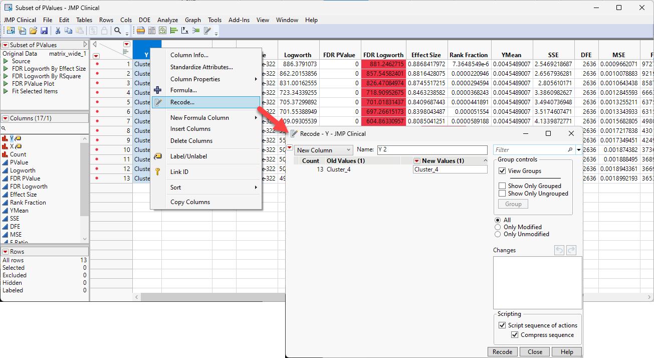
| 8 | Replace the value in the New Values box with Platelets and click . |
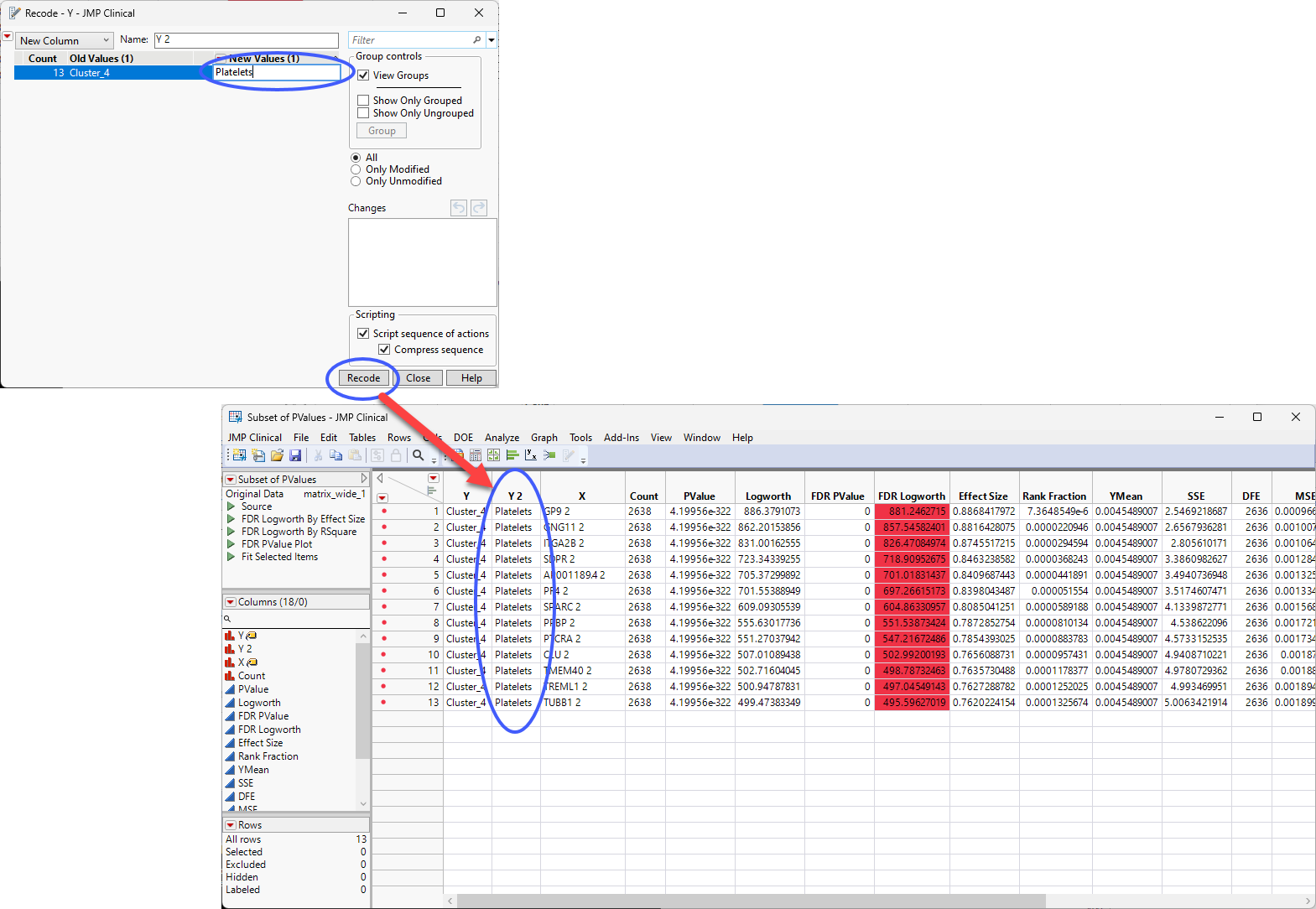
You can rename the new column (Cell Type, for example) and from here, you can explore the other clusters for cell type specificity, combine the table with other annotation information, continue the further investigation of your experimental results.