Adverse Events Time to Event
Adverse Events Time to Event generates analyses for studies with one or more treatment arms and computes treatment differences between all treatments for studies with two or more treatment arms.
Most analyses of adverse events (AEs) compare the proportion of patients experiencing an AE across treatments. This analysis is limited in that it does not consider the time at which an event occurs. For example, two treatments could have the same number of patients experiencing events, but the patients on one treatment could experience their events much earlier than the other treatment. Experiencing an event early implies that there is ample opportunity to experience the event additional times over the course of follow up.
This analysis does not consider each and every AE experienced by the patient (see the Adverse Events Recurrence for this type of analysis), only the first experienced. For each type of AE, the analysis computes the time until the first event for patients experiencing the event. Patients who do not experience the event are censored at their last available follow-up.
Methodology
When using CDISC standards, the AE or ADAE data sets summarize the events that were experienced by patients in the study, but more information is needed. In order to conduct a time to event analysis, dates representing the start and end of an appropriate follow-up period need to be defined for all patients, not just those who experience a particular AE. Further, the derivation of the appropriate follow-up dates will depend on the types of AEs of interest for analysis (see below).
Figure 1: Display of start and end dates for different types of adverse events.
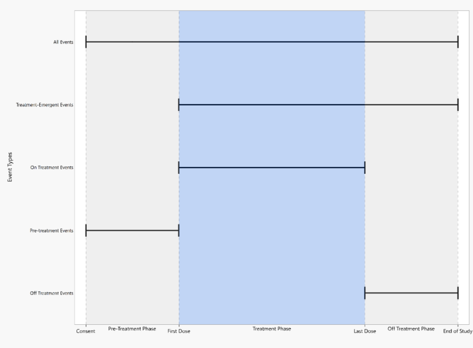
The figure above displays start and end dates appropriate for different types of events. Dates used to define follow up period are described below, and they are considered in the order of presentation.
Note: Visit End Date is equivalent to Visit Start Date if it is not available.
All Events include any AEs that may occur on study once informed consent is signed until the patient ends study participation.
| • | Start date: Consent Date or Enrollment Date or Earliest Visit Start Date |
| • | End date: End of Participation or End of Study or Maximum of (Latest Visit End Date, Latest date for Disposition Events from the DS domain) |
Treatment Emergent Events include any AEs that may occur on or after the first dose of study therapy determined by the treatment arm.
| • | Start date: First Treatment Date |
| • | End date: End of Participation or End of Study or Maximum of (Latest Visit End Date, Latest date for Disposition Events from the DS domain) |
On Treatment Events include any AEs that may occur on or after the first dose of study therapy and before or at the last dose of study therapy.
| • | Start date: First Treatment Date |
| • | End date: Last Treatment Date |
Pre-Treatment Events include any AEs that may occur prior to the first dose of study therapy.
| • | Start date: Consent Date or Enrollment Date or Earliest Visit Start Date |
| • | End date: First Treatment Date |
Off Treatment Events include any AEs that may occur after the last dose of study therapy.
| • | Start date: Last Treatment Date |
| • | End date: End of Participation or End of Study or Maximum of (Latest Visit End Date, Latest date for Disposition Events from the DS domain) |
For Screen Failures, the following changes apply:
All Events
| • | No changes |
Pre-Treatment Events
| • | Any events are considered to have occurred before treatment since treatment was never received |
| • | End date: End of Participation or End of Study or Maximum of (Latest Visit End Date, Latest date for Disposition Events from the DS domain) |
Excluded from Treatment Emergent, On treatment, and Off Treatment events since no treatment was received.
Note: This report is not valid for crossover studies due to the limitations of the statistical methods in computing treatment differences (which assumes treatment arms are independent).
Refer to the JMP Survival Analysis platform documentation for information on the methods used in this report.
Note: Records marked as not occurring (xxOCCUR = N) are excluded from this analysis.
Usage and Interpretation
The Adverse Events Distribution report was run with Nicardipine sample data set to demonstrate usage and interpretation of results.
Example 1:
In this example, report options were set as shown in the following table:
| Option Type | Option | Setting | |
|---|---|---|---|
| Data | Event Type | Treatment emergent events | 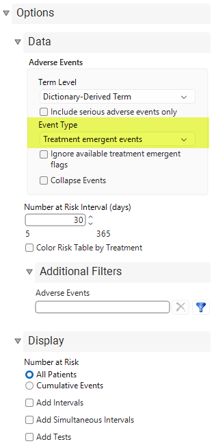
|
| All other options set to default. | |||
Output from the report is organized into sections. Each section contains one or more plots, data panels, data filters, or other elements that facilitate your analysis.For studies with two or more treatment arms, differences between the treatment arms are compared at the minimum of the maximum follow-up times for the treatments. Here, the minimum follow-up time is 125 days.
Figure 2: Double-Dot Plot
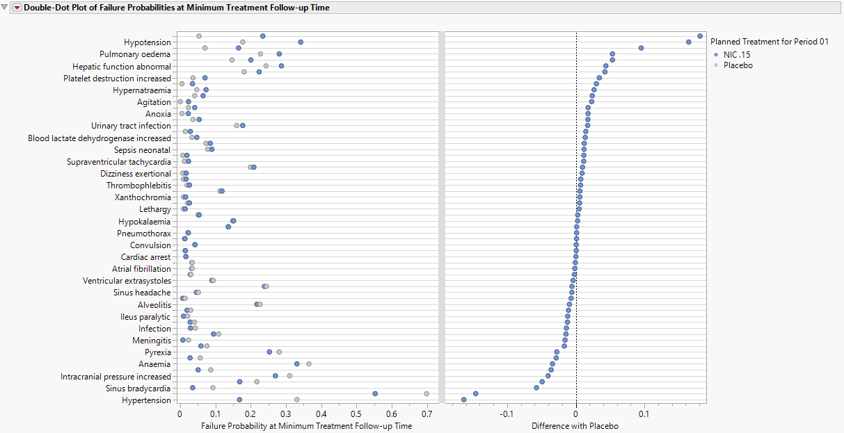
The plot shown in Figure 2 (click image to enlarge) is a modification to the more common dot-forest plot that is provided in other reports, as confidence intervals between the difference in probabilities estimated from two Kaplan-Meier curves are generally not available. The left panel presents the probability of a patient experiencing an event at the end of the study (here, 125 days). The right panel presents the difference in probabilities between the two treatments (here, Nicardipine minus Placebo, though this can be modified using the Treatment Differences are With selector). The y-axis is sorted so that events with greatest risk for Nicardipine are at the top of the figure while those with greatest risk on placebo are on the bottom. This highlights events that may be of interest to examine further. Note that for a single arm study, a dot-forest is provided with 95% confidence intervals provided around the individual estimate of event probability.
The limitation of the dot-forest plot, however, is that it only communicates the risk between treatments at a single point in time. For two or more treatments, an alternative to screen events across the entirety of follow-up, the max difference plot, shown below, can be utilized.
The data filter has variables to subset the dot-forest plot by the overall event total, the maximum by treatment event total, or the Failure, though other variables may be added.
Figure 3: Max Difference Plot
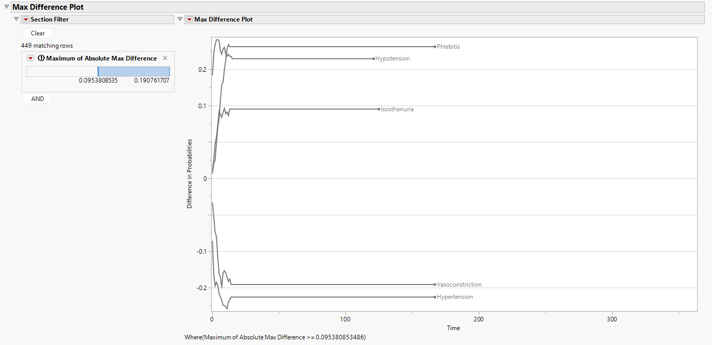
This plot above (click image to enlarge) computes the difference in Kaplan-Meier curves across the duration of follow up. When more than 2 treatments are available, the difference between the maximum probability and the minimum probability are summarized. For two treatments, the direction of the treatment differences are considered to show which of the two treatments has greater risk. For example, the above figure shows greater risk for Nicardipine for phlebitis, hypotension, and isosthenuria, while placebo shows elevated risk for vasoconstriction and hypertension. Note that this plot is filtered to those events that have been limited to those with at least a difference of 9.17% observed at least once along follow up.
The remaining plots are specific to an individual AE which can be selected by the Data Filter. By default, the event at the top of the double-dot plot is selected (here, phlebitis). Event plots are presented below (click image to enlarge).
Figure 4: Event Plots
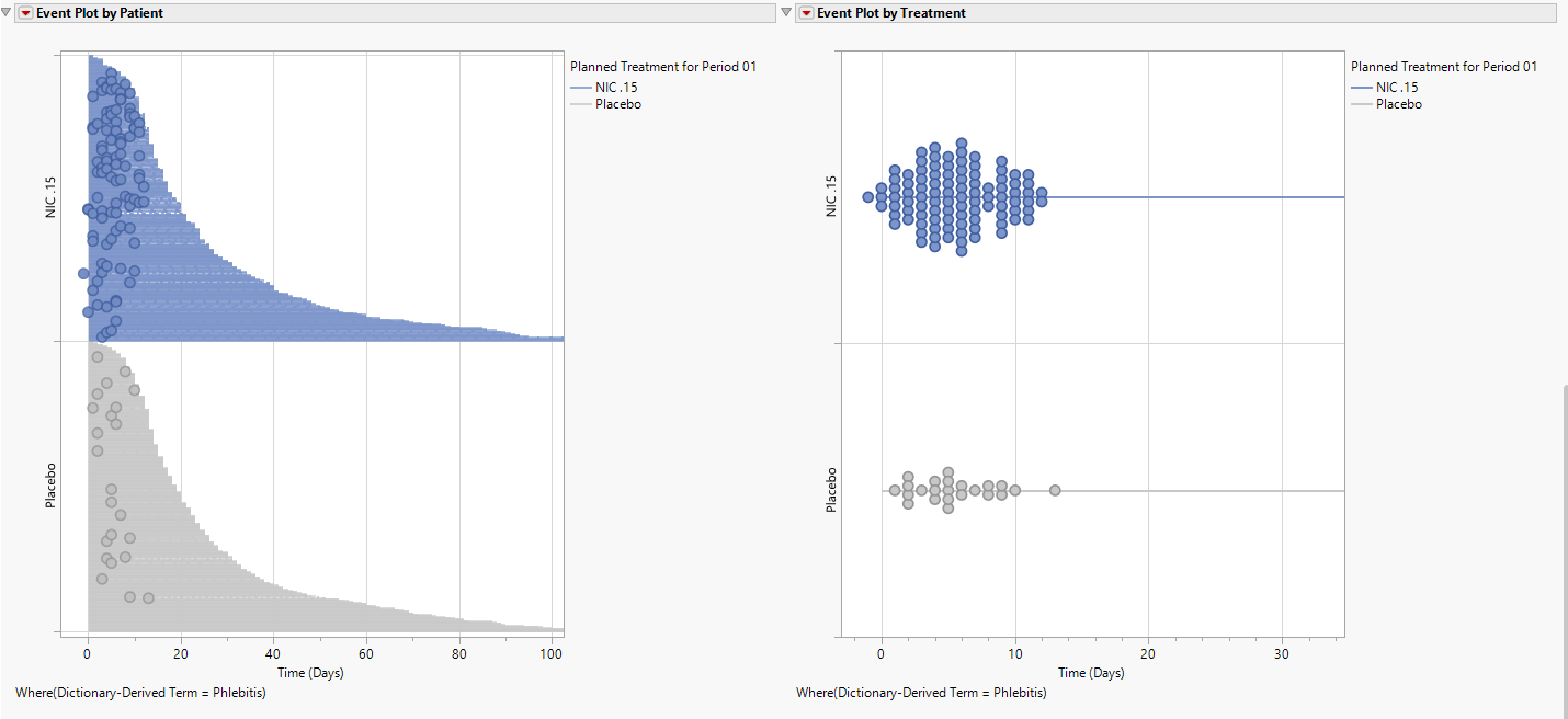
The plot on the left is a patient-level event plot which summarizes the follow-up for each patient with the first event highlighted on the plot. If multiple events were experienced on that same date, this would be denoted by differing bubble size. Though difficult to see for all patients, once a patient experiences an event, the bar becomes dashed making it easier to distinguish follow up events that occur after the first event. This helps the user determine whether particular events lead to patient discontinuation after the first event. The right plot is a treatment-level event plot where all events are presented along a line which represents the maximum follow up experienced on the treatment arm. As visible from either plot, patients experience their first phlebitis event within 15 days, and the nicardipine arm had far more patients experience events.
Figure 5: Time to Adverse Event
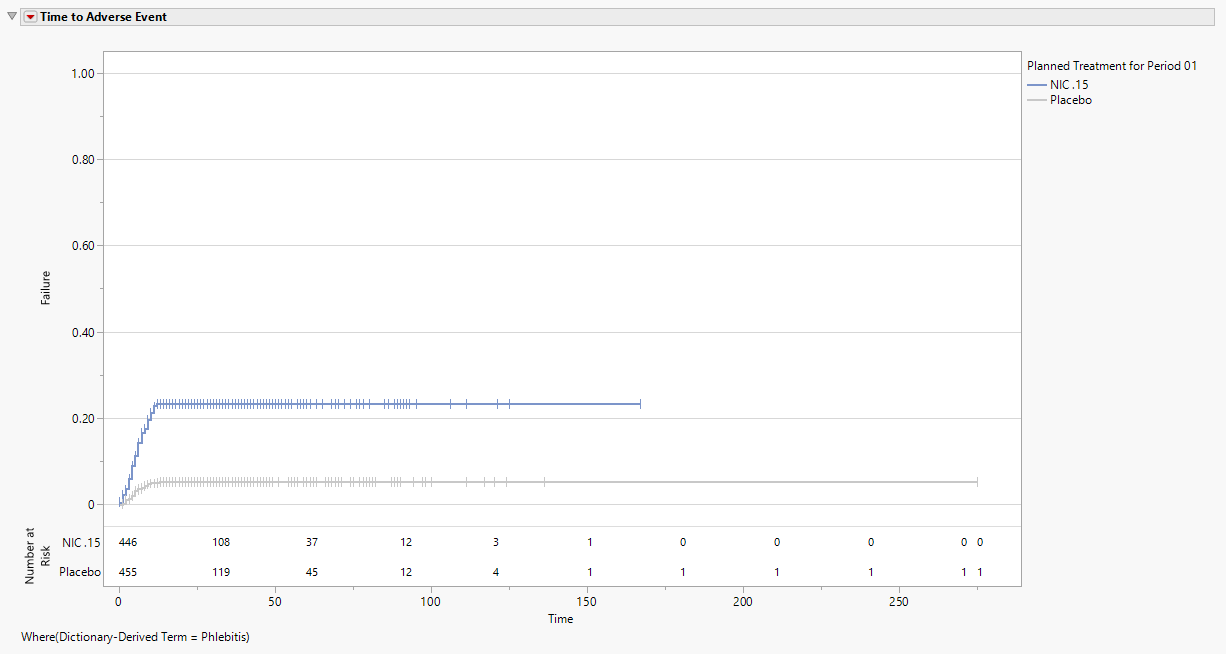
This plot (click image to enlarge) is a failure-type Kaplan-Meier plot, which starts at 0 (no one has the event) with increasing probability to communicate the cumulative proportion of patients who have experienced a phlebitis event. Based on the tests and narrow confidence intervals, one can conclude there is a difference in phlebitis events between the two treatments.
The Number at Risk table, displayed at the bottom of the figure when All Patients is selected using the Number at Risk display option, communicates the number of patients who have yet to have an event or be censored. When Cumulative Events is selected using the Number at Risk display option, the total number of patients with events up to and including a particular time are presented in the risk table, which has now been renamed Cumulative Events. Numbers are presented every 30 days and at the last day of follow up.
Options
Data
Term Level
 View/Hide Details.
Use this option to specify which level of terms to use as categories.
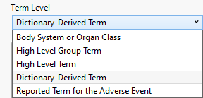
Possible term levels are report-specific and are listed in the following table:
|
Term Level |
Corresponding Variable |
Function |
||||||
|
Preferred Term (PT) |
AEDECOD in AE |
|
||||||
|
Verbatim Term (VT) |
AETERM in AE |
|
||||||
|
Body System |
AEBODSYS in AE |
|
||||||
|
High(er) Level Term (HLT) |
AEHLT in AE |
|
||||||
|
High(er) Level Group Term (HLGT) |
AEHLGT in AE |
|
||||||
|
Standard MedDRA Query |
|
|
||||||
|
Primary System Organ Class (SOC) |
AESOC in AE |
|
||||||
|
Lowest Level Term (LLT) |
AELLT in AE |
|
||||||
|
Body System or Organ Class |
AEBODSYS in AE |
|
||||||
|
Dictionary-Derived Term |
AEDECOD in AE |
|
||||||
|
Reported Term for the Adverse Event |
AETERM in AE |
|
||||||
|
Reported Name |
either CMTRT (for Concomitant Medications) or SUTRT (for Substance Use) |
|
||||||
|
Standardized Name |
either CMDECOD (for Concomitant Medications) or SUDECOD (for Substance Use) |
|
Note: Input data determines the availability of options. Not all term levels are available in all of the reports in which term levels are specified.
Note: The dictionary name and version used to generate the descriptions should be included as part of the submission.
Include serious adverse events only
View/Hide Details.
Check this box to include only serious adverse events in the analysis.
Serious events are identified by a “Y” value in the expected AESER variable in the AE or ADAE data sets.
Event Type
View/Hide Details.
Use this feature to specify the inclusion of particular events in the analysis. The selection limits the report to only adverse events of that type.
By default, all events are included in the analysis.

Available options are listed in the following table:
|
Option: |
Select when you want to: |
|||
|
All event types |
|
|||
|
Pre treatment events |
|
|||
|
Treatment emergent adverse events |
Note: For information about how treatment emergent adverse events (TEAEs) are defined, please refer to How does JMP Clinical determine whether an Event Is a Treatment Emergent Adverse Event?. |
|||
|
On treatment events |
|
|||
|
Off treatment follow up events |
|
Note: When crossover is detected, only those events that occur within the specified treatment period dates are shown. This is true even when All Event Types has been selected. For example, pre-treatment events are not assigned to a treatment and therefore not shown in the report.
Ignore available treatment emergent flags
View/Hide Details.
This option applies only if the selected event type specifies treatment-emergent events. If this option is not checked, then the report will check for existing treatment emergent flags in the data and subset based on those flags. If the option is checked, then the Algorithm JMP Clinical uses to define treatment emergence will be applied.
Collapse Events
View/Hide Details.
Checking this option, when combined with available filters, groups events meeting the filter criteria into a single user-defined set of events. The first event in this set, no matter what it may be, is used to compute the time to the set of events.
Number at Risk Interval (days)
View/Hide Details.
Enter the number of days comprising the block of time between study days where the number of subjects remaining in the study are reported.
Color Risk Table by Treatment
View/Hide Details.
Use this option to color the numbers in the Risk Table by treatment.
Additional Filters - Adverse Events
View/Hide Details.
The Adverse Events field is an optional parameter that enables you to filter rows from the AE data set to choose the appropriate records to subset to adverse events of interest. Risk indicators are calculated using this subset of adverse events only.

This filter uses JMP WHERE clauses to Select Rows that meet the specified criteria. To use this filter, you must enter the JSL (JMP Scripting Language) expressions that constitute the WHERE clause in the appropriate text box for specific filtering of AEs. Note: This is an advanced concept that not only requires some basic knowledge of the JSL where clause syntax (similar to, but different from, SQL), but also an understanding of the exact variables in the tables in the study.
To filter subjects with a specific event or finding, one could also use the Subpopulation Builder on any domain of interest. For example, filter to all subjects that exhibit cardiac failure ( :Customized Query 01 Name == "Cardiac failure" ) and run all reports on those.
To specify an Adverse Events filter:
| 8 | Click  to open the Where Clause Builder to construct the desired filter. to open the Where Clause Builder to construct the desired filter. |
| 8 | Click  to clear the filter. to clear the filter. |
Display
Number at Risk
Use this option to specify whether to calculate risk for all subjects or just those experiencing cumulative events. All Patients, which is set by default, displays the number of patients currently at risk in the analysis (i.e., those who have yet to have an event or be censored). Cumulative Events displays the number of patients who have experienced an event by the given time point.
Add Intervals
Check this option to show the 95% pointwise confidence bands for the Kaplan-Meier survival functions in the Survival Plot and the Failure Plot. Meeker and Escobar (1998, ch. 3) discuss pointwise and simultaneous confidence intervals and the motivation for simultaneous confidence intervals in survival analysis.
Add Simultaneous Intervals
Check this option to show the 95% simultaneous confidence bands for the Kaplan-Meier survival functions in the Survival Plot and the Failure Plot. Meeker and Escobar (1998, ch. 3) discuss pointwise and simultaneous confidence intervals and the motivation for simultaneous confidence intervals in survival analysis.
Add Tests
Check this option to add the Wilcoxon and Log-rank test p-values when two or more treatments are present.
General and Drill Down Buttons
Action buttons provide you with an easy way to drill down into your data. The following action buttons are generated by this report:
| • | Click  to rerun the report using default settings. to rerun the report using default settings. |
| • | Click  to view the associated data tables. Refer to Show Tables for more information. to view the associated data tables. Refer to Show Tables for more information. |
| • | Click  to generate a standardized PDF- or RTF-formatted report containing the plots and charts of selected sections. to generate a standardized PDF- or RTF-formatted report containing the plots and charts of selected sections. |
| • | Click  to generate a JMP Live report. Refer to Create Live Report for more information. to generate a JMP Live report. Refer to Create Live Report for more information. |
| • | Click  to take notes, and store them in a central location. Refer to Add Notes for more information. to take notes, and store them in a central location. Refer to Add Notes for more information. |
| • | Click  to read user-generated notes. Refer to View Notes for more information. to read user-generated notes. Refer to View Notes for more information. |
Default Settings
Refer to Set Study Preferences for default Subject Level settings.
References
Meeker, W. Q., and Escobar, L. A. (1998). Statistical Methods for Reliability Data. New York: John Wiley & Sons.