The Contour element  shows regions of density (or value contours when used with a Color variable). Density contours are useful when you have a scatterplot with many points where the mass of points makes it difficult to see patterns in density. A smooth bivariate nonparametric density surface is fit to reflect the density of the data points. The nonparametric density surface estimates the bivariate probability density function at each point, providing a continuous analog of a bivariate histogram. The Contour element type plots contours of this nonparametric density.
|
•
|
For only one continuous variable, a violin plot appears instead of a contour plot. A violin plot illustrates the density of the data by plotting symmetric kernel densities around a common vertical axis. The kernel density estimates the probability density function at each point, providing a continuous analog of the histogram. The violin plot is similar to a box plot with symmetric kernel densities replacing the box and whiskers.
|
|
•
|
If you add a Color variable to a Contour plot, the plot shows value contours that reflect the levels of the Color variable. The value contours are computed using Delaunay triangulation. You can select an option (Transform) to show a plot where the X and Y ranges have been normalized. See Example of a Contour Plot with a Color Variable in Graph Builder Examples.
|
For an example of a contour plot, see Example of Wafer Maps Based on a Cluster Analysis in Graph Builder Examples. For an example of a violin plot, see Example of a Violin Plot in Graph Builder Examples.
Figure 2.29 Contour Options
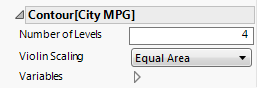
For density contours, specifies the number of contours that appear. For k levels, the contours are set at 100%, (100/k)%, 2(100/k)%, ..., (k-1)(100/k)%.
Tip: If you have multiple graphs, you can color or size each graph by different variables. Drag a second variable to the Color or Size zone, and drop it in a corner. In the Variables option, select the specific color or size variable to apply to each graph.