Launch the Chart platform by selecting Graph > Legacy > Chart.
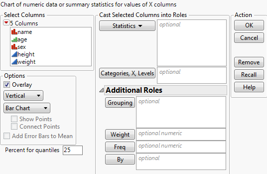
Figure 13.5 The Chart Launch Window
|
•
|
Up to two X variables, which appear on the x-axis in the same order that you assign them in the launch window.
|
|
•
|
As many Y variables (statistics) as you want. If the data is already summarized, select Data as the statistics option.
|
Select up to two X variables whose levels are categories on the x-axis. The Chart platform produces a bar for each level or combination of levels of the X variables. If you do not specify an X variable, the chart has a bar for each row in the data table.
For one or more Grouping variables, independent results are produced for each level or combination of levels of the grouping variables. These results appear in the same report window, but in separate plots. See Use Grouping Variables.
Select the type of chart that you want. Available chart types are Bar Chart, Line Chart, Pie Chart, Needle Chart, and Point Chart. Selecting a chart controls which of the other options are available.
This option is available only for Line Chart.
Adds error bars when the Mean statistic is selected for at least one Y variable and at least one X variable is assigned. This option is not selected by default.
This option is available for Line Chart and Bar Chart, and additional options are added to the Chart launch window. See Adding Error Bars.
Sets the specific quantile when the Quantiles statistic is selected for at least one Y variable. The default value is 25. Specify a different quantile:
|
1.
|
Type the value in the Percent for quantiles box.
|
|
3.
|
Click Statistics.
|
|
4.
|
Select Quantiles from the menu of statistics.
|