Add Graphs or Images to Hover Labels
You can add a thumbnail of a graph or an image to a hover label using graphlets.
• Preset graphlets: Preset graphlets are predefined and editable. They are easy to add, simply right-click on a graph and select Hover Label > graph type, or you can add them from the Hover Label Editor.
Note: Graphs based on synthetic data (such as data used in simulations) that are not connected to a data table do not support preset graphs.
• Paste graphlet: Create a graph in Graph Builder. Copy the script by saving it to your clipboard, and then paste it as a graphlet into a baseline graph.
Once you add the hover graph, put your pointer over an element in the baseline graph. A thumbnail preview of the hover graph appears for that element. For example, for aggregate data, you can see a hover graph of the underlying data distribution.
Some JMP platforms have built-in hover label graphs, such as Principal Components, Process Screening, Model Driven Multivariate Control Charts, and Functional Data Explorer. You do not need to do anything to add these graphs to your visualizations. When you place your pointer over them, the graph automatically appears in the hover labels.
You can also customize hover label graphs using JSL. For details, see Hover Labels in the Scripting Guide.
Hover Graph Actions
• Click a hover graph to launch it in a new window, or click an image to open a related link.
• Press Ctrl and click on a hover label graph to replace the baseline graph with the hover label graph.
• Press Alt and click on a hover label graph to replace the contents of the last launched window, instead of opening a new one.
Example of Adding a Preset Graph
In this example, you create a graph, add preset graphs to hover labels, and then customize the hover label graphs.
Create the Original Graph
1. Select Help > Sample Data Library and open JMP Man Dozen.jmp.
2. Select Graph > Graph Builder.
3. Select X and Y and drag them to the Y zone.
4. Select Data Set and drag it to the X zone.
5. Click the Bar element ![]() .
.
6. For the Error Interval, select Standard Deviation.
Figure 9.41 Original Graph for JMP Man Dozen.jmp
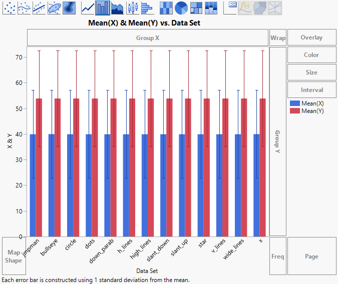
You can see that the mean and standard deviation for these observations are the same, so this graph does not tell you much. Use preset graphs to get more insight into the data.
Add Preset Graphs
1. In the graph, right-click and select Hover Label > Histogram.
This adds preset histograms to the hover labels.
2. Point to some of the bars. For example, point to the red bars for dots and star.
Tip: To make the hover label remain so that you can compare it with other hover labels, click the Pin icon  in the top right corner. See Pin Hover Labels on a Graph.
Figure 9.42 Example of Preset Histogram Graphs
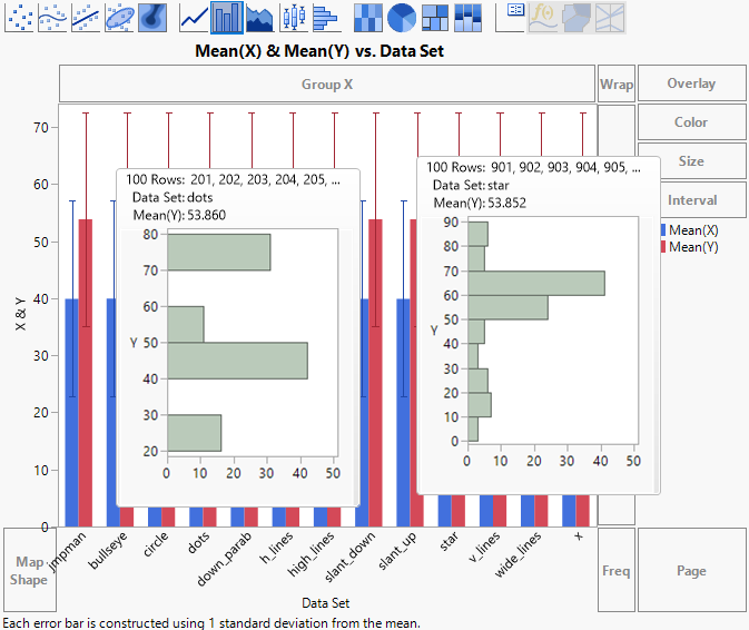
You can see that the distribution for the measurements is clearly different. But you want to see another type of graph, a scatterplot.
3. In the graph, right-click and select Hover Label > Marker.
This changes the preset graphs from histograms to scatterplots.
4. Place your pointer over the blue bar for down_parab and the red bar for down_parab. Notice that the Y and X variables on the axes are reversed.
You want to use the same X and Y role assignments for all graphs (assigning the X variable to the X axis, and the Y variable to the Y axis). You also want to change the smoother to a line of fit, and add a caption box with summary statistics to the scatterplot.
You can customize a graph in Graph Builder and then copy the graph as a template and apply it to all of the hover labels in this graph.
Customize Graphs
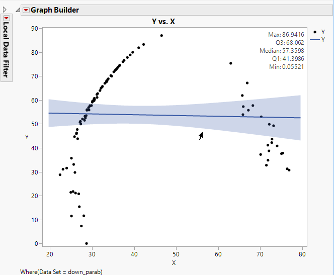
1. Place your pointer over the blue bar for down_parab and click the graph to open it in a new window.
The graph opens in Graph Builder.
Note: Notice that when you launch a preset graph, you see a Local Data Filter at left. You can use the Local Data Filter to expand and modify the graph. For details, see Local Data Filter.
2. Click the Graph Builder red triangle and select Show Control Panel.
3. Click the Line of Fit element ![]() .
.
4. Click the Caption Box icon ![]() .
.
5. Under Caption Box, change the Summary Statistic to 5 Number Summary.
6. Click Done.
Figure 9.43 Customized Graph for down_parab
7. Click the Graph Builder red triangle menu and select Save Script > To Clipboard.
8. Close this Graph Builder window.
9. In your original graph, right-click and select Hover Label > Paste Graphlet.
This applies the customized graph as a template to all hover label graphs. Hover over a few bars to see the changes.
Tip: To better compare original graphs and graphs launched from hover labels, use projects. See Create a Project in the Save and Share Data section.
Example of Specifying Drill-Down Column Hierarchies
In preset graphs that use categorical columns, you can specify which columns to filter by.
Create the Original Graph
1. Select Help > Sample Data Library and open San Francisco Crime.jmp.
These data show crime statistics for police districts in San Francisco.
2. Select Graph > Graph Builder.
3. Select Police District and drag it to the X zone.
4. Click the Treemap element ![]() .
.
You can see a treemap of the different police districts in San Francisco.
5. Right-click on the graph and select Hover Label > Treemap.
6. Put your pointer over Central to see the hover label graph.
Figure 9.44 Initial Hover Label Graph for Central
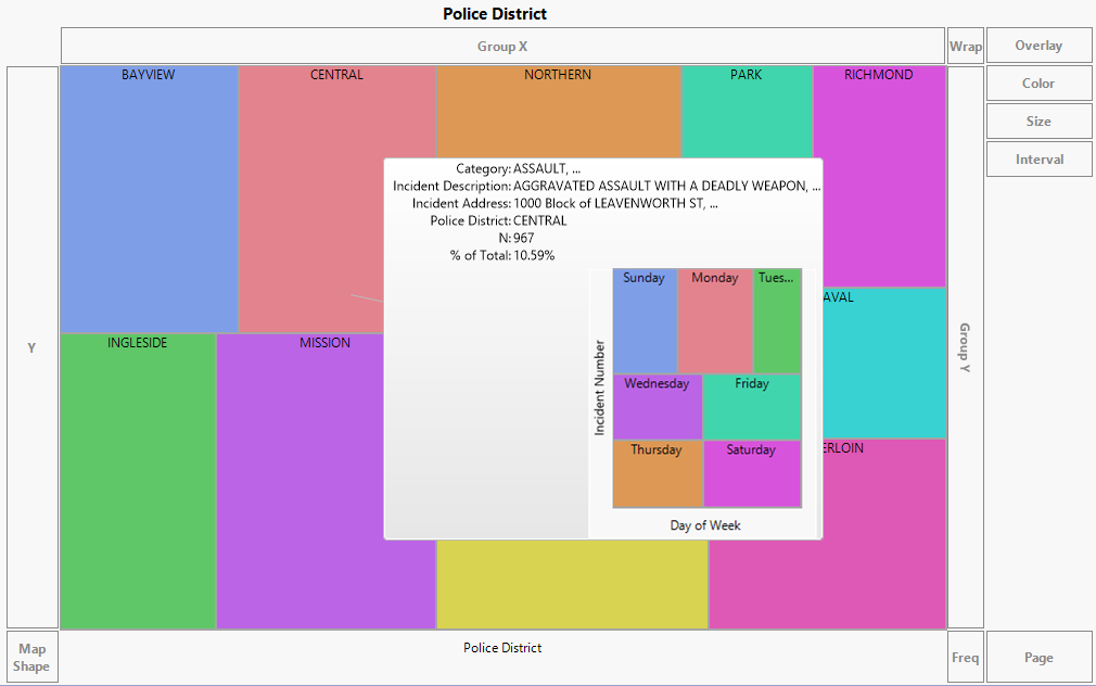
The hover label graph is showing the number of incidents in each district by the day of the week. Instead, in this example, you want to see the number of incidents in each district by category.
Specify the Drill-Down Column Hierarchy
1. In the San Francisco Crime.jmp data table, right-click the Police District column heading and select Column Properties > Next in Hierarchy.
2. Under Next in Hierarchy, click Category.
Figure 9.45 Category Selected for Next in Hierarchy
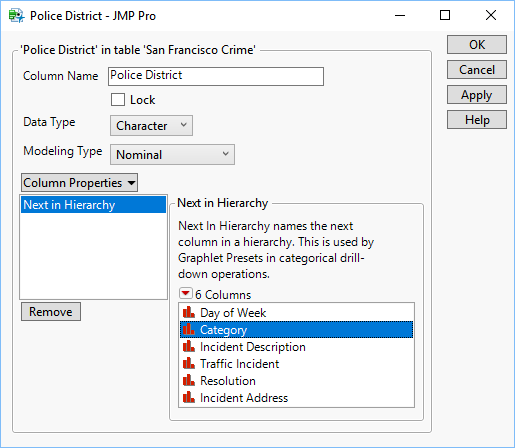
3. Click OK.
4. Add a second level of the hierarchy that appears if the first hover label graph is launched:
a. In the San Francisco Crime.jmp data table, right-click the Category column.
b. Select Column Properties > Next in Hierarchy.
c. Under Next in Hierarchy, click Incident Description.
d. Click OK.
5. In Graph Builder, put your pointer over Central again to see the updated hover label graph.
Figure 9.46 Updated Hover Label Graph for Central
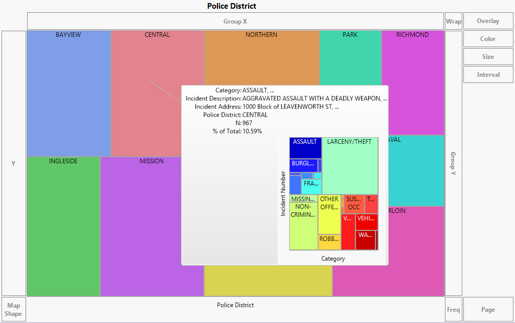
The hover label graph is now showing the number of incidents in each district by category.
6. Click the hover label graph to launch it.
7. Put your pointer over Other Offenses.
Figure 9.47 Second Level Hover Label Graph for Other Offenses Category
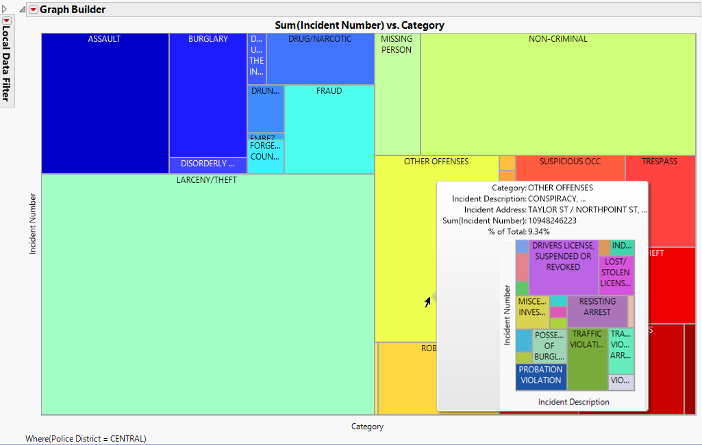
The second level of the hover label graph is showing the number of incidents in the Other Offenses category by the incident description.
Example of Removing a Filter Column from a Graph
In some cases, the hover label graph might be filtering on a column that you want to remove. For example, the filter column might be too granular to be useful. You can remove it using the Hover Label Editor.
Create the Original Graph
1. Select Help > Sample Data Library and open CrimeData.jmp.
These data show crime rates for regions and states in the U.S.
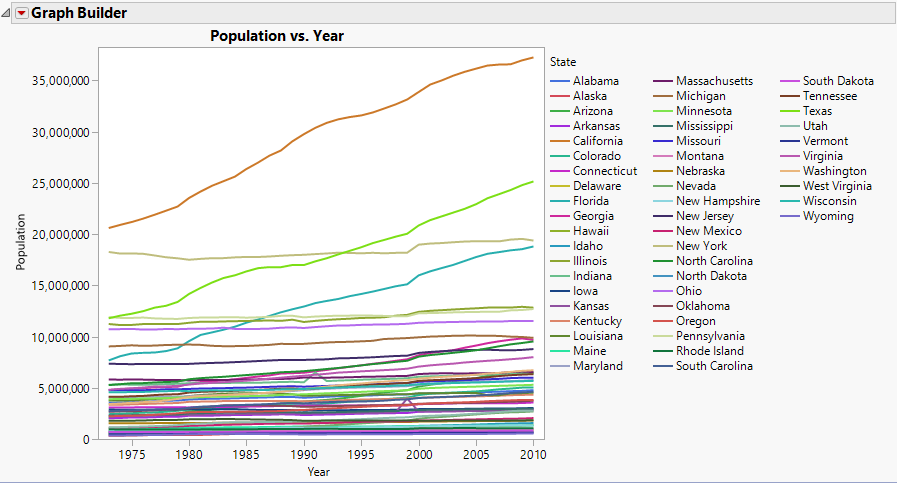
2. Select Graph > Graph Builder.
3. Select Population and drag it to the Y zone.
4. Select Year and drag it to the X zone.
5. Select Region and drag it to the Overlay zone.
6. Click the Line element ![]() .
.
Figure 9.48 Mean Population Crime Rates by U.S. Region Per Year
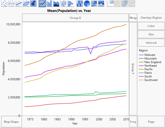
This graph shows the mean population in each U.S. region that were impacted by different crime rates over different years. In the hover label graphs, you want to see a more granular view that shows the impacts by U.S state instead of region.
7. Keep this window open.
Copy and Paste a Graph
1. Click the Graph Builder red triangle and select Redo > Redo Analysis.
A copy of the original graph appears.
2. In the copy of the graph, select State and drag it to the Overlay zone.
This replaces Region with State.
3. Click Done.
Figure 9.49 Mean Population Crime Rates by U.S. State Per Year
4. Click the Graph Builder red triangle and select Save Script > To Clipboard.
5. Close this graph.
6. In the original graph, right-click and select Hover Label > Paste Graphlet.
7. Place your pointer over the Pacific line and click to launch the hover label graph.
Figure 9.50 Hover Label Graph Showing Crime Rates by State and Year for the Pacific Region
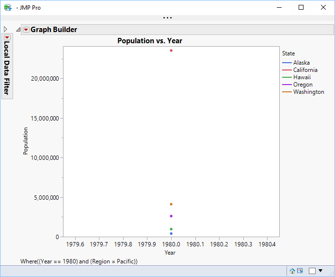
Because we are still filtering by year, this view is too granular to be useful. You want to remove the year filter, so the graph filters only by region.
8. Close the hover label graph for the Pacific region.
Remove a Filter Column
1. Right-click the original graph and select Hover Label > Hover Label Editor.
2. In the Graphlet window, click the Filters tab.
3. Select Year, the column you no longer want to filter by.
Figure 9.51 Skip Filters in the Hover Label Editor
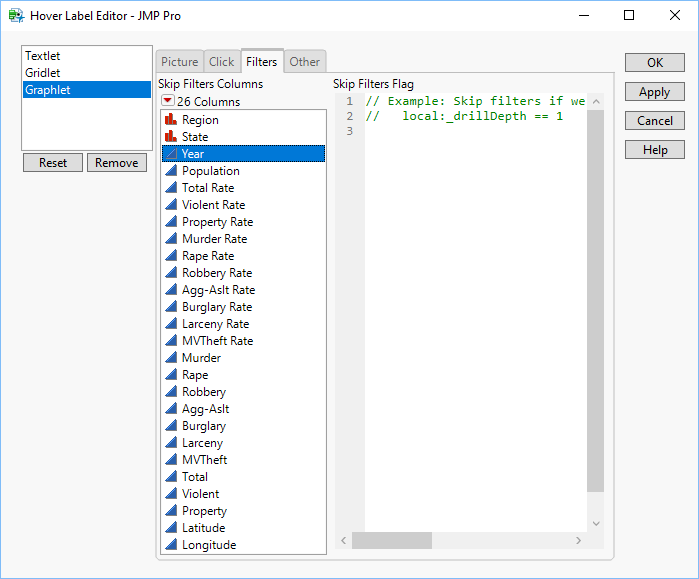
4. Click OK.
5. Hover over the Pacific line and click to launch the hover label graph.
Figure 9.52 Hover Label Graph Showing Crime Rates by State for the Pacific Region
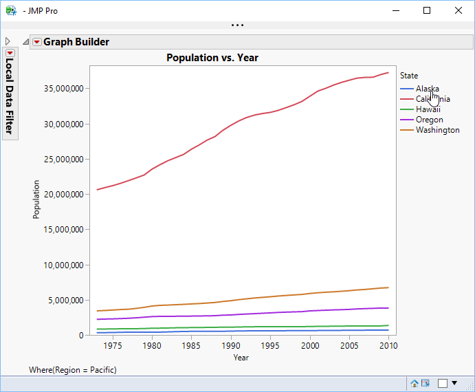
You can see that the hover label graphs are no longer filtering by year, but by region only, creating a more useful visualization.