Customize Markers, Lines, Text, and More
Graphs consist of markers, lines, text, and other graphical elements that you can customize. For example, in a Scatterplot Matrix graph, you might want to highlight data points in one of the bivariate graphs with a pink solid marker. In a Contour Plot graph, you can increase the width or transparency of the contour lines.
Example of Customizing a Contour Plot
1. Select Help > Sample Data Library and open Little Pond.jmp.
2. In the Table panel, click the green triangle next to the Contour Plot script.
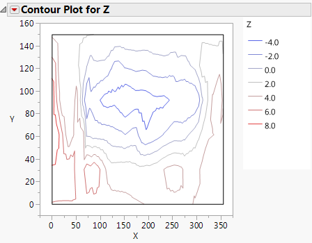
3. Click the red triangle next to Contour Plot for Z and deselect Fill Areas.
Figure 9.33 Contour Plot before Customization
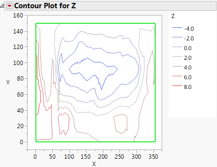
4. Right-click the plot and select Customize.
The Customize Graph window appears.
5. Click Shape.
6. Change the Line Width to 2.0.
7. Click the color next to Line Color and select a shade of green.
8. Click OK.
Figure 9.34 Customized Contour Plot
The graphical elements that you can customize differ on each graph. For example, in a Control Chart graph, there are three line elements (Lower Limit, Upper Limit, and Connect Line). In other graphs, the line element might be named Line or Custom.
To customize graphical elements in the current graph, follow these steps:
1. Right-click the graph and select Customize.
2. Select the element that you want to change, and then modify the properties.
Your changes are immediately shown on the graph.
3. Click OK to save your changes to the current graph.
Note: The Customize settings do not override those shown in the legend. For example, if you set the fill area in a bar chart to red, and the legend is blue, the legend will remain blue.
Each element can include properties for line color, marker style and size, text style, and so on. Here are some common properties:
Line Color
Changes the color of the line. Click to select any color in the window. Right-click to choose from more colors.
Line Style
Changes the style of the line. Click to select one of five different styles.
Line Width
Changes the width of the line. Click in the box and enter the desired line width in points.
Marker
Changes the marker shape. For more information about markers, see Use Markers.
Marker Size
Changes the size of the marker.
Arrow
Adds an arrowhead to a line at either None, Start, End, or Both ends of the line.
Line of Fit
Changes the color, width, or style of the line.
Text Color
Changes the color of the text.
Font
Changes the font, style, and point size of the text.
Text Style
Changes the text alignment to centered, left-aligned, or right-justified. The Fill option applies the selected color to the background.
Fill Color
Changes the color of objects such as box plots and Fit Confidence regions.
Fill Pattern
Changes the pattern of filled objects.
Transparency
Changes the marker or label transparency. Enter the level of transparency to draw markers (points) on the graph. The degrees of opacity ranges from 0 (clear) to 1 (opaque). For more information about changing the transparency of markers, see Specify Marker Transparency.
Clip Shape
Crops the object (such as contours) around the boundary according to the selected Clip Shape. The display segs that make up the object then conform to the boundaries of the map. Select a sub-boundary to display the objects only over a portion of the boundary. For example, you might want to display the objects only over New York.
About Clip Shape Options
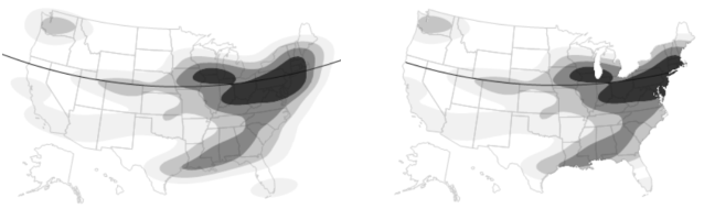
Graphical elements (display segs such as reference, grid lines, and contours) can be clipped to conform to the boundaries of a geographical map. The Customize Graph window provides Clip Shape options, where you can select a boundary around which to clip the shape. Figure 9.35 shows reference lines clipped around a map of the United States.
Figure 9.35 Unclipped (Left) and Clipped (Right) Reference Lines
Tips:
• See Maps in Essential Graphing for an example of creating the maps shown in Figure 9.35.
• The Clip Shape option in the Customize window was also set to clip the contours to the boundaries of the map. See Clip Shape.
• Scripting provides additional options such as specifying the clipping path in a matrix or string. See Clip Display Segs in Graphics in the Scripting Guide.
Create Scripts for Graphical Elements
In addition to customizing graphical elements, you can write JSL scripts that add elements. These scripts run when you display the graph. You can write the scripts from scratch, or you can select from the following lists of commands and scripts, accessed by clicking on the Add a new script button  :
:
• Use the Templates list to insert a single JSL command. For example, the Polygon option inserts the Polygon command. The text enclosed in underscores are placeholders for point values, which you replace with your own values.
Polygon([_x0_, _x1_, ... ], [_y0_, _y1_, ...]);
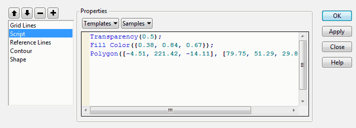
• Use the Samples list to insert a script that creates elements such as bubble plots and sine waves. In this list, the Polygon option shows examples of the Transparency, Fill Color, and Polygon values, which you replace with your own values.
Figure 9.36 The Polygon Sample Script
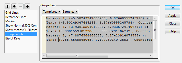
In some graphs, you can view the JSL that creates graphical elements. Figure 9.37 shows the Group Label script for a Discriminant Analysis graph. The script defines markers and text for group labels. The commands included in these built-in scripts cannot be modified or deleted. You can insert commands from the Templates or Samples list, but you cannot click in the window and type new commands.
Figure 9.37 Example of JSL That Creates Group Labels
For information about JSL, see the Scripting Guide and the JSL Syntax Reference.
To create a graphics script, follow these steps:
1. Right-click the graph and select Customize.
2. Click the Add a new script button () to create a new script.
The default name, Script, is highlighted.
3. With the default name highlighted, type a more descriptive name, and then press Enter. (If you already moved the pointer and the name is no longer highlighted, double-click Script, and then enter the new name.)
4. Do one or more of the following:
– Enter JSL in the Properties window.
– Select one or more JSL commands from the Templates list, and modify the placeholder text. For example, change the Pen Color option from “blue” to “red.”
– Select one or more sample scripts from the Samples list and modify, if necessary.
5. (Optional) Click Apply to update the graph with your changes without closing the window. Unlike other property changes, script changes to not take effect until you click Apply or OK.
6. Click OK to save your changes.
One of the following occurs:
– The element that you created appears on the graph.
– An error message appears if the script contains an error. Select View > Log to read about the error, and then correct the script.
To delete a script that you created, select the script and then select the Delete selected object button ( ).
).
Change the Drawing Order of Graphical Elements
The graphical elements are drawn in the order in which they are listed. The first element on the list is drawn first, so it appears behind all other graphical elements. If one element hides another, you can rearrange the order of the elements.
To rearrange graphical elements
1. Right-click the graph and select Customize.
2. Select the element that you want to move.
3. Click the Move up in drawing order button ( ) or Move down in drawing order (
 ) button one or more times until the elements are in the order in which you want them drawn.
4. Click OK.
Save Your Customizations
The graph customizations apply to the current graph and are also used when you redo an analysis. To re-create your graph at a later time with its customizations, select Save Script from the red triangle menu, and then select one of the Save options. For example, you can save the script to the data table, which applies your customized properties each time you run the script. See Save Your Analysis as a Script in the Save and Share Data section.
Copy Your Customizations
You can copy your customizations from one graph to another. All objects that you created or modified, such as colored text or lines, are pasted to the other graph.
To copy lines from one graph to another, see Copy and Paste Graph Contents.
To copy other objects
1. Right-click in the graph with custom elements and select Edit > Copy Customizations.
2. Right-click in the destination graph and select Edit > Paste Customizations.
The objects appear on the current graph and are added to the list of customized elements.
Notes:
• The customizations are pasted into all similar graphs when you press Ctrl, click, and then paste.
• The copy customizations feature copies only the elements that you added or modified. It does not copy the other contents of the graph.