Example of a Stacked Bar Chart
In this example, you have data about oil consumption and production for selected countries. You want to visualize oil consumption and production in a meaningful way.
1. Select Help > Sample Data Library and open Oil Use.jmp.
2. Select Graph > Graph Builder.
3. Select Country and drag it to the Y zone.
Figure 4.7 Country Assigned to the Y Zone
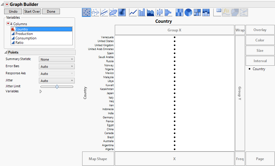
Tip: The countries are ordered in ascending alphabetical (starting point is at the bottom). To change the sorting order, use the Value Order column property or Row Order Levels option. See Value Order or Sorted Order in Using JMP. Alternatively, you can sort using the values of a continuous variable. See Order the Levels of a Categorical Variable in the Graph Builder section.
4. Select Production and Consumption and drag them to the X zone.
Markers appear on the graph for both variables with a legend identifying the two colors.
Figure 4.8 Country versus Production and Consumption
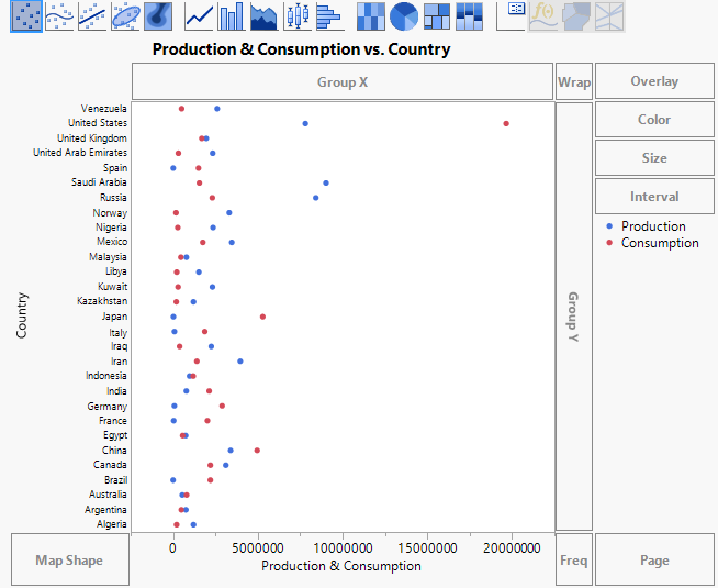
Because the default graph element is set to points, it is difficult to relate the labels to the points. Change the points to bars to make the graph easier to interpret.
5. Click the Bar element  .
.
Figure 4.9 Side-by-Side Bars for Production and Consumption
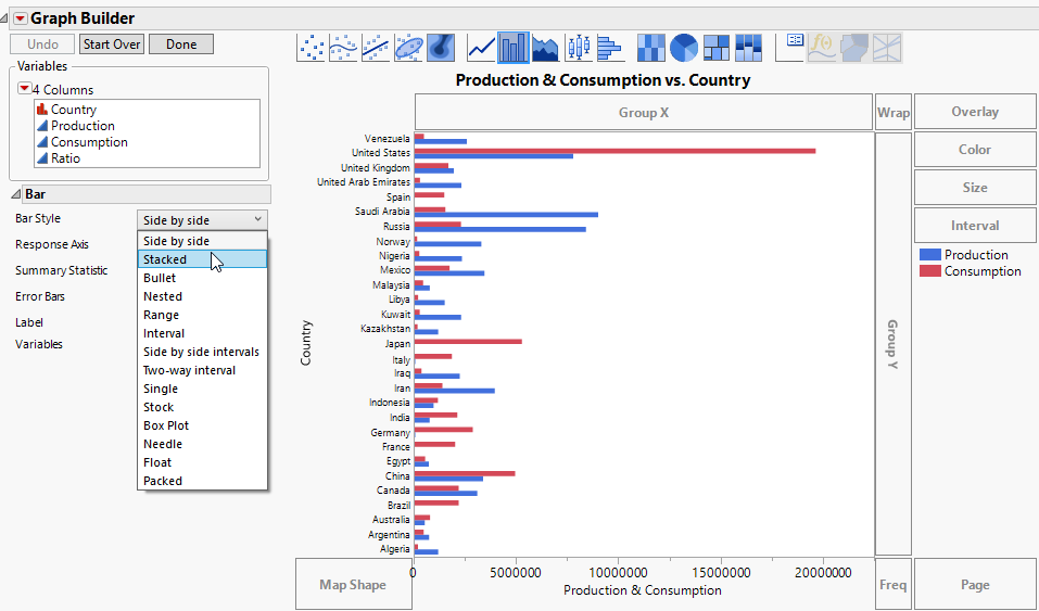
Experiment with the presentation of the bar chart. Change the side-by-side bars to stacked bars.
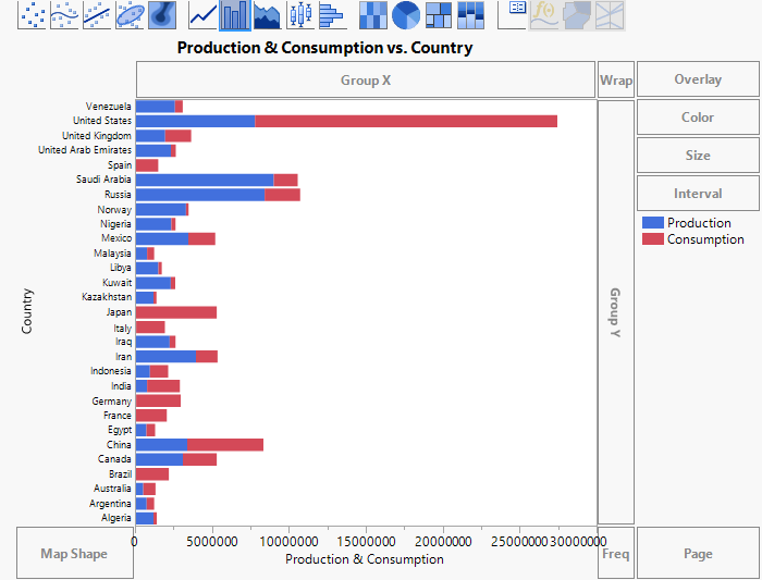
6. Next to Bar Style, select Stacked (Figure 4.9).
Figure 4.10 Stacked Bars for Production and Consumption
Because production is the opposite of consumption, you would like your plot to reflect this by having the production and consumption bars point in opposite directions.
7. In the Variables list, right-click the column Consumption and select Transform > Negation.
This makes Consumption negative. A column called -Consumption appears in the list of columns. The column name is italicized to indicate that it is a virtual column. Use this column to plot the consumption bar in terms of negative values.
8. Right-click the X axis label, Production & Consumption, and select Remove > Consumption.
9. Select -Consumption and drag it to just above the X axis.
Figure 4.11 Stacked Bars for Production and Negative Consumption

Negative consumption (-Consumption) is plotted on the left in red, and Production is on the right in blue. Next, use the Consumption column as an ordering variable to sort the countries by their oil consumption.
10. Select Consumption and drag it to the right of the Y axis. Do not drop the variable until a blue polygon appears.
Figure 4.12 Polygon for Ordering Countries by Consumption
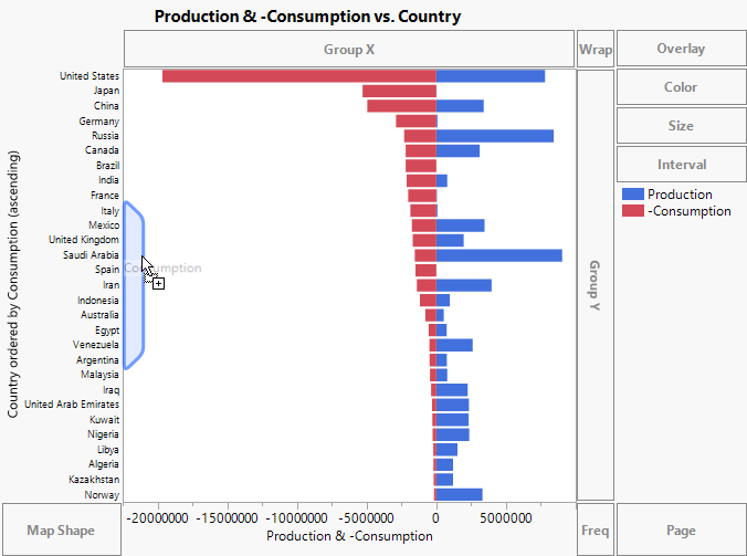
11. (Optional) Click Done.
The levels of Country are now ordered by Consumption. The countries that consume the most oil appear at the top of the graph. You can also see each country’s oil production.