Example of Correspondence Analysis
This example uses the Cheese.jmp sample data table. This table contains data from the Newell cheese tasting experiment; the data were reported in McCullagh and Nelder (1989). The experiment records counts more than nine different response levels across four different cheese additives.
1. Select Help > Sample Data Library and open Cheese.jmp.
2. Select Analyze > Fit Y by X.
3. Select Response and click Y, Response.
The Response values range from one to nine, where one is the least liked, and nine is the best liked.
4. Select Cheese and click X, Factor.
A, B, C, and D represent four different cheese additives.
5. Select Count and click Freq.
6. Click OK.
Figure 7.10 Mosaic Plot for the Cheese Data
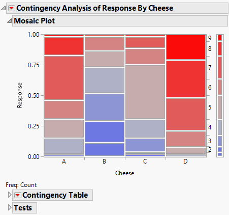
From the mosaic plot, you notice that the distributions do not appear alike. However, it is challenging to make sense of the mosaic plot across nine levels. A correspondence analysis can help define relationships in this type of situation.
7. To see the correspondence analysis plot, click the red triangle next to Contingency Analysis of Response By Cheese and select Correspondence Analysis.
Figure 7.11 Example of a Correspondence Analysis Plot
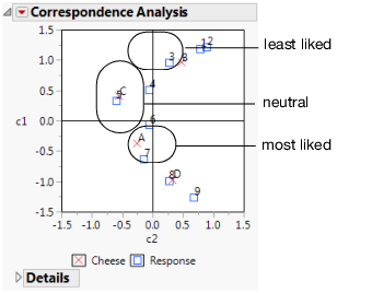
Figure 7.11 shows the correspondence analysis graphically, where the plot axes are labeled c1 and c2. Notice the following:
• c1 seems to correspond to a general satisfaction level. The cheeses on the c1 axis go from least liked at the top to most liked at the bottom.
• Cheese D is the most liked cheese, with responses of 8 and 9.
• Cheese B is the least liked cheese, with responses of 1,2, and 3.
• Cheeses C and A are in the middle, with responses of 4,5,6, and 7.
8. Click the red triangle next to Correspondence Analysis and select 3D Correspondence Analysis.
Figure 7.12 Example of a 3-D Scatterplot
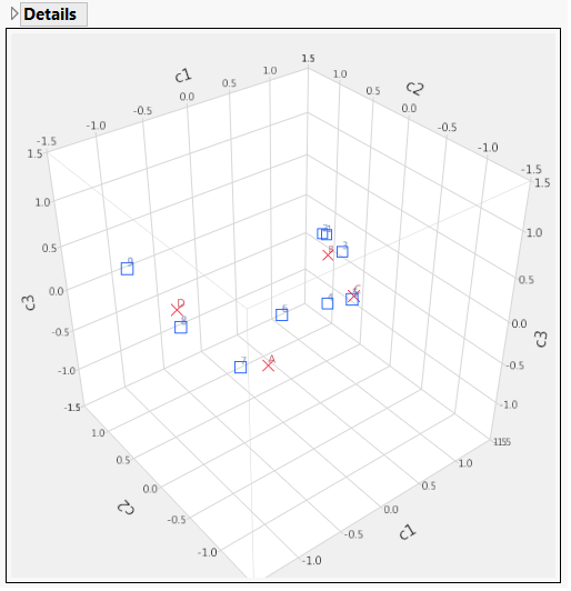
Notice the following:
• Looking at the c1 axis, responses 1 through 5 appear to the right of 0 (positive). Responses 6 through 9 appear to the left of 0 (negative).
• Looking at the c2 axis, A and C appear to the right of 0 (positive). B and D appear to the left of 0 (negative).
• You can conclude that c1 corresponds to the general satisfaction (from least to most liked).