Example of the Pareto Plot Platform
This example uses the Failure.jmp sample data table, which contains failure data and a frequency column. It lists causes of failure during the fabrication of integrated circuits and the number of times each type of defect occurred. From the analysis, you can determine which factors contribute most toward process failure.
1. Select Help > Sample Data Library and open Quality Control/Failure.jmp.
2. Select Analyze > Quality and Process > Pareto Plot.
3. Select failure and click Y, Cause.
This column lists the causes of failure. It is the variable that you want to inspect.
4. Select N and click Freq.
This column list the number of times that each type of failure occurred.
5. Click OK.
Figure 13.2 Pareto Plot Report Window
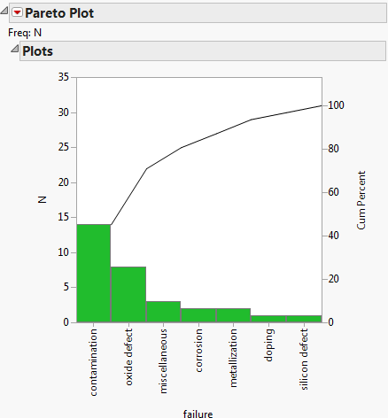
The left axis represents the count of failures, and the right axis represents the percent of failures in each category. The bars are in decreasing order with the most frequently occurring failure to the left. The curve indicates the cumulative failures from left to right.
6. Click the Pareto Plot red triangle and select Label Cum Percent Points.
Note that Contamination accounts for approximately 45% of the failures. The point above the Oxide Defect bar shows that Contamination and Oxide Defect together account for approximately 71% of the failures.
7. Click the Pareto Plot red triangle and deselect Label Cum Percent Points and Show Cum Percent Curve.
8. Click the label for the y-axis labeled N and rename it Count.
9. Double-click the y-axis to display the Y Axis Settings window.
– In the Maximum field, type 15.
– In the Increment field, type 2.
– In the Axis Label Row panel, select Grid Lines for the Major grid line.
– Click OK.
10. Click the Pareto Plot red triangle and select Category Legend.
Figure 13.3 Pareto Plot with Display Options
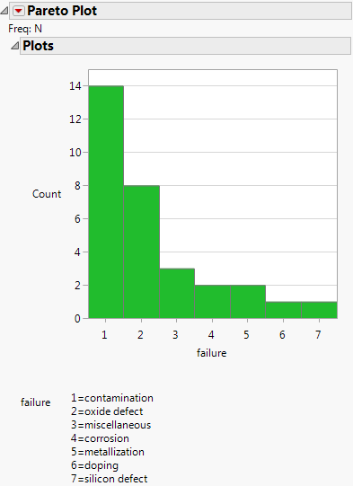
Figure 13.3 shows the counts of different types of failures and has a category legend. The vertical count axis is rescaled and has grid lines at the major tick marks.
11. To view the data as a pie chart, click the Pareto Plot red triangle and select Pie Chart.
Figure 13.4 Pareto Plot as a Pie Chart
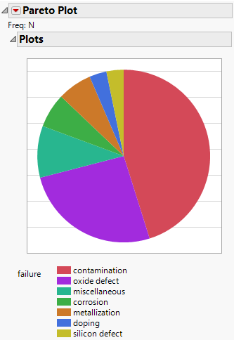
Contamination and Oxide Defect clearly represent the majority of the failures.