Examples of Area Plots
The examples in this section use area plots to show behavior over a period of time, and to show upper and lower bounds around group means.
Show Behavior over Time
This example shows the behavior of average consumer prices for three items from January 1980 to July 2006. If you want to emphasize the lines in the area plot rather than the filled areas, you can create this plot using the Line element. See Show Behavior over Time - Line Element.
1. Select Help > Sample Data Library and open Consumer Prices.jmp.
2. Click the green triangle next to the Split into Series script.
A new data table called Consumer Prices Split by Series appears. This is the data table to use for the remainder of the example.
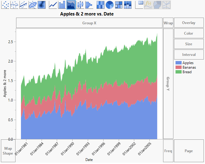
3. Select Graph > Graph Builder.
4. Select Date and drag it to the X zone.
5. Select Apples, Bananas, and Bread and drag them to the Y zone.
6. Click the Area element  .
.
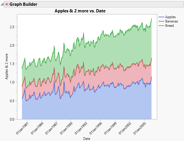
Figure 4.20 Area Plot for Apples, Bananas, and Bread by Date
Stacked area plots appear for all three responses. You can see that apple and bread prices have increased over time, and that banana prices have increased, but to a smaller degree. You would like to be able to compare the three series in a way that makes comparisons easier.
7. Change the Area Style to Overlaid.
Because banana prices are uniformly smaller than prices for apples and bread, the layer for Bananas is at first entirely hidden behind the other two layers. The apples price is hidden behind the bread price for some months. Use the Line element to see prices for all three clearly.
8. Select the Line element ![]() and drag it into the graph.
and drag it into the graph.
Figure 4.21 Overlaid Area Style
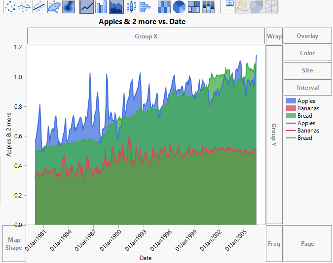
The layers for the plot are ordered by the order of entry of variables, as shown in the legend. The graph shows that banana prices are uniformly smaller than both apple and bread prices. On average, apple prices dominate bread prices up to the year 2000. After this, bread prices are generally higher than apple prices. Also note that the price of bread increases at a smoother rate than prices for apples and bananas. The line plots for Apples and Bananas are very jagged, with a lot of spikes and dips from year to year.
9. In the Area options, click the triangle next to Variables. Select Y Bananas so that it is highlighted, and click the down arrow once.
Note: When selecting Y Bananas, be sure to leave the check box marked. Otherwise, the variable is removed from the graph.
10. In the Line options, click the triangle next to Variables. Select Y Bananas so that it is highlighted, and click the down arrow once.
11. (Optional) Click Done.
Figure 4.22 Overlaid Area Showing All Layers
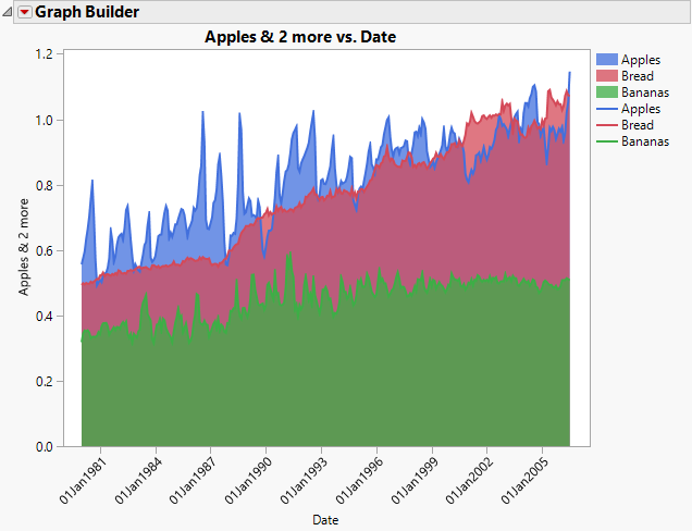
By re-ordering the variables in the legend and using the Line element, you can show prices for the three series with area plots in a way that does not obscure any of the underlying data.
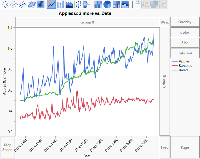
Show Behavior over Time - Line Element
1. Select Help > Sample Data Library and open Consumer Prices.jmp.
2. Click the green triangle next to the Split into Series script.
A new data table called Consumer Prices Split by Series appears. This is the data table to use for the remainder of the example.
3. Select Graph > Graph Builder.
4. Select Date and drag it to the X zone.
5. Select Apples, Bananas, and Bread and drag them to the Y zone.
6. Click the Line element ![]() .
.
Figure 4.23 Line Plot for Apples, Bananas, and Bread by Date
7. In the Line options, select Stack, and change the Fill to Fill Below.
8. (Optional) Click Done.
Figure 4.24 Area Plot for Apples, Bananas, and Bread by Date using Line Element