Histograms
The histogram is one of the most useful graphical tools for understanding the distribution of a continuous variable. Use a histogram to find the following in your data:
• the average value and variation
• extreme values
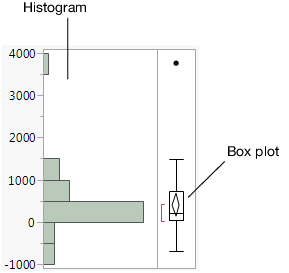
Figure 4.2 Example of a Histogram
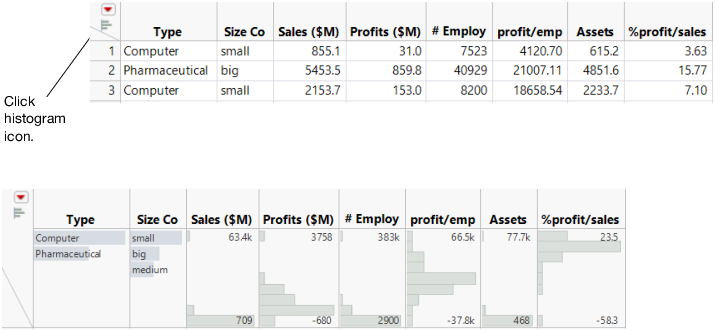
Instant Histograms
You can view a histogram instantly by clicking the histogram icon in the column header. Histograms appear below the column header.
Figure 4.3 Instant Histograms
Scenario
This example uses the Companies.jmp data table, which contains data on profits for a group of companies.
A financial analyst wants to explore the following questions:
• Generally, how much profit does each company earn?
• What is the average profit?
• Are there any companies that earn either extremely high or extremely low profits compared to the other companies?
To answer these questions, use a histogram of Profits ($M).
Create the Histogram
1. Select Help > Sample Data Library and open Companies.jmp.
2. Select Analyze > Distribution.
3. Select Profits ($M) and click Y, Columns.
Figure 4.4 Distribution Window for Profits ($M)
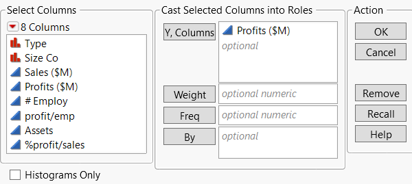
4. Click OK.
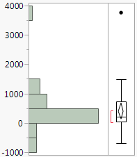
Figure 4.5 Histogram of Profits ($M)
Interpret the Histogram
The histogram provides these answers:
• Most companies’ profits are between $-1000 and $1500.
All the bars except for one are located in this range. Also, more companies’ profits range from $0 to $500 than any other range. The bar representing that range is much longer than the others.
• The average profit is a little less than $500.
The middle of the diamond in the box plot indicates the mean value. In this case, the mean is slightly lower than the $500 mark.
• One company has significantly higher profits than the others, and might be an outlier. An outlier is a data point that is separated from the general pattern of the other data points.
This outlier is represented by a single, very short bar at the top of the histogram. The bar is small and represents a small group (in this case, a single company), and it is widely separated from the rest of the histogram bars.
In addition to the histogram, this report includes the following:
• The box plot, which is another graphical summary of the data. For detailed information about the box plot, see Box Plot in Essential Graphing.
• Quantiles and Summary Statistics reports. These reports are discussed in Analyze Distributions in the Analyze Your Data section.
Interact with the Histogram
Data tables and reports are all connected in JMP. Click a histogram bar to select the corresponding rows in the data table.