Box Plot
The Box Plot element ![]() shows outlier or quantile box plots. A box plot provides a compact view of a distribution of values. The box plot element is useful when variables have a Numeric data type. For more information about outlier and quantile box plots, see Outlier Box Plot and Quantile Box Plot in Basic Analysis.
shows outlier or quantile box plots. A box plot provides a compact view of a distribution of values. The box plot element is useful when variables have a Numeric data type. For more information about outlier and quantile box plots, see Outlier Box Plot and Quantile Box Plot in Basic Analysis.
• If one of the variables is continuous and the other is nominal or ordinal, box plots are constructed for values of the continuous variable. There is a box plot for each level of the categorical variable.
• If both variables are continuous, box plots are constructed for values of the continuous variable on the axis specified as the Response Axis. There is a box plot for each level of the other continuous variable.
For an example of a graph using box plots, see Example of Features in Graph Builder.
Figure 3.33 Box Plot Options
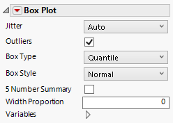
Jitter
Turns jitter on or off. Jitter adds random noise to data, and can help reduce over-plotting.
Outliers
Shows or hides values that extend beyond the whiskers.
Box Type
Specifies whether the box plot is an outlier box plot or a quantile box plot.
Box Style
Changes the style the box plot. For box style descriptions, see Table 3.3.
5 Number Summary
Adds statistics like the median, maximum, minimum, and quantiles 1 and 3 to the graph.
Width Proportion
adjusts the width of the box plots.
Variables
Shows or hides graph elements for variables, or re-orders the display of variables.
Note: These options do not apply to variables in the Group X, Group Y, Wrap, or Page zones.
Check boxes are followed by the zone designation and the name of the variable. Use check boxes to do the following:
– Show or hide the elements corresponding to a variable in a zone.
– Add or remove the effect of applying the Color, Size, Shape, or Freq variable to the variable in the zone.
Tip: If you have multiple graphs, you can color or size each graph by different variables. Drag a second variable to the Color or Size zone, and drop it in a corner. In the Variables option, select the specific color or size variable to apply to each graph.
Use arrows to re-order the display if there are multiple variables in a zone. Highlight a variable name and click an arrow to reposition it.
Red Triangle Options for Box Plot
Response Axis
Specifies the axis for the variable that is used as the response in constructing the box plots. Available only when both variables have a Continuous modeling type. If only one variable is Continuous, its axis is the response axis. The Auto setting is the Y axis.
Box Style | Description |
|---|---|
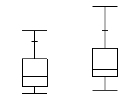
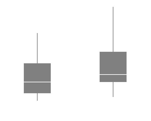
Normal | Shows the box defined by the quartiles as hollow with only a line at the median.
|
Solid | Shows the box defined by the quartiles with solid fill. The line at the median is shown by white space.
|
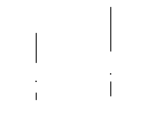
Thin
| The box defined by the quartiles is not shown. It is discernible due to the whiskers. The median is denoted by a point.
|