Office Temperature Study
This example demonstrates the creation of a custom background map for an office temperature study and how JMP was used to visualize the results. Data was collected concerning office temperatures for a floor within a building. A map was created for the floor using the Custom Map Creator add-in from the JMP File Exchange (https://community.jmp.com/docs/DOC-6218). Using Graph Builder, the office temperature results were then analyzed visually.
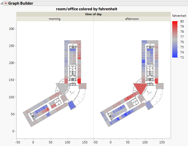
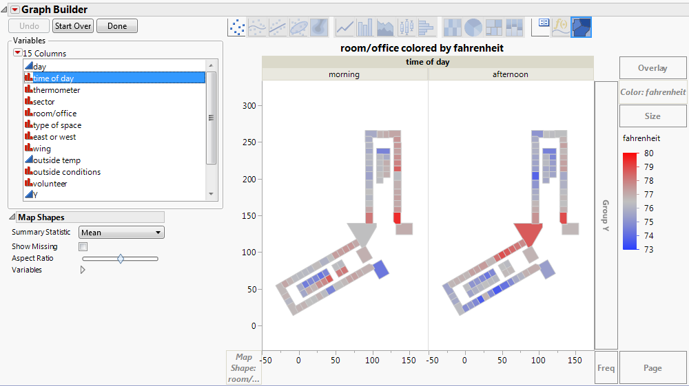
The map shown below is the floor, grouped by time of day. The color reflects the Fahrenheit value. Exploring data visually in this way can give hints as to what factors are affecting office temperature. Looking at this map, it appears the offices on the east side of the building are warmer in the mornings than they are in the afternoons. On the western side of the building, the opposite appears to be true. From this visualization, we might expect that both of these variables are affecting office temperatures, or perhaps that the interaction between these terms is significant. Such visuals help guide decision-making during the analysis.
Figure 12.33 Room/Office Colored by Fahrenheit and Grouped by Time of Day
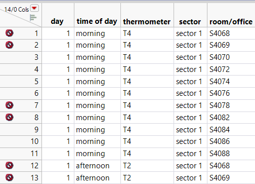
First, data was collected and input into a data table (S4 Temps.jmp). Note the Room/Office column. It contains the unique names for each office and was assigned the Map Role to correctly define the map files.
Figure 12.34 Partial View of the S4 Temps.jmp Data Table
Then, a map of the floor was created using the Custom Map Creator add-in, which you can download from the JMP File Exchange at https://community.jmp.com/docs/DOC-6218. The add-in creates two tables to define the shapes; an XY table and a Name table. The instructions below describe how it was built.
Create a Map of the Floor
1. Launch the add-in through the menu items Add-Ins > Map Shapes > Custom Map Creator. Two tables open in the background followed by the Custom Map Creator Window.
2. Drag a background image into the graph frame. An image of the floor plan was available.
3. Perform any resizing on the background image and graph the frame.
4. Name the table (for example, S4).
5. Click Next.
6. Name the shape that you are about to define. For this example, each office was individually named for the map (for example, S4001).
7. Within the graph frame, use your mouse to click all of the boundaries of the shape that you want to define. A line appears that connects all of the boundary points.
8. As soon as you finish defining the boundaries of the shape, click Next Shape. Continue adding shapes until you have completed the floor plan. Note that you do not need to connect the final boundary point; the add-in automatically does that for you when you click Next Shape.
9. The line size and color can be changed. In addition, checking Fill Shapes fills each shape with a random color.
10. Click Finish.
The custom map files were created and named appropriately. The map files are S4-Name.jmp and S4-XY.jmp and have been saved in the JMP Samples/Data folder.
Add the Map Role Column Property
Note: Pathnames in this section refer to the “JMP” folder. On Windows, in JMP Pro, the “JMP” folder is named “JMPPro”.
The S4 Temps.jmp data table contains office data over a three-day period. Set up the Map Role column property in the data table, as follows:
1. Select Help > Sample Data Library and open S4 Temps.jmp.
2. Right-click the Room/Office column and select Column Info.
3. Select Column Properties > Map Role.
4. Select Shape Name Use.
5. Click the icon next to Map name data table and browse to the S4-Name.jmp file (located in the JMP Samples/Data folder).
This tells JMP where the data tables containing the map information reside.
6. Select room from the Shape definition column list.
Room is the specific column within the S4-Name.jmp data table that contains the unique names for each office. Notice that the room column has the Shape Name Definition Map Role property assigned, as part of correctly defining the map files.
Note: Remember, the Shape ID column in the -Name data table maps to the Shape ID column in the -XY data table. This means that indicating where the -Name data table resides links it to the -XY data table, so that JMP has everything that it needs to create the map.
Figure 12.35 Map Role Column Property
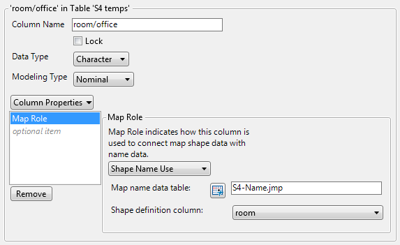
7. Click OK.
Once the Map Role column property has been set up, you can perform your analysis. You want to visually see the differences in office temperatures throughout the floor.
1. Select Graph > Graph Builder.
2. Drag and drop room/office into the Map Shape zone.
Since you have defined the Map Role column property on this column, the map appears.
3. Drag and drop Fahrenheit to the Color zone.
Figure 12.36 Room/Office Colored by Fahrenheit
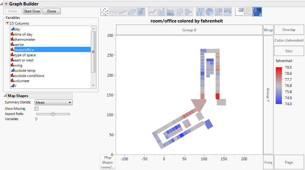
4. Drag and drop Time of Day onto Group X zone.
Figure 12.37 Room/Office Colored by Fahrenheit and Grouped by Time of Day
Note that only the offices that were part of the study and were created using the Custom Map Creator add-in are displayed. To add the entire floor plan image, the original floor plan graphic was dragged and dropped onto the Graph Builder window to create Figure 12.38.
To view Figure 12.38, select Help > Sample Data Library and open S4 Temps.jmp and run the by Time of Day script.
Figure 12.38 Room/Office Map with Original Floor Plan
There are several scripts provided with the data table that you can run to view the various analysis and modeling that can be performed and visually displayed.