Scatterplot
The Scatterplot of the lifetime event versus the explanatory variable is shown at the top of the report window. For the Devalt.jmp sample data, the Scatterplot shows Hours versus Temp. Table 4.2 indicates how each type of failure is represented on the Scatterplot in the report window. To increase the size of the markers on the graph, right-click the graph, select Marker Size, and then select one of the marker sizes listed.
Figure 4.6 Scatterplot of Hours versus Temp
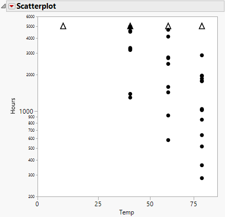
Event | Scatterplot Representation |
|---|---|
failure | dots |
right-censoring | upward triangles |
left-censoring | downward triangles |
interval-censoring | downward triangle on top of an upward triangle, connected by a solid line |
Scatterplot Options
The Scatterplot red triangle menu contains the following options:
Add Density Curve
Specify the density curve that you want, one at a time, by entering any value within the range of the accelerating factor. You can then select different distributions by selecting the appropriate check box(es) that appear after you add a curve.
Remove Density Curves
Displays previously entered density curve values. Remove curves by selecting the appropriate check box.
Show Density Curves
Displays the density curves. If the Location or the Location and Scale model is fit, or if Nested Model Tests is selected in the launch window, then the density curves for all of the given explanatory variable levels are shown. After the curves have been created, the Show Density Curves option toggles the curves on and off the plot.
Add Quantile Lines
Specify the quantile lines that you want, three at a time. You can add more quantiles by continually selecting Add Quantile Lines. Default quantile values are 0.1, 0.5, and 0.9. Invalid quantile values, such as missing values, are ignored. If desired, you can enter just one quantile value, leaving the other entries blank.
Show Quantile Line CI Bands
Shows or hides confidence intervals around the quantile lines.
Set Level of Quantile Line CI Bands
Specifies the confidence level for the confidence intervals around the quantile lines.
Remove Quantile Lines
Displays previously entered quantile values. Remove lines by selecting the appropriate check box.
Transposed Axes
Swaps the horizontal and vertical axes.
Use Transformation Scale
The default view of the scatterplot incorporates the transformation scale. Select this option to switch between the linear and nonlinear scales for the horizontal axis.
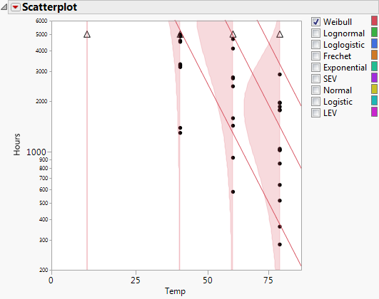
Figure 4.6 shows the initial scatterplot; Figure 4.7 shows the resulting scatterplot with the Show Density Curves and Add Quantile Lines options selected displaying the curves and the lines for the various Temp levels for the Weibull distribution. You can also view density curves across all the levels of Temp for the other distributions. These distributions can be selected one at a time or can be viewed simultaneously by checking the boxes to the left of the desired distribution name(s).
Figure 4.7 Scatterplot with Density Curve and Quantile Line Options