Launch the Chart Platform
Launch the Chart platform by selecting Graph > Legacy > Chart.
Figure A.3 The Chart Launch Window
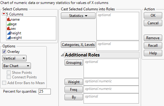
In the Chart launch window, you can assign the following:
• Up to two X variables, which appear on the x-axis in the same order that you assign them in the launch window.
• As many Y variables (statistics) as you want. If the data is already summarized, select Data as the statistics option.
The following options are available:
Cast Selected Columns Into Roles
Statistics
Use this menu to select the statistic to chart for each Y variable.
See Plot Statistics for Y Variables.
Categories, X, Levels
Select up to two X variables whose levels are categories on the x-axis. The Chart platform produces a bar for each level or combination of levels of the X variables. If you do not specify an X variable, the chart has a bar for each row in the data table.
See Use Categorical Variables.
Additional Roles
Grouping
For one or more Grouping variables, independent results are produced for each level or combination of levels of the grouping variables. These results appear in the same report window, but in separate plots. See Use Grouping Variables.
Weight
Assigns a variable to give the observations different weights.
Freq
Assigns a frequency variable. This is useful if you have summarized data.
By
By variables cause plots to be created in separate outline nodes.
Options
Overlay
If this option is selected, all Y variables are plotted in one graph. If this option is not selected, each Y variable is plotted in its own graph. This option is selected by default where available.
This option is available for all chart types except Pie Chart.
Chart Orientation
Select Vertical for a vertical chart or Horizontal for a horizontal chart. Vertical is the default option.
This option is available for all chart types except Pie Chart.
Chart Type
Select the type of chart that you want. Available chart types are Bar Chart, Line Chart, Pie Chart, Needle Chart, and Point Chart. Selecting a chart controls which of the other options are available.
You can always change these options after the chart appears. See Y Options.
Show Points
Shows the points in the plot. This option is selected by default where available.
This option is available for all chart types except Bar Chart and Pie Chart.
Connect Points
Connects the points in the plot. Show Points does not have to be selected to connect points. This option is selected by default where available.
This option is available only for Line Chart.
Add Error Bars to Mean
Adds error bars when the Mean statistic is selected for at least one Y variable and at least one X variable is assigned. This option is not selected by default.
This option is available for Line Chart and Bar Chart, and additional options are added to the Chart launch window. See Adding Error Bars.
Percent for quantiles
Sets the specific quantile when the Quantiles statistic is selected for at least one Y variable. The default value is 25. Specify a different quantile:
1. Type the value in the Percent for quantiles box.
2. Select a column.
3. Click Statistics.
4. Select Quantiles from the menu of statistics.
For more information about the launch window, see Launch Windows in Using JMP.
After you click OK, the Chart report window appears. See The Chart Report.
Plot Statistics for Y Variables
You can plot the raw data for Y variables, or you can plot as many statistics as you want on the y-axis. The Statistics menu in the Chart launch window lists the available statistics. To specify the y-axis, highlight one or more numeric columns in the Select Columns list and select from the list of statistics. If all the statistics requested are counting statistics (for example, N) for the same column, that column is used as the category variable.
The statistics in the Chart platform are the same as those computed by statistical platforms in the Analyze menu and the Summary command in the Tables menu. The following statistics are available:
Data
The value of each row in the data table when there is no categorical variable. If there is a categorical variable, Data produces a point plot within the variable’s levels.
N
The number of nonmissing values. Also used to compute statistics when there is no column assigned as a weight variable. The Chart platform shows N for each level of a categorical variable.
Mean
The arithmetic average of a column’s values. The mean is the sum of nonmissing values divided by the number of nonmissing values.
Std Dev
The sample standard deviation computed for each level of a categorical variable. It is the square root of the variance of the level values.
Min
The least value, excluding missing values, in the level of a categorical variable.
Max
The greatest value in the level of a categorical variable.
Range
The difference between the maximum and minimum values in each level of a categorical variable.
% of Total
The percentage of the total number of rows represented by each level of the Categories, X, Levels variable. If summary statistics are requested on a continuous variable, then the % of Total equals the proportion of the sum represented by each level of the Categories, X, Levels variable.
N Missing
The number of missing values in each level of a categorical variable.
N Categories
Also known as n-categories. The combinatorial or algebraic models of directed spaces.
Sum
The sum of all values in each level of a categorical variable.
Sum Wgt
The sum of all values in a column assigned as Weight. Also used instead of N to compute other statistics. Chart shows the sum of the weight variable for each level of a categorical variable.
Variance
The sample variance computed for each level of a categorical variable.
Std Err
The standard error of the mean of each level of a categorical variable. It is the standard deviation, Std Dev, divided by the square root of N for each level. If a column is assigned a weight variable, then the denominator is the square root of the sum of the weights.
CV
The coefficient of variation of a column’s values. The CV is computed by dividing the column standard deviation by the column mean and multiplying by 100.
Median
The middle value in each level of a categorical variable. Half of the values in the level are greater than or equal to the median and half are less than the median.
Geometric Mean
The nth root of the product of the data. For example, geometric means are often used to calculate interest rates. The statistic is also helpful when the data contains a large value in a skewed distribution.
Note: Negative values result in missing numbers, and zero values (with no negative values) result in zero.
Interquartile Range
The measure of statistical dispersion (difference between the upper and lower quartiles) often used to find outliers in data. Also known as the midspread or middle fifty.
Quantiles
Divides a data set so that n% of the data is below the nth quantile. To compute a specific quantile, enter the quantile value in the box located in the lower left of the Chart launch window before requesting Quantile from the menu.
Use Categorical Variables
You can assign zero, one, or two X variables whose levels are categories on the x-axis. The Chart platform produces a bar (or a needle, or a pie slice, and so on) for each level or combination of levels of the X variables. If you do not specify any X variable, the chart has a bar for each row in the data table.
The following table shows what type of chart to expect based on the number of X and Y variables.
X | Y | Type of Chart |
|---|---|---|
none | one or more | If you do not specify a variable for categories, most statistics produce a bar (or a needle, or a pie slice, and so on) for each observation in the data table. This is useful when your data is already summarized. In that case, you usually specify Data as the statistic to plot. Each bar reflects the value of the Y variable. |
one or two | none | Plots the counts for each level of the X variable. For two X variables, the counts for each level of both X variables are included (or overlaid) in a single chart. |
one or two | one or more | Plots the selected statistics for each level of the X variable. For two X variables, the selected statistics for each level of the X variables are included (or overlaid) in a single chart. |
Use Grouping Variables
If you specify one grouping variable, the result is a separate chart for each level of the grouping variable. All charts are under the same outline title. If you used the same variable as a By variable instead, the same separate charts are produced, but each chart is under its own outline title.
If you specify two or more grouping variables, the result is a matrix of charts. Each chart shows a combination of one level from each of the grouping variables.
If there are multiple statistics, the Overlay option is checked by default, and the Y variables (statistics) are plotted on the same chart for each level of the grouping variable. However, the levels of the grouping variable cannot be overlaid into the same plot frame. For example, if the levels of your grouping variable are Male and Female, the Overlay option cannot be used to combine the two Male and Female graphs into one graph. To see that type of result, use Categories, X, Levels instead of Grouping variables.
Adding Error Bars
Error bars are available when the Mean statistic is selected for at least one Y variable, and at least one X variable is assigned. Error Bars are not available for pie charts. Selecting Add Error Bars to Mean causes additional options to appear in the Chart launch window.
After the option is checked, select a type of error bar from the menu that appears. Some of the types of error bar have an additional numeric field. The following types of error bars are available:
Range
Creates error bars based on the range of the data.
Standard Error
Creates error bars based on the standard error of the mean. You can specify the number of standard errors.
Standard Deviation
Creates error bars based on the standard deviation of the data. You can specify the number of standard deviations.
Confidence Interval
Creates error bars based on a confidence interval of the mean. The standard deviation used for the confidence interval is separate for each bar. You can specify the level of confidence.
Confidence Interval (pooled)
Creates error bars based on a confidence interval of the mean. The standard deviation used for the confidence interval is based on the pooled standard deviation. This option is not available if you have more than one category variable. You can specify the level of confidence.