Outlier Analysis
Figure 4.11 Outlier Analysis Report
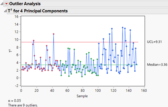
By default, the Outlier Analysis report displays the T2 for <A> Principal Components plot. The plot shows the T2 value for each observation and horizontal lines at the Median and Upper Control Limit (UCL). For more information about how the T2 values, median, and UCL are calculated, see Calculations for Outlier Analysis.
The α level used to calculate the UCL is displayed below the plot. The number of outliers detected is also shown. This number is the number of observations with T2 values that are greater than the UCL.
Tip: Place your cursor over a point in the T2 Plot to view the T2 Contribution Proportion Plot for that observation. Click the T2 Contribution Proportion Plot to add it to the report window.
Outlier Analysis Report Options
T2 Plot
Shows or hides the T2 plot. On by default.
Contribution Heat Map
Shows or hides a heat map of the T2 contribution values for all observations.
Contribution Proportions Heat Map
Shows or hides a heat map of the T2 contribution values for all observations expressed as a proportion of the individual row’s T2. The proportions for an individual row are obtained by computing the square of the contribution and dividing by the sum of the squares of all contributions for that individual row.
Contribution Plots for Selected Samples
(Available only if one or more points is selected in the T2 plot.) Shows a report with a T2 contribution plot for each selected sample. A T2 contribution plot shows the contribution of each variable to the sample’s T2 statistic. For more information about how the contributions are calculated, see Calculations for Outlier Analysis. Use contribution plots to investigate outliers. The variables with the largest positive or negative contributions are those that contribute most to a sample having a large T2 value. See Contribution Plots Report Options for information on red triangle menu options.
Contribution Proportion Plots for Selected Samples
(Available only if one or more points is selected in the T2 plot.) Shows a report with a T2 contribution proportion plot for each selected sample. A T2 contribution proportion plot shows the contribution values for the selected observations expressed as a proportion of the individual row’s T2. This is a different presentation of the information found in the Contribution Proportions Heat Map. See Contribution Plots Report Options for information on red triangle menu options.
Mean Contribution Proportion Plots for Selected Samples
(Available only if two or more points are selected in the T2 plot.) Shows a report with a T2 contribution proportion plot. This plot shows the mean contribution value for the selected observations expressed as a proportion of the mean T2 value for the selected observations. For each variable, the mean proportions are obtained by computing the mean of the squared contributions and dividing by the mean of the sum of squares (for the selected observations).
Normalized DModX Plot
(Available only when the number of components is less than the number of variables.) Shows or hides a plot of the Normalized DModX values. DModX values are useful for detecting moderate outliers in the data.
Number of Components
Enables you to specify the number of principal components used in the T2 and T2 contribution statistics. When you change the number of components, the T2 plot, heap map, and normalized DModX plot automatically update.
Set α level
Enables you to specify the α level.
Save T2
Saves the T2 values to a new column in the data table.
Save Contributions
Saves the T2 Contributions to new columns in the data table. There is one column for each Y variable.
Save Normalized DModX
(Available only when the number of components is less than the number of variables.) Saves the normalized DModX values to a new column in the data table.
Contribution Plots Report Options
The T2 Contribution Plots for Selected Samples, T2 Contribution Proportion Plots for Selected Samples, and T2 Mean Contribution Proportion Plots for Selected Samples contain the following red triangle menu options.
Remove Plot
Removes the contribution plot from the report.
Bar Label
Displays a submenu of options to label the bars in the contribution plot. The label options are No Label, Label by Value, and Label by Column.
Control Charts for Selected Items
(Available only if one or more bar segments are selected in the contribution plot.) Opens a Control Chart Builder window, with control chart results for each of the selected processes and groups.
Tip: You can also view the control chart by placing your cursor over a bar segment in a contribution plot. Click the control chart to open the Control Chart Builder window.