Overlay Plots
Like scatterplots, overlay plots show the relationship between two or more variables. However, if one of the variables is a time variable, an overlay plot shows trends across time better than scatterplots do.
Figure 4.31 Example of an Overlay Plot
Note: To plot data over time, you can also use bubble plots, control charts, and variability charts. For more information about Graph Builder and bubble plots, see Graph Builder in Essential Graphing. See Control Chart Builder and Variability Gauge Charts in Quality and Process Methods for information about control charts and variability charts.
Scenario
This example uses the Stock Prices.jmp data table, which contains data on the price of a stock over a three-month period.
A potential investor wants to explore the following questions:
• Has the stock’s closing price changed over the past three months?
To answer this question, use an overlay plot of the stock’s closing price over time.
• How do the stock’s high and low prices relate to each other?
To answer this question, use another overlay plot of the stock’s high and low prices over time.
Create the first overlay plot to answer the first question, and then create a second overlay plot to answer the second question.
Create the Overlay Plot of the Stock’s Price over Time
1. Select Help > Sample Data Library and open Stock Prices.jmp.
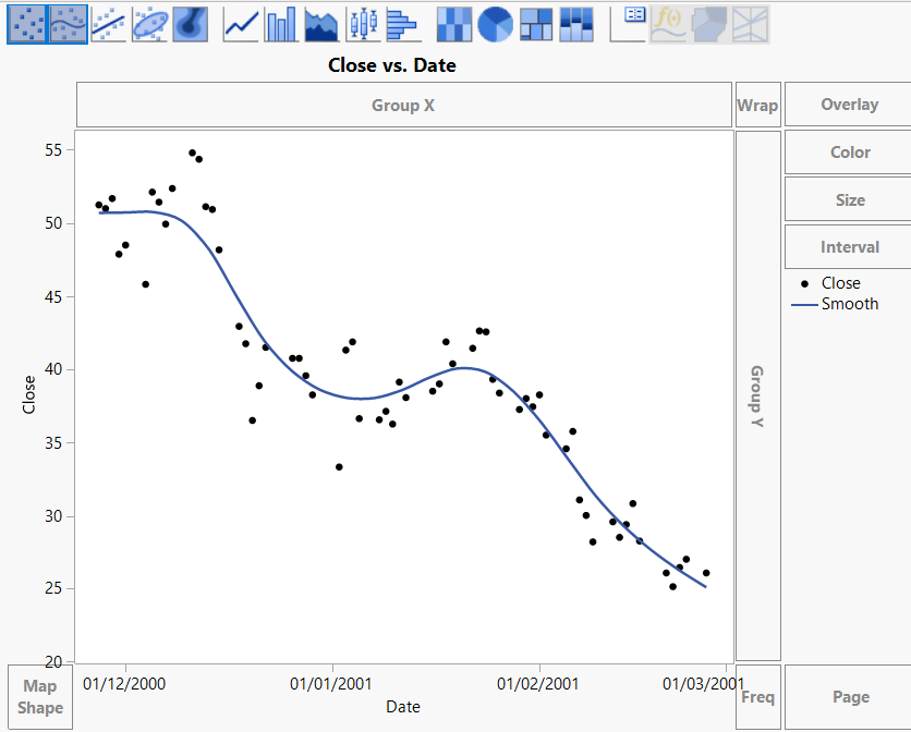
2. Select Graph > Graph Builder.
3. Select Close and click Y.
4. Select Date and click X.
Figure 4.32 Overlay Plot with Smoother
5. Hold down the Control key and click the Smoother icon  above the graph to remove the smoother line.
Figure 4.33 Overlay Plot of the Closing Price over Time
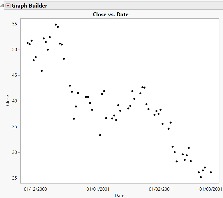
Interpret and Interact with the Overlay Plot
The overlay plot shows that the closing stock price has been decreasing over the last several months. To see the trend more clearly, connect the points.
1. Hold down the Shift key and click the Line icon ![]() above the graph.
above the graph.
Figure 4.34 Connected Points
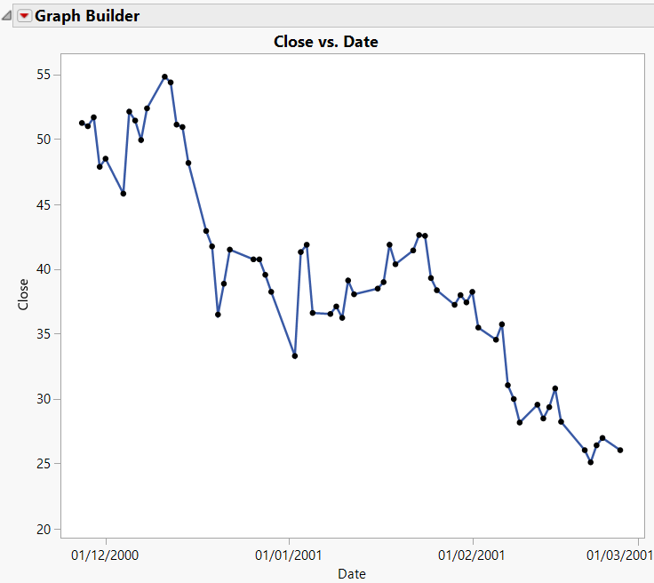
The potential investor can see that although the stock price has gone up and down over the past three months, the overall trend has been downward.
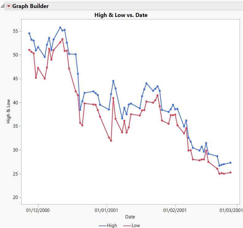
Create the Overlay Plot of the Stock’s High and Low Prices
Use an overlay plot to plot more than one Y variable. For example, suppose that you want to see both the high and the low prices on the same plot.
1. Follow the steps in Create the Overlay Plot of the Stock’s Price over Time, this time assigning both High and Low to the Y role.
2. Connect the points and add grid lines as shown in Interpret and Interact with the Overlay Plot.
Figure 4.35 Two Y Variables
The legend at the bottom of the plot shows the colors and markers used for the High and Low variables in the graph. The overlay plot shows that the High price and Low price track each other very closely.
Answer the Questions
Both of the overlay plots answer the two questions asked at the beginning of this example.
• The first plot shows that the price of this stock has not remained the same, but has been decreasing.
• The second plot shows that the high and low prices of this stock are not very different from each other. The stock price does not vary wildly on any given day.