The Variability Gauge Chart
The variability chart and the standard deviation chart show patterns of variation. You can use these charts to identify possible groups of variation (within subgroups, between subgroups, over time). If you notice that any of these sources of variation are large, you can then work to reduce the variation for that source.
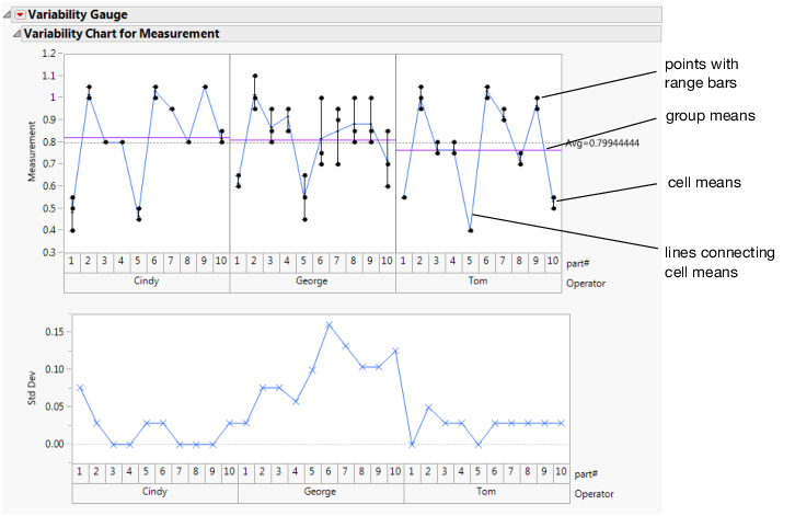
Follow the instructions in Example of a Variability Chart to produce the results shown in Figure 5.4.
Figure 5.4 Variability Gauge Chart
The charts show the response on the y-axis and a multilevel, categorized x-axis.
In Figure 5.4, the Measurement chart shows the range of measurements for each operator by part. Each measurement appears on the chart. Maximum and minimum bars indicate the range of values for each cell, and a cell means bar indicates the median value for each combination of values. The Std Dev chart plots the standard deviation of the measurements taken on each part by operator.
You can add features to the charts, as illustrated in Figure 5.4. See Variability Gauge Platform Options.
To replace variables in charts, do one of the following:
• Swap existing variables by dragging a variable from one axis label to the other axis label. When you drag a variable over a chart or click an axis label, the axis labels are highlighted. This indicates where to drop the variable.
• Click a variable in the Columns panel of the associated data table and drag it onto an axis label.
In other platforms, rows that are excluded in the associated data table still appear on the charts or plots. However, in variability charts, excluded rows do not appear on the charts.