Customize Axes and Axis Labels in the Axis Settings Window
Double-click a numeric axis to customize it using the Axis Settings window. Or, right-click the axis area and select Axis Settings to access the window.
Note: In the Graph Builder and Distribution platforms, you can also customize nominal axes using the Axis Settings window.
Customization features in the window depend on the data type of the axis and the specific platform JMP uses to create the plot or chart. Figure 9.26 shows a typical Axis Settings window for numeric (continuous) axes.
Figure 9.26 Axis Settings Window for a Numeric (Continuous) Axis
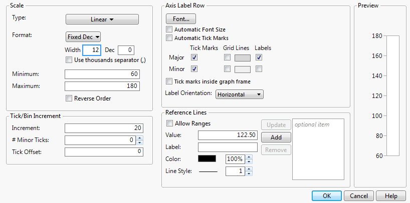
The Axis Settings window contains the following panels:
• Scale
• The Preview panel shows how your current selections will appear on the axis.
Scale
In the Scale panel, you can do the following:
• Change the Numeric Format of an Axis
• Establish Minimum and Maximum Axis Values
Change the Axis Scale Type
When viewing a graph with a numeric axis, you can change the axis scale to one of the following types:
• Linear
• Log
• Power
• Geodesic
• Geodesic US
• Probability Scales (Normal, Weibull, Fréchet, Logistic, Exponential, Gamma, Beta, and Mixtures)
Notes:
• Specific platforms might use other scale types that are fixed and cannot be changed. For example, Destructive Degradation, Degradation, and the X axis in Fit Y by X scatterplots use custom scales. Do not change the scale in these graphs through the Axis Settings window.
• If you selected a scale type of Log, enter the Base to use.
• If you selected a scale type of Power, enter the Power to use.
To set a default scale type for a variable, which avoids making this change every time you run an analysis, see Axis in the The Column Info Window section.
Change the Numeric Format of an Axis
For plots and charts that contain a numeric axis area, you can change the format of the axis. For more information about numeric formats, see Numeric Formats in the The Column Info Window section.
Notes:
• If you selected Date, Time, or Duration, you need to specify the format of the increments. See Add and Remove Axis Labels. You can also specify label row nesting. See Label Row Nesting.
• If you selected Fixed Dec, enter the number of decimal places that you want JMP to display in the Dec box.
• If you selected Precision, select whether you want to keep trailing zeros and all whole digits.
• To add commas to values that equal a thousand or more, select the Use thousands separator option. You must account a space for each comma in the Width box, or else they might not appear. This option is available for the Best, Fixed Dec, Percent, and Currency formats.
• For a numeric axis, you can adjust the width of the tick mark labels using the Width box.
Note: When you change the numeric format of an axis, you do not change the numeric format of the way the values appear in the corresponding data table. To change how a date or time appears in a data table, see Numeric Formats in the The Column Info Window section.
Selecting a date interval from the date increment drop-down menu divides the JMP date (number of seconds) into the appropriate units. This gives the plot scale that you want for your data. The date axis must be a column with a JMP date value and appear in the Axis Settings window in the date format found in the Column Info window. However, you can use the Axis Settings window to format the date’s appearance in the plot.
Establish Minimum and Maximum Axis Values
For plots and charts that contain a numeric axis area, you can change the minimum and maximum values that you want the graph to display.
Note the following:
• To restore the default minimum and maximum axis settings of a numeric axis, right-click a numeric axis and select Revert Axis.
• Select Reverse Order to reverse the axes by reversing the minimum and maximum values. Note that this option is not supported for ternary plots.
Tip: To set a default minimum and maximum axis value for a variable, which avoids making this change every time you run an analysis, see Axis in the The Column Info Window section.
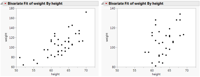
The example on the right in Figure 9.27 is an enlargement of the point cluster that shows between 80 and 140 in the plot to the left. The enlarged plot is obtained by reassigning the maximum and minimum axis values.
Figure 9.27 Rescale Axis to Enlarge a Plot Section
Tick/Bin Increment
In the Tick/Bin Increment panel, you can do the following:
Change Axis Increments
While viewing a graph, you can change the axis increments.
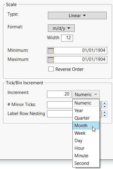
If the axis Format is set to Date, Time, or Duration, a format menu appears beside Increment (Figure 9.28). Select which format you want the increments to take.
Figure 9.28 Selecting the Format for Date and Time Increments
Tip: To set a default axis increment for a variable, which avoids making this change every time you run an analysis, see Axis in the The Column Info Window section.
Add Minor Tick Marks
You can add tick marks to a numeric axis, or change the number of minor tick marks that appear on a numeric axis. In the Axis Label Row panel, be sure to select the Minor Tick Marks box so that the tick marks appear on the axis.
Tip: To set default minor tick marks for a variable, which avoids making this change every time you run an analysis, see Axis in the The Column Info Window section.
Change the Tick Offset
To change the starting point of the tick marks, enter a number in the Tick Offset box. For example, if the Tick Offset is currently set to 0, setting it to 1 will move all the values on the axes up by 1.
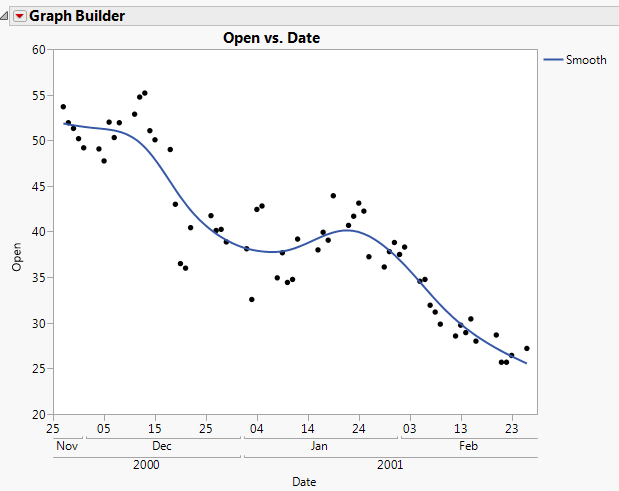
Label Row Nesting
This option appears only if you have selected Date, Time, or Duration as the axis Format. Label row nesting enables you to split a date axis into multiple rows based on the format. For example, you might put the year on the outermost row, then the month, then the day:
1. Select Help > Sample Data Library and open Stock Prices.jmp.
2. Select Graph > Graph Builder.
3. Drag Date into the X zone.
4. Drag Open into the Y zone.
5. Double-click the X axis.
6. For Format, select Date > ddMonyyyy.
7. Increase the value for Label Row Nesting to 3.
8. Click OK.
9. Click Done to see the finished graph.
Figure 9.29 Example of Label Row Nesting
Axis Label Row
In the Axis Label Row panel, you can do the following:
• Add Tick Marks, Grid Lines, or Labels
• Change the Orientation for Tick Labels
Note: In Graph Builder, if you have nested labels in an axis, tabs appear in the Axis Label Row panel. You can modify each row of labels separately in its own tab.
Change Axis Label Font
You can modify the axis label font on any axis type. Your changes only apply to the active graph. To set the default axis label font, see Fonts in the JMP Preferences section.
Note: Windows 7 does not support the Adobe Compact Font Format (CFF). As a result, JMP cannot render axis labels using CFF fonts (like certain OpenType fonts). Windows 8 supports CFF fonts. Therefore, JMP correctly renders axis labels using CFF fonts.
To change the current font type and size, perform one of the following steps:
• Right-click an axis label and select Font
or
• Right-click an axis and select Axis Settings. Click Font.
Notes:
• To change the font color, right-click an axis label and select Font Color.
• Select Automatic Font Size to have JMP attempt to decrease the font size (down to a certain minimum) if all of the labels cannot fit at the default size.
Add Tick Marks, Grid Lines, or Labels
These options can vary depending on whether your axis is continuous or categorical. Figure 9.30 shows axis settings for a categorical axis. Figure 9.26 shows axis settings for a continuous axis.
Note: Remember that the Axis Settings window is available only for categorical axes in Graph Builder and Distribution.
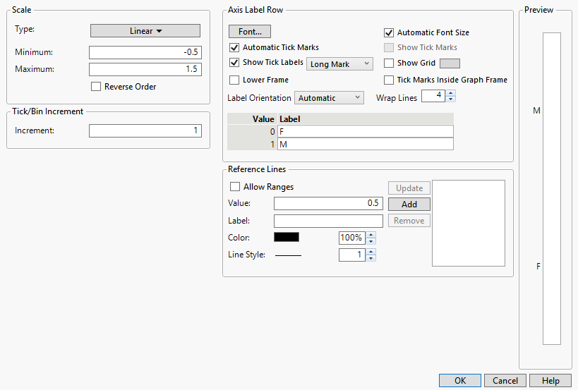
Figure 9.30 Axis Label Row for a Categorical Axis
Options for continuous axes:
• Select Automatic Tick Marks to turn on tick marks only if one or more labels are hidden (due to insufficient space).
• Add major or minor tick marks, grid lines, or labels, by selecting the corresponding check boxes.
• Click the color box to change the color of grid lines.
• Select Tick Marks Inside Graph Frame to move the tick marks inside the graph.
Options for categorical axes:
• The default is to not show tick marks if all of the labels are visible. To add tick marks, select Show Tick Labels. Change the tick mark style by selecting one of the options.
• Select Automatic Tick Marks to turn on tick marks only if one or more labels is hidden (due to insufficient space).
• Add grid lines by selecting Show Grid.
• Click the color box to change the color of grid lines.
• Select Tick Marks Inside Graph Frame to move the tick marks inside the graph.
• Select Lower Frame to add a frame around the labels.
• Change the number of lines that text wraps.
• Modify the labels by entering different values in the Label boxes.
Tip: To set default tick marks for a variable, which avoids making this change every time you run an analysis, see Properties That Control the Display of Columns in the The Column Info Window section.
Change the Orientation for Tick Labels
To change the orientation for tick labels, select an option from the Label Orientation list.
Automatic
Tick labels are oriented automatically to be readable, depending on the tick increment and length of the labels.
Horizontal
Baseline at the bottom.
Vertical
Vertical with the baseline on the right.
Perpendicular
Horizontal for vertical axes and vertical for horizontal axes.
Note: Parallel and Perpendicular are useful with paired axes, like in Multivariate plots.
Parallel
Vertical for vertical axes and horizontal for horizontal axes.
Angled
Angled at about 45 degrees.
Reference Lines
To add references lines to graphs, proceed as follows:
1. Double-click a numeric axis. Or, right-click a numeric axis and select Axis Settings.
2. In the Value text box, enter the value to which you want the reference line to correspond. This is the position on the graph at which the line is placed.
Note: If you opened the Axis Setting window by double-clicking on the graph, the default value corresponds to the point on the graph that you clicked.
3. Enter a Label for the line.
4. You can further customize the reference line by choosing either of these options:
Allow Ranges
Enables you to enter a minimum and a maximum value, which define the beginning and the end of the reference line. The reference line appears over a range of data.
Color
Changes the line color. You can also specify the opacity.
Line Style
Specifies the line style (when Allow Ranges is not selected). You can also specify the line width.
5. Click Add. The value moves into the box to the right of the Add button, indicating that it will be placed on the graph. Your changes appear in the Preview window.
6. To add more lines, repeat the above steps.
7. To modify an existing reference line, make your changes, and then click Update.
Tip: To set a default reference line for a variable, which avoids making this change every time you run an analysis, see Properties That Control the Display of Columns in the The Column Info Window section.