Histogram
The Histogram element ![]() shows a variable’s distribution using binning. For more information about histograms, see Histograms in Basic Analysis.
shows a variable’s distribution using binning. For more information about histograms, see Histograms in Basic Analysis.
Note: The bars of the histogram align with the tick marks on the axis for the zone containing the variable. If you customize the axis, the histogram adjusts to match the new tick marks.
You can change the primary direction of the graph to X (horizontal), Y (vertical), or Auto using the Response Axis option.
• If both variables are nominal or ordinal, the histogram shows the count of observations in a level of the variable on the axis that is not specified as the Response Axis.
• If one of the variables is continuous and the other is nominal or ordinal, the plot shows a histogram for the continuous variable for each level of the categorical variable.
• If the same variable is specified for both X and Y, then the Y role is ignored and a single histogram appears.
• If both variables are continuous, then the variable on the X axis is treated as discrete. You might need to rescale the X axis to view the graph clearly. For an alternative visual, use a scatterplot with the Contour element.
Tip: You can overlay histograms with transparent color so that you can see the individual histograms. To do this, assign the variable of interest as X or Y. Assign your overlay variable to the Overlay zone. Then, click the Histogram element icon. See Example of an Overlaid Histogram and Ridgeline Chart.
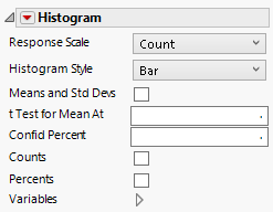
Figure 3.34 Histogram Options
Response Scale
Specifies the scale for the response axis. The options are count, percent, or fill. Fill has no response axis label, fills the display space, and scales multiple histograms independently.
Overlap
(Available with a categorical response.) Adjusts the amount of histogram overlap between vertical categories.
Histogram Style
Specifies the histogram style.
Bar
Default traditional histogram bars with a height based on the number or percent of observations that fall within each bar or bin.
Polygon
Connects the peaks of each histogram bar to construct a polygon representation of the distribution of the data.
Kernel Density
Density curve with a smoother control.
Shadowgram
Overlays histograms with different bin widths.
Means and Std Devs
Shows the means and standard deviations for the levels of the variables in the X or Y zone.
t Test for Mean At
Performs a t test for the specified mean.
Confid Percent
Specifies the confidence interval for the mean.
Counts
Displays counts on the histogram bars.
Percents
Displays percents on the histogram bars.
Variables
Shows or hides graph elements for variables, or re-orders the display of variables.
Note: These options do not apply to variables in the Group X, Group Y, Wrap, or Page zones.
Check boxes are followed by the zone designation and the name of the variable. Use check boxes to do the following:
– Show or hide the elements corresponding to a variable in a zone.
– Add or remove the effect of applying the Color, Size, Shape, or Freq variable to the variable in the zone.
Tip: If you have multiple graphs, you can color or size each graph by different variables. Drag a second variable to the Color or Size zone, and drop it in a corner. In the Variables option, select the specific color or size variable to apply to each graph.
Use arrows to re-order the display if there are multiple variables in a zone. Highlight a variable name and click an arrow to reposition it.
For an example using Variables, see Example of an Area and Line Chart.
Red Triangle Option for Histogram
Response Axis
Specifies the axis for the variable that is used as the response in constructing the histograms. Available only when both variables have a Continuous modeling type. If only one variable is Continuous, the other axis is the response axis.
