The Multivariate Control Chart
Use the multivariate control chart to quickly identify shifts in your process and to monitor your process for special cause indications.
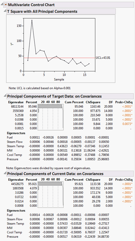
Follow the instructions in Example of a Multivariate Control Chart to produce the results shown in Figure 10.6.
Figure 10.6 Multivariate Control Chart
Tip: For information about additional options, see Multivariate Control Chart Platform Options.
The multivariate control chart plots Hotelling’s T2 statistic. The calculation for the control limit differs based on whether targets have been specified. To understand how the T2 statistic and the UCL (Upper Control Limit) are calculated, see Statistical Details for Multivariate Control Charts. For more information about control limits, see Tracy et al. (1992).
In this example, the Principal Components reports for both data sets indicate that the first eigenvalue, corresponding to the first principal component, explains about 95% of the total variation in the variables. The values in both Eigenvectors tables indicate that the first principal component is driven primarily by the variables Fuel and Steam Flow. You can use this information to construct a potentially more sensitive control chart based only on this first component. For more information about the Principal Components reports, see Principal Components.
