Predictive Modeling
The statistical models described previously are useful for identifying markers associated with genetic effects on the expression of desired traits in an observed population. However, all models above fit the effect of just one SNP at the time. If the goal is to build a predictive model that captures the effects of all SNPs at once, we need to fit more complex models. Predictive modeling tools in JMP can help test and compare a variety of these models.
Once competing models have been built, their respective prediction formula can be saved to new column formulas, and then compared with the target response observed values using correlation plots.
Sample Data
The genotype data used in this chapter is from a genome-wide association study of trait and genotype data from rice (Oryza sativa) cultivars by Zhao, et al., 20111. The data was kindly provided by the authors, opened in JMP, and saved as the rice_diversity1.jmp table shown below.
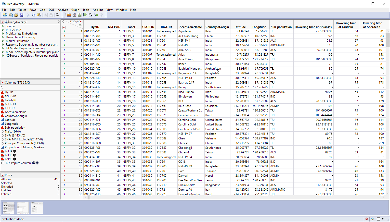
This table is a wide![]() A data table in which variables are columns and samples are rows. table with 413 samples in rows and 37365 columns listing annotation, trait and genotype data. The 34454 genotype columns are collected into a group named SNPs, for convenience. The 413 individual hybrids used in this study were from multiple countries and grown at different sites throughout the world. Thirty-six traits were assessed in the study. in this example, we analyze for only one: panicle number per plant. The SNP genotypes are numerically encoded with 2 designating individuals homozygous for the less common allele, 0 representing individuals homozygous for the most common allele, and 1 representing the heterozygotes.
A data table in which variables are columns and samples are rows. table with 413 samples in rows and 37365 columns listing annotation, trait and genotype data. The 34454 genotype columns are collected into a group named SNPs, for convenience. The 413 individual hybrids used in this study were from multiple countries and grown at different sites throughout the world. Thirty-six traits were assessed in the study. in this example, we analyze for only one: panicle number per plant. The SNP genotypes are numerically encoded with 2 designating individuals homozygous for the less common allele, 0 representing individuals homozygous for the most common allele, and 1 representing the heterozygotes.
We can use the rice_diversity1.jmp table, for the predictive models, with some modifications.
First, we imputed all missing values in the marker columns, as described in Missing Values. We then performed a principal components analysis (PCA), as described in Principal Component Analysis, on all of the markers and saved the top 150 principal component columns to the data table and grouped into Principal Components.
Second, we created an 80:20 training and validation split column with training rows as a 0 and validation rows as a 1. For the target response, we created a new column that copies it but sets the validation rows to missing. This column was named Panicle number per plant for Training.
The modified data set was saved as the rice_diversity2_imputedFinal.jmp table. This table was used for the following examples.
Fit Model, Mixed Model Personality
When your objective becomes prediction, as opposed to large-scale statistical association testing as discussed in Statistical Modeling, the Mixed Model personality can also fit a variety of standard mixed models.
| 8 | Click Analyze > Fit Model. |
| 8 | Select Mixed Model as the personality. |
| 8 | Select thePanicle number per plant for Training column as the Y. |
| 8 | Select the Principal Components group and click to add the group to the Random Effects pane. |
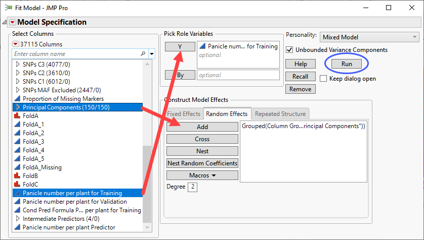
| 8 | Click . |
The following report is generated:
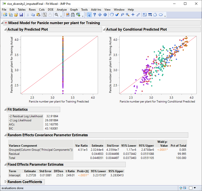
The plot on the right plots the actual number of panicles by the predicted number of panicles by the model in the training data. The observation that the points fall approximately along the diagonal suggests that this model does a reasonably good job of predicting the influence of the marker genotypes on the number of panicles per plant in the training set.
XGBoost
XGBoost
For general prediction problems, the XGBoost Add-in is a powerful and flexible gradient boosted tree platform that will often outperform other methods.
Note: The XGBoost add-in must be downloaded from the JMP Community site and installed before you can run this analysis.
| 8 | Click Add-Ins> XGBoost. |
| 8 | Select the Panicle Number per plant column as the Y, Response. |
| 8 | Select the Principal Components group as the X, Factor. |
| 8 | Select FoldA_1 as the Validation. |
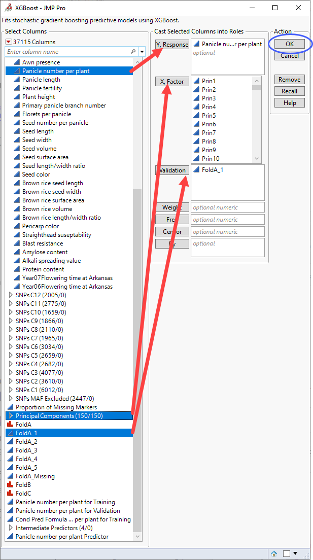
| 8 | Click . |
The following report is generated:
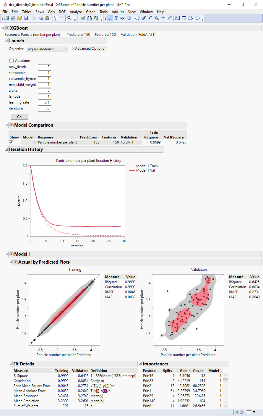
The plots at the bottom of the report plot the actual number of panicles by the number predicted by the model for both the training and the validation data. The observation that the points fall approximately alongthe diagonal suggests that this model does a reasonably good job of predicting the influence of the marker genotypes on the number of panicles per plant. As expected, the predictions are much better in the training than in the validation set.
Comparing the Predictive Models
Although both models do pretty well predicting the response, which one is better? To finally decide which mode model is better, we need to compare how good their predictions are in the validation set.
Both models were built and their respective prediction formula were saved to new column formulas, and then used to compare the target response observed values using correlation plots of the validation rows only. Based on the 80:20 training and validation split column that we created for the Fit Model, Mixed Model (see previous description), for the target response, we created a new column that copies it but sets the training rows to missing. This column was named Panicle number per plant for Validation.
The columns used for the comparison are as follows:
| • | Panicle number per plant for Validation - This column contains the observed number of panicles per plant for each of the cultivars in the study. |
| • | Conditional Pred Formula Panicle number per plant for Training - This column contains the number of panicles per plant predicted by the Mixed Model for each of the cultivars in the study. |
| • | Panicle number per plant Predictor - This column contains the number of panicles per plant predicted by XGBoost for each of the cultivars in the study. |
| 8 | Click Analyze > Multivariate Methods > Multivariate. |
| 8 | Select thePanicle number per plant, Conditional Pred Formula Panicle number per plant for Cross Validation, and Panicle number per plant Predictor columns as the Y, Columns. |
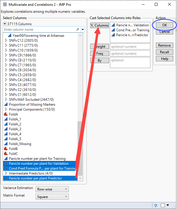
| 8 | Click . |
The following report is generated:
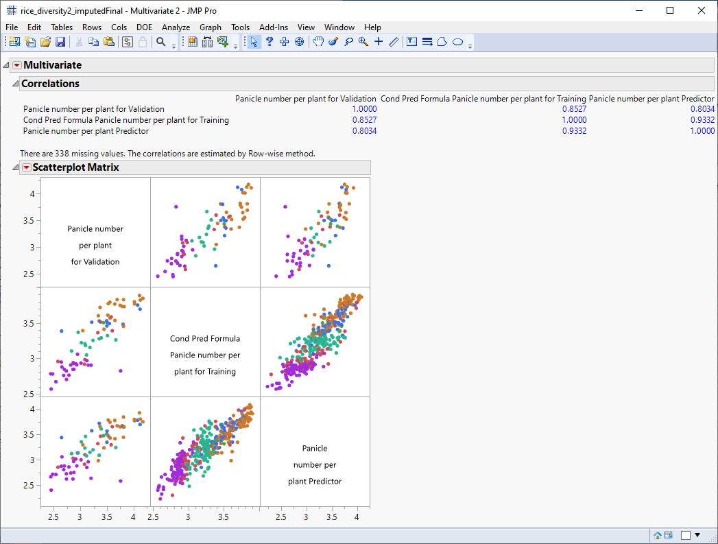
The scatterplot matrix shows strong correlation between the observed number of panicles and the predicted numbers from both models. All of the correlations are above 0.8. For example, the correlation coefficient for the predictors from the mixed model and XGBoost is 0.9332 (column 3, row 2 of the Correlation table).
To answer the question asked at the beginning of this section: Yes, markers identified here, can be used to predict expression of at least one trait in rice.