Findings Time Trends
This report enables you to visualize findings measurements across the time line of the study.
Report Results Description
Running Findings Time Trends with the Nicardipine sample setting and LB findings domain generates the report shown below.
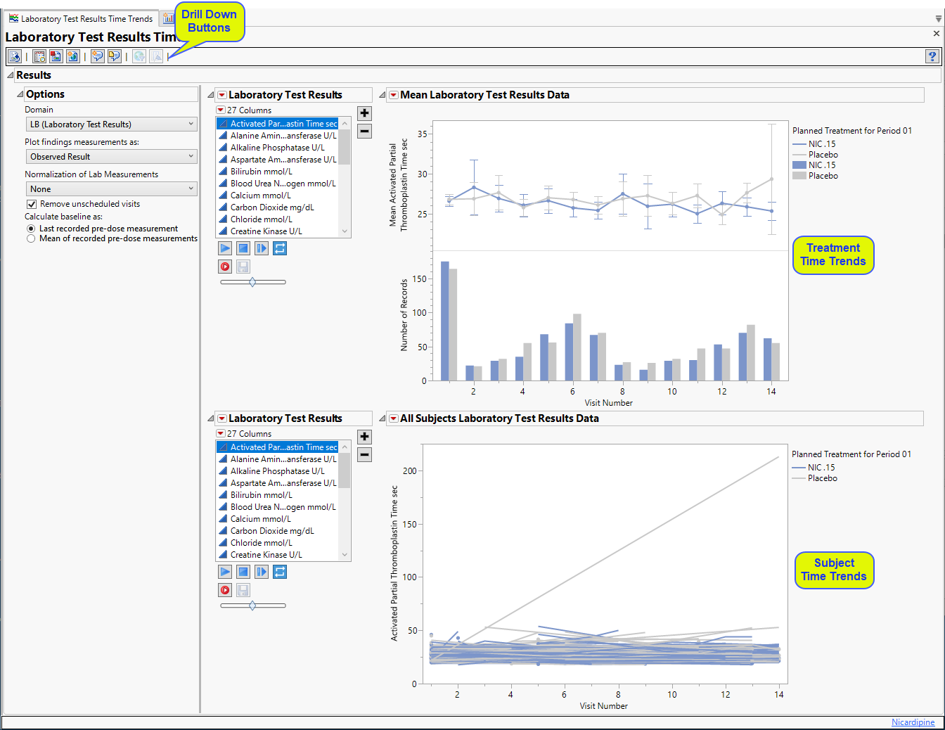
The Report contains the following sections:
Treatment Time Trends
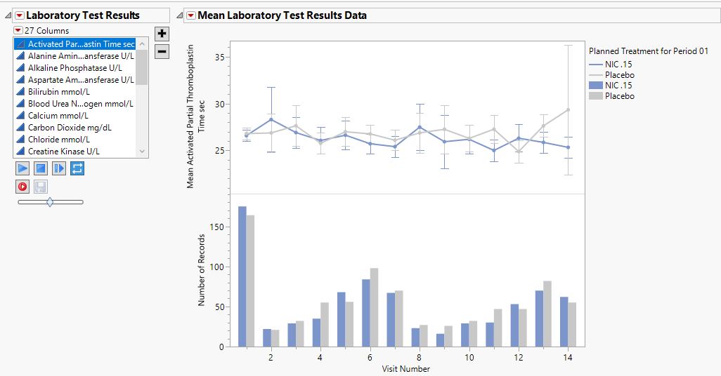
Shows a plot for each quantitative findings test (for example, laboratory) in the Findings data set that was analyzed. Use the filter at left to select the finding plot to view. Each plot contains a line for each treatment group representing the average measurements taken across time.
The Treatment Time Trends section contains the following elements:
| • | A set of Treatment Level Time Trend Plots |
If findings test category (xxCAT) exists (where xx represents the two-letter domain abbreviation -- for example, LB), these plots are first ordered by xxCAT. Next, if findings test subcategory (xxSCAT) exists, plots are secondarily ordered by xxSCAT. If xxCAT is missing, plots are ordered by test short name (xxTESTCD), which is required. Findings tests with a missing xxCAT value are assigned to the “OTHER” category.
Note: Findings tests with a missing numeric result (xxSTRESN), as well as those taken on only one day, are excluded from these plots.
Tip: You can collapse categories (and simultaneously exclude them from any report that you create) by clicking on the gray triangles located to the left of the category labels.
Each plot displays the means of the measurements taken across time for each treatment arm in a study for a quantitative findings test. The value of xxTEST (where xx represents the two-letter domain abbreviation -- for example, LB) is displayed in the outline box for each plot, and the test short name (xxTESTCD) is displayed along with the measurement units (where applicable) on the Y axis. The Y axis can represent the observed test result, the change from baseline, percent change from baseline, or percent of baseline, depending on the selection made for the Plot findings measurements as: parameter on the report dialog. Time, as either Study Day, Study Week, or Visit, is plotted on the X axis (according to yourTime Scale selection). Time trend lines connect the points of measurement; each marker point represents the average findings measurement for subjects belonging to that treatment arm at the measured time point.
The Y axis can optionally be displayed with log scaling (this is very useful for interpreting laboratory findings). In addition, you can choose to compute and show standard error bars at each measured time point for each treatment group. These standard error bars can be helpful in visualizing significantly different measurements for a findings test at certain time points. Note that standard error calculations depend heavily on the number of measured subjects at a specific time point. These plotting options are found on the Output tab of the report dialog.
The time trend lines are interactive. Selecting a line selects all subjects belonging to the treatment group the selected line represents. You can then use the down buttons to profile, cluster, or show these subjects or to create a subject filter to do further analysis only with the selection of subjects. Selecting a treatment time trend line also selects and highlights all the individuals' subject time trend lines on the accompanying Subject Time Trends section that is part of the output from this report.
| • | Associated Bar Charts showing the number of subjects in each treatment group at each visit. |
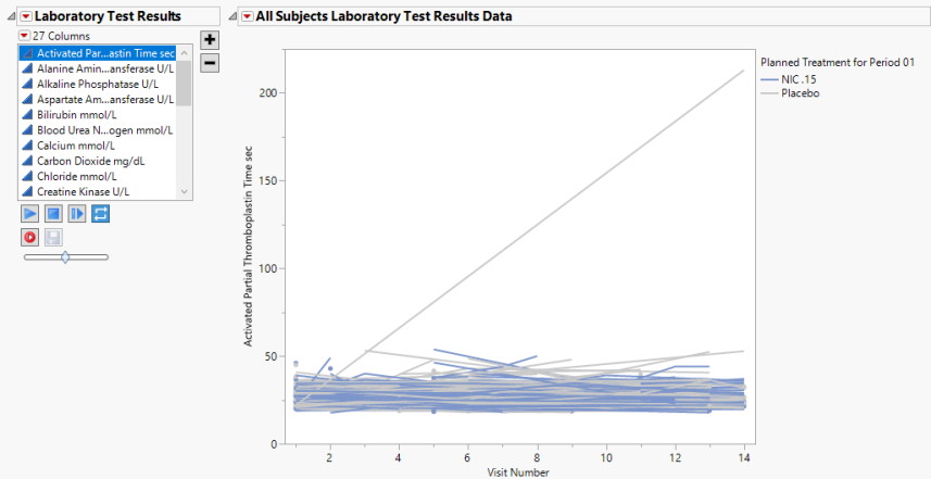
Subject Time Trends
Shows a plot for each quantitative findings test (for example, laboratory) in the Findings data set that was analyzed. Use the filter at left to select the finding plot to view. Each plot contains a line for each subject in the study representing the patient's measurements taken across time.
This section contains the following elements:
| • | A set of Subject Level Time Trends Plots also known as spaghetti plots |
If findings test category (xxCAT) exists (where xx represents the two-letter domain abbreviation -- for example, LB), these plots are first ordered by xxCAT. Next, if findings test subcategory (xxSCAT) exists, plots are secondarily ordered by xxSCAT. If xxCAT is missing, plots are ordered by test short name (xxTESTCD), which is required. Findings tests with a missing xxCAT value are assigned to the “OTHER” category.
Note: Findings tests with a missing numeric result (xxSTRESN), as well as those taken on only one day, are excluded from these plots.
Tip: You can collapse categories (and simultaneously exclude them from any report that you create) by clicking on the gray triangles located to the left of the category labels.
Each plot displays the measurements taken across time for each subject in a study for a quantitative findings test. The value of xxTEST is displayed in the outline box for each plot and the test short name (xxTESTCD) is displayed along with the measurement units (where applicable) on the Y axis. The Y axis can represent the observed test result, the change from baseline, percent change from baseline, or percent of baseline, depending on the selection made for the Plot findings measurements as: parameter on the report dialog. Time, as either Study Day, Study Week, or Visit, is plotted on the X axis (according to yourTime Scale selection). Time trend lines connect the points of measurement; each marker point represents the findings measurement for each subject at the measured time point. If multiple measurements were taken for a subject on the same Study Day, Study Week, or Visit, the point represents the mean measurement for that subject.
The Y axis can optionally be displayed with log scaling (this is very useful for interpreting laboratory findings). For the LB domain, you can also choose to draw reference limits by checking the Show ULN and LLN reference lines for lab tests option on the dialog. If there are multiple reference limits for a lab test, the maximum ULN (as measured by LBSTNRHI) and the minimum LLN (LBSTNRLO) are displayed.
Options
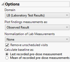
Domain
Use this widget to specify whether to plot the distribution of measurements from either the Electrocardiogram (EG), Laboratory (LB), or Vital Signs (VS) findings domains.
Plot findings measurements as:
Use this widget to specify whether to plot the results either as observed or how they relate to the baseline measurement. Refer to Plot findings measurements as: for more information.
Normalization of Lab Measurements
Use this widget to select a normalization to be applied to the baseline and on-therapy measurements. Refer to Normalization of Lab Measurements for more information.
By default, JMP Clinical reports unaltered laboratory measurement values. In any cases, simply examining the raw numbers can make interpretation somewhat confusing. Normalization of Lab Measurements to accepted values can often ease these difficulties. JMP Clinical offers three options for normalizing your data.
Selecting LLN normalizes the data to the lower limit of the expected normal range and is best used when you expect the values to fall below the normal. Normalized values less than one are considered to be lower than normal.
Selecting ULN normalizes the data to the upper limit of the expected normal range and is best used when you expect the values to exceed the normal range. Normalized values greater than one are considered to be higher than normal.
Remove unscheduled visits
You might or might not want to include unscheduled visits when you are analyzing findings by visit. Check the Remove unscheduled visits to exclude unscheduled visits.
Calculate baseline as:
Use the Calculate baseline as: widget to use the last recorded pre-dose measurement or the mean of all the measurements taken during the baseline time window as the baseline measurement.
General and Drill Down Buttons
Action buttons, provide you with an easy way to drill down into your data. The following action buttons are generated by this report:
| • | Click  to rerun the report using default settings. to rerun the report using default settings. |
| • | Click  to view the associated data tables. Refer to Show Tables/View Data for more information. to view the associated data tables. Refer to Show Tables/View Data for more information. |
| • | Click  to generate a standardized pdf- or rtf-formatted report containing the plots and charts of selected sections. to generate a standardized pdf- or rtf-formatted report containing the plots and charts of selected sections. |
| • | Click  to generate a JMP Live report. Refer to Create Live Report for more information. to generate a JMP Live report. Refer to Create Live Report for more information. |
| • | Click  to take notes, and store them in a central location. Refer to Add Notes for more information. to take notes, and store them in a central location. Refer to Add Notes for more information. |
| • | Click  to read user-generated notes. Refer to View Notes for more information. to read user-generated notes. Refer to View Notes for more information. |
| • | Click  to open and view the Subject Explorer/Review Subject Filter. to open and view the Subject Explorer/Review Subject Filter. |
| • | Click  to specify Derived Population Flags that enable you to divided the subject population into two distinct groups based on whether they meet very specific criteria. to specify Derived Population Flags that enable you to divided the subject population into two distinct groups based on whether they meet very specific criteria. |
Default Settings
Refer to Set Study Preferences for default Subject Level settings.