Patient Profiles
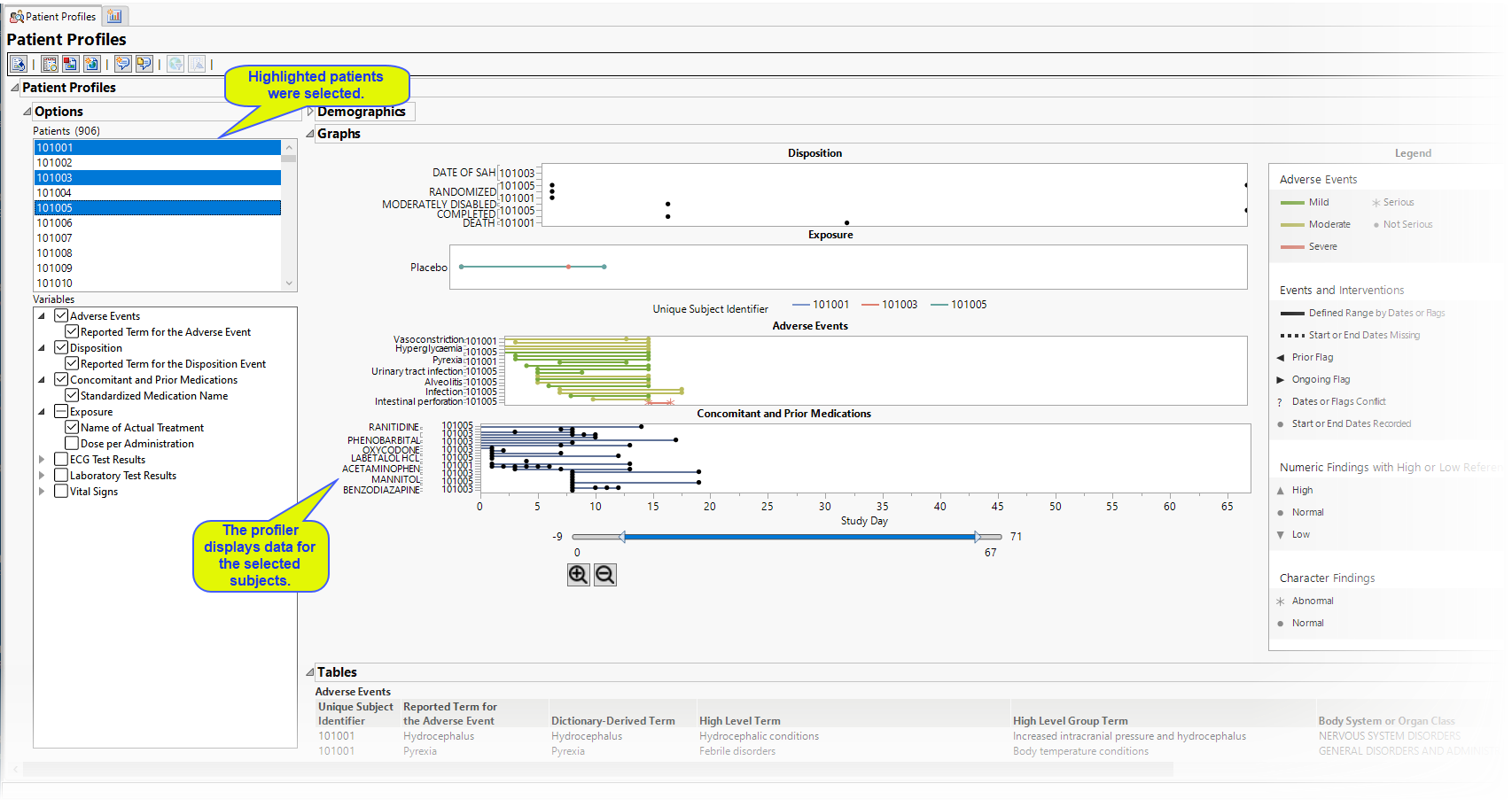
Profiling subjects is a powerful way to view all of the data for the study subjects, enabling you to view their entire history and determine potential causes for unexpected events or findings.
Note: The report initially generates and displays one profile at a time. You can select any one or multiple subjects in the study to profile using the Patients option.
Running this report for the Nicardipine example using default settings generates the Report shown below.
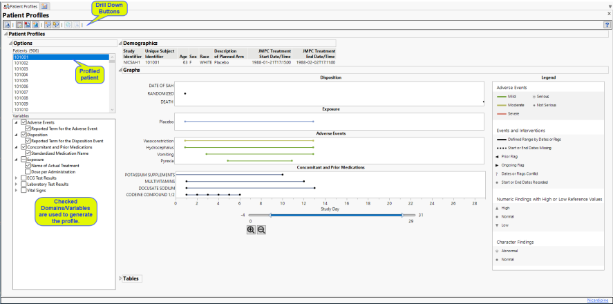
The Patient Profiler window contains the following elements:
Demographics
This table displays a simple table of the basic demographics for the currently profiled patient(s).
.
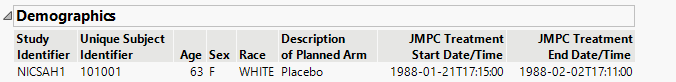
In the example shown here, one patient was profiled.
Graphs
The Graphs tab contains the following elements:
| • | One Subject Profile. |
This is the principal display. Time1 is displayed along the x-axis and data values from selected domains are grouped along the y-axis. When duration information is available, points are joined with a horizontal line.
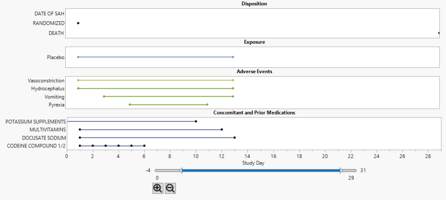
The color and shape of points is domain dependent and is described in the Legend pane.
| • | One Legend. |
This pane describes the colors and symbols used in the primary display.
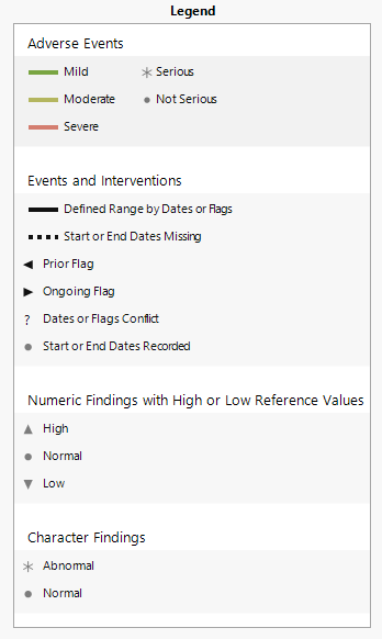
The top panel (shown below) denotes symbols and colors used for adverse events. Blue, green, or red bars indicate that the events are mild, moderate, or severe, respectively, as specified by the values in the SDTM variable aesev
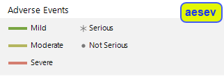
. When you specify aetoxgr instead of aesev in your AE or ADAE domain, the color scale has four levels instead of 3.
Note: For both cases (aesev and aetoxgr) shown above, the colors can be changed at the Study level using the Set Value Order and Color in Studies option.
The asterisk ( ) and filled-circle (
 ), in both cases, indicate whether the condition is serious or not serious, respectively, as specified by the values in the variable aeser.
Note: Serious conditions are generally, but not necessarily, severe.
The middle panel (shown below) denotes line formats and symbols used for dates and times of different events and interventions.
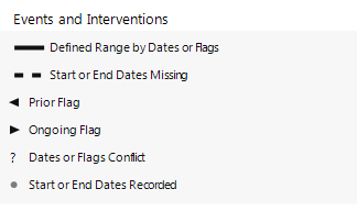
Events or interventions with a defined range are indicated by a solid line spanning the ranges. Events or interventions with unknown start or end dates are indicated by a dashed line. Flagged events are indicated by left (prior) or right (ongoing) arrows. Conflicts are indicated by and question mark2. Start and End dates are denoted by a filled-circle ( ).
).
The bottom panel (shown below) differentiates levels of findings for numeric and character findings.
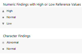
Numeric findings that exceed the specified maximum reference value (also defined as the upper limit of normal or ULN) are indicated by an upward arrow ( ). Findings that fall below the specified minimum reference value (also defined as the lower limit of normal or LLN) are indicated by a downward arrow (
![]() ). Findings between the ULN and LLN are indicated by a filled-circle (
). Findings between the ULN and LLN are indicated by a filled-circle ( ). The normal range is considered to be the median value over all subjects +/- 1.5 x the interquartile range (IQR). Findings falling within that range are are indicated by a filled-circle (
 ).
).
Normal character finding are indicated with a filled circle ( ). Character findings considered abnormal are indicated by an asterisk ( ).
).
Tables
The Tablessection is shown below:
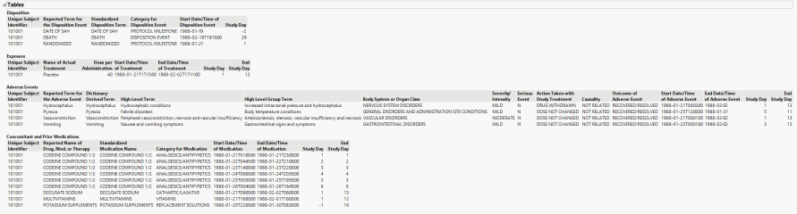
The Tables section lists and summarizes subject-level data for all profiled subjects in tabular form.
Options
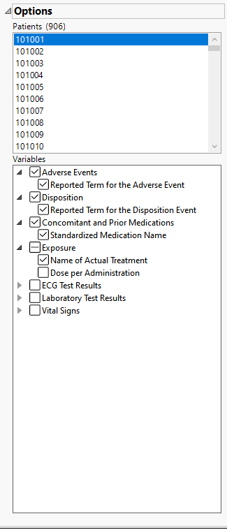
Patients
This widget enables you to select which patients to profile. Hold the Ctrl key to select multiple patients or the Shift key to select contiguous patients among those listed. Shown below is a partial Profile display for three selected patients.
Variables
This widget enables you select the domains and variables to include in your profiles. Click  to expand the domains and display the variables that may be selected. Click within the check boxes to select desired domains and variables.
General and Drill Down Buttons
Action buttons, provide you with an easy way to drill down into your data. The following action buttons are generated by this report:
| • | Click  to rerun the report using default settings. to rerun the report using default settings. |
| • | Click  to view the associated data tables. Refer to Show Tables/View Data for more information. to view the associated data tables. Refer to Show Tables/View Data for more information. |
| • | Click  to generate a standardized pdf- or rtf-formatted report containing the plots and charts of selected sections. to generate a standardized pdf- or rtf-formatted report containing the plots and charts of selected sections. |
| • | Click  to generate a JMP Live report. Refer to Create Live Report for more information. to generate a JMP Live report. Refer to Create Live Report for more information. |
| • | Click  to take notes, and store them in a central location. Refer to Add Notes for more information. to take notes, and store them in a central location. Refer to Add Notes for more information. |
| • | Click  to read user-generated notes. Refer to View Notes for more information. to read user-generated notes. Refer to View Notes for more information. |
| • | Click  to open and view the Subject Explorer/Review Subject Filter. to open and view the Subject Explorer/Review Subject Filter. |
| • | Click  to specify Derived Population Flags that enable you to divided the subject population into two distinct groups based on whether they meet very specific criteria. to specify Derived Population Flags that enable you to divided the subject population into two distinct groups based on whether they meet very specific criteria. |
Note: For information about how treatment emergent adverse events (TEAEs) are defined in JMP Clinical, please refer to How does JMP Clinical determine whether an Event Is a Treatment Emergent Adverse Event?.
Default Settings
Refer to Set Study Preferences for default Subject Level settings.
Methodology
No testing is performed. Analysis is restricted to tabulating data and plotting occurrence and duration of findings, events, dispositions, concomitant medications, and exposures.
Note: Prior versions of JMP Clinical had precompute functionality in this report. This functionality is now managed automatically.