The Cell Plot
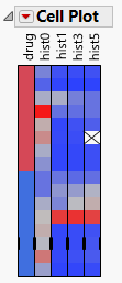
To produce the plot shown in Figure 8.4, follow the instructions in Example of a Cell Plot.
Figure 8.4 The Cell Plot Report Window
Note: Any rows that are excluded in the data table are also hidden in the cell plot.
Cell plots are direct representations of a data table, drawn as a rectangular array of cells with each cell corresponding to a data table entry. Colors are assigned to each cell based on the range and type of values found in the column.
• Nominal variables use a distinct color for each level. You can customize nominal and ordinal colors using the Value Colors property of data columns, available through the Column Info command.
• Continuous variables are assigned a gradient of colors to show the smooth range of values in the variable.
• Ordinal variables are scaled like continuous variables in order.
• When some outliers are present, the scale uses all but the extreme categories for the 90% middle of the distribution, so that the outliers do not overly influence the scale.
The cell plot appears with a one-to-one correspondence of a colored cell representing each data table entry.