About the Graph Builder Window
To launch Graph Builder, open your data table and then select Graph > Graph Builder. The Variables list contains the columns in your data table, which you can drag into zones.
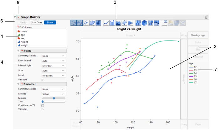
Figure 3.2 Graph Builder Window for Big Class.jmp
Number | Description |
|---|---|
1 | The columns in your data table are listed in the Columns panel. Drag columns from the Columns list into zones, or select the column and click the empty zone. Note: You can use columns that contain multiple response data in X or Y zones or in grouping zones. You can create a virtual column by right-clicking a column name in the Columns list and selecting from the options that are provided. • The transformed column appears in the list in italics. • The transformed column can be moved into Graph Builder zones just like other column. • Right-click the transformed column for further options. Tip: For descriptions of the column options in the Columns red triangle, see “Columns Panel in Data Tables” in Using JMP. |
2 | The graph area and zones are the main body of Graph Builder. Your graph appears in the middle, and you drag variables into different zones. See Graph Zones. Note: Any excluded rows are hidden in graphs. |
3 | Click an element type icon to choose the type of graph that you want. You can apply several types of elements to your data simultaneously by pressing Shift and selecting the element type icon. See Element Types and Options. |
4 | Customize the graph with specific options for the type of graph that you selected. See Element Types and Options. |
5 | Customize the Graph Builder window. See Graph Builder Options. |
6 | Undo actions, start over, and more. See Graph Builder Buttons. |
7 | If your graph has a legend, it appears on the right side of the graph. To customize the legend, see Legend Options in Graph Builder. |
To re-create and modify the graph in Figure 3.2, follow these steps:
1. Select Help > Sample Data Folder and open Big Class.jmp.
2. Select Graph > Graph Builder.
3. Select height and drag it to the Y zone.
4. Select weight and drag it to the X zone.
5. Select age and drag it to the Overlay zone.
The graph in Figure 3.2 appears. The relationship between height and weight for each value of age is shown by using color in a single graph.
Now you want to see separate graphs for each value of age.
6. Select age in the Overlay zone and drag it to the Wrap zone.
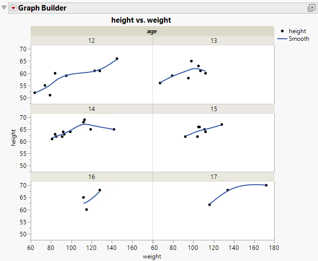
Figure 3.3 Height and Weight Grouped by Age
For each age value, the relationship between height and weight is shown in a separate graph.

