 Example of a Continuous Treatment
This example shows how to use the Causal Treatment personality in the Fit Model platform to analyze the effect of supervisor leadership, a continuous variable, on job satisfaction. Data for this example are simulated to represent responses from a self-report survey where each employee answers questions about satisfaction, conflict, and leadership in the workplace. The Leadership_Avg variable is a measure of how happy each employee is with their supervisor. This score is considered the continuous treatment variable for this example.
1. Select Help > Sample Data Folder and open Job Satisfaction.jmp.
2. Select Analyze > Fit Model.
3. Select Satisfaction_Avg from the Select Columns list and click Y.
4. From the Personality list, select Causal Treatment.
5. Select Leadership_Avg from the Select Columns list and click Treatment.
6. Select the Treatment Model tab.
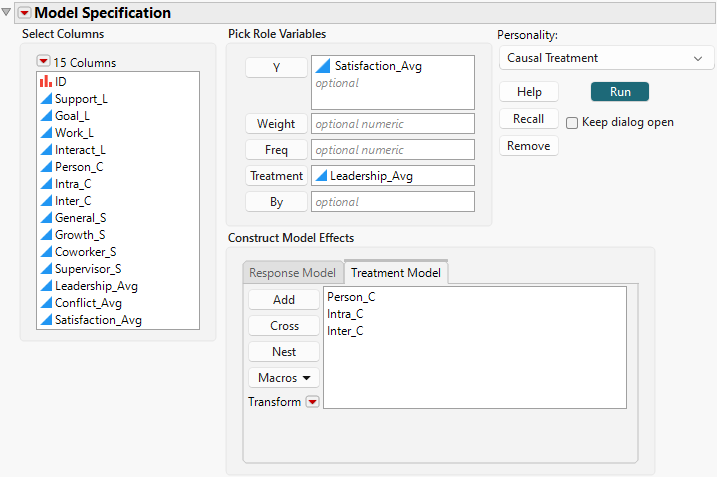
7. Select Person_C through Inter_C and click Add.
Figure 14.8 Completed Fit Model Launch Window That Shows Treatment Model Tab
8. Click Run.
The Model 1 report shows results of two modeling techniques: Marginal Structural Modeling with Inverse Probability Weighting with Ratio Adjustment and Generalized Propensity Score modeling. Both models are fit automatically. In the continuous case, the propensity score is a function of estimated density functions. Both techniques use the specified treatment model to calculate the propensity score, but the propensity score is then used differently in each technique. MSM with IPWR uses the inverse, stabilized propensity scores as weights in fitting the response model. The GPS technique uses functions of the propensity score as fixed effects in fitting the response model. For more information about these modeling techniques, see Statistical Details for the Causal Treatment Personality.
9. Set Treatment Level Minimum to 1, Treatment Level Maximum to 10, and Treatment Level Increment to 1 in the Model Launch control panel in the Fit Causal Treatment report and click Go.
A Model 2 report is displayed, which reflects the Treatment Level parameters that you specified. To focus on this report, remove the Model 1 report.
10. Click the Model 1 red triangle and select Remove Fit.
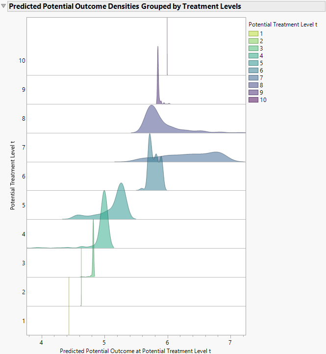
Now only the Model 2 report is shown. In the Analysis of Causal Effects section, the Predicted Potential Outcome Densities Grouped by Treatment Levels plot (Figure 14.9) is shown under Generalized Propensity Score Model Results. At each potential value of the treatment (Leadership_Avg) that is marked on the vertical axis, the distribution of Predicted Potential Outcomes, given the GPS model, is shown. At the low and high levels of treatment, the Predicted Potential Outcome distributions have very little spread.
Figure 14.9 Predicted Potential Outcome Densities Grouped by Treatment Levels Plot
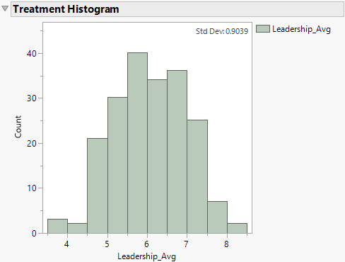
The Treatment Histogram in Figure 14.10 shows that no employee rated their supervisor below a 3.5 or above a 9. The lack of observations in these areas of the support explain why the prediction variances for low and high values of treatment are small. The model is extrapolating rather than using information from observed data points when the treatment level is low or high.
Figure 14.10 Treatment Histogram Plot for Continuous Treatment
11. Click the Fit Causal Treatment red triangle and select Show Tips and Interpretations.
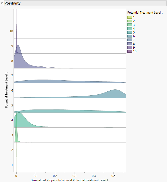
The Positivity ridgeline plot in Figure 14.11 shows that many of the density curves peak or congregate around a GPS of 0. This means that many observations have a very low estimated propensity of receiving certain levels of the treatment, given the GPS model. This phenomenon is common in continuous treatment examples, given the infinite-dimensionality of the treatment space. However, in this case, the positivity assumption might be violated. In other words, there might be a covariate profile with zero probability of receiving a certain treatment level. To maintain valid causal inference in the face of positivity violations, you might consider truncating the range of the treatment variable or converting the treatment variable into a binary variable. More information about the positivity assumption in the continuous treatment case is shown below the Positivity plot when the Show Tips and Interpretations option is selected in the Fit Causal Treatment red triangle menu.
Figure 14.11 Generalized Propensity Score Ridgeline Plot
Finally, use the Analysis of Causal Effects section to calculate causal estimates. For information about how to perform these calculations, see Analysis of Causal Effects. Suppose you are interested in what the change in average job satisfaction would be if every employee gave their supervisor a score of 7 versus a score of 5. First, answer this question by using the MSM results that are shown in Figure 14.12. With this modeling technique, the specified average treatment effect is 1.03. Under the proper causal assumptions, you conclude that, on average, rating leadership as a 7 versus a 5 increases self-reported job satisfaction by 1.03 points.
Figure 14.12 Marginal Structural Model Results Table
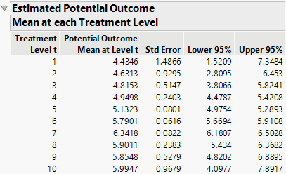
Now answer the same question by using the GPS model results that are shown in Figure 14.13. The Estimated Potential Outcome Mean at each Treatment Level table provides potential outcome mean estimates. With this modeling technique, the ATE estimate is 1.21. Under the proper causal assumptions, you conclude that, on average, rating leadership as a 7 versus a 5 increases self-reported job satisfaction by 1.21 points.
Figure 14.13 Generalized Propensity Score Model Results Table
