|
1.
|
Select the annotate tool
|
|
3.
|
Lets you change the current font type, style, and size. To change the default font, see Fonts in JMP Preferences.
Displays the JMP color palette to change the color of the shape’s sides, and its fill color when the Filled option is in effect.
|
2.
|
|
3.
|
Displays the JMP color palette to change the color of the shape’s sides and its fill color when the Filled option is in effect.
To enhance your graphs with logos, pictures, or any other type of graphic, you can paste it into a report in .bmp, .jpeg, or .png format. You can also drag and drop graphics into reports.
|
3.
|
Select Edit > Paste Background Image. The graphic is inserted at the point in the graph that you right-clicked.
|
|
1.
|
|
4.
|
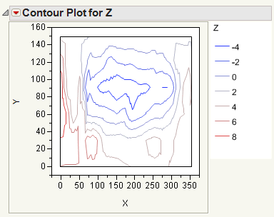
Right-click the plot and select Customize.
|
|
5.
|
Click Shape.
|
|
6.
|
Change the Line Width to 2.0.
|
|
7.
|
Click on the color next to Line Color and select a shade of green.
|
|
8.
|
Click OK.
|
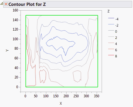
The graphical elements that you can customize differ on each graph. For example, in a Control Chart graph, there are three line elements (Marker, Lower Limit, Upper Limit and Connect Line). In other graphs, the line element might be named Line or Custom.
|
1.
|
Right-click the graph and select Customize.
|
|
3.
|
Click OK to save your changes to the current graph.
|
Changes the text alignment to centered, left-aligned, or right-justified. The Fill option applies the selected color to the background.
Changes the marker or label transparency. Enter the level of transparency to draw markers (points) on the graph. The degrees of opacity ranges from 0 (clear) to 1 (opaque). For more information about changing the transparency of markers, see Specify Marker Transparency.
|
•
|
Use the Templates list to insert a single JSL command. For example, the Polygon option inserts the Polygon command. The text enclosed in underscores are placeholders for point values, which you replace with your own values.
|
|
•
|
Use the Samples list to insert a script that creates elements such as bubble plots and sine waves. In this list, the Polygon option shows examples of the Transparency, Fill Color, and Polygon values, which you replace with your own values.
|
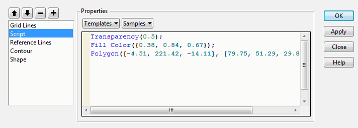
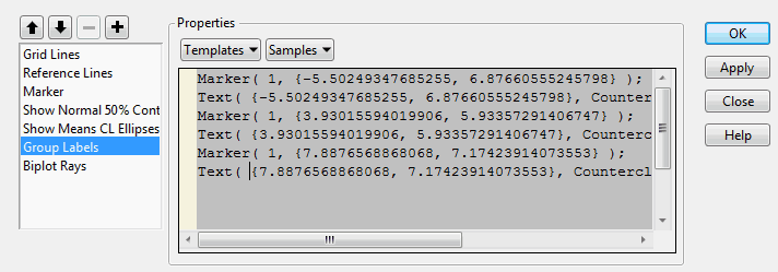
In some graphs, you can view the JSL that creates graphical elements. Example of JSL That Creates Group Labels shows the Group Label script for a Discriminant Analysis graph. The script defines markers and text for group labels. The commands included in these built-in scripts cannot be modified or deleted. You can insert commands from the Templates or Samples list, but you cannot click in the window and type new commands.
For information about JSL, see the Scripting Guide book.
|
1.
|
Right-click on the graph and select Customize.
|
|
2.
|
|
‒
|
Select one or more JSL commands from the Templates list, and modify the placeholder text. For example, change the Pen Color option from “blue” to “red.”
|
|
‒
|
Select one or more sample scripts from the Samples list and modify, if necessary.
|
|
5.
|
(Optional) Click Apply to update the graph with your changes without closing the window. Unlike other property changes, script changes to not take effect until you click Apply or OK.
|
|
6.
|
Click OK to save your changes.
|
|
‒
|
An error message appears if the script contains an error. Select View > Log to read about the error, and then correct the script.
|
To delete a script that you created, select the script and then select the Delete selected object button ( ).
).
The graphical elements are drawn in the order in which they are listed. The first element on the list is drawn first, so it appears behind all other graphical elements. If one element hides another, you can rearrange the order of the elements.
|
1.
|
Right-click the graph and select Customize.
|
|
3.
|
Click the Move up in drawing order button (
|
|
4.
|
Click OK.
|
The graph customizations apply to the current graph and are also used when you redo an analysis. To re-create your graph at a later time with its customizations, select Script from the red triangle menu, and then select one of the Save options. For example, you can save the script to the data table, which applies your customized properties each time you run the script. See Save Your Analysis as a Script in Save and Share Data for details.
|
1.
|
Right-click in the graph with custom elements and select Edit > Copy Customizations.
|
|
2.
|
Right-click in the destination graph and select Edit > Paste Customizations.
|