Subgroup Screening
The Subgroup Screening report makes it straightforward to assess how the treatment effect (or the treatment response, in the case of single arm studies) can vary within subgroups and what factors might contribute to this heterogeneity.
Note: For the purposes of this report, the term factor will refer to a variable that will be used either alone or in conjunction with other factors to determine subgroups, which are the individual levels of a factor or a combination of two or more factor levels. For example, the variable sex would be considered a factor, while male and female would be considered subgroups.
Report Results Description
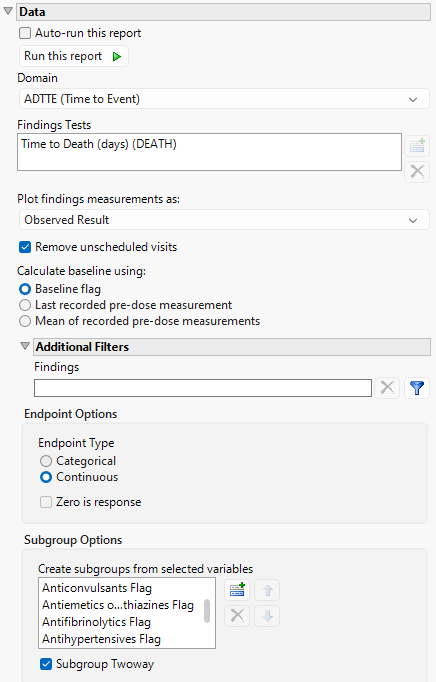
The Subgroup Screening report was opened and the following setting were specified: the ADTTE domain was selected and the Time to Death (days)(DEATH) findings test was specified. The Observed Result was specified for plotting the findings measurements. Baseline is calculated using the baseline flag. The Endpoint Type is set to Continuous. Finally, the following variables were selected for this analysis: Sex, Age Group 1, Race, Anticonvulsants Flag, Antiemetics or Phenothiazines Flag, Antifibrinolytics Flag, Antihypertensives Flag, Blood Transfusion Flag, Central Venous Pressure Monitoring Flag, Induced Hypertension Flag, Intentional Hemodilution Flag, and Intentional Hypervolemia Flag.
Running Subgroup Screening for Nicardipine using the specified setting generates the report shown below.
The Report contains the following elements:
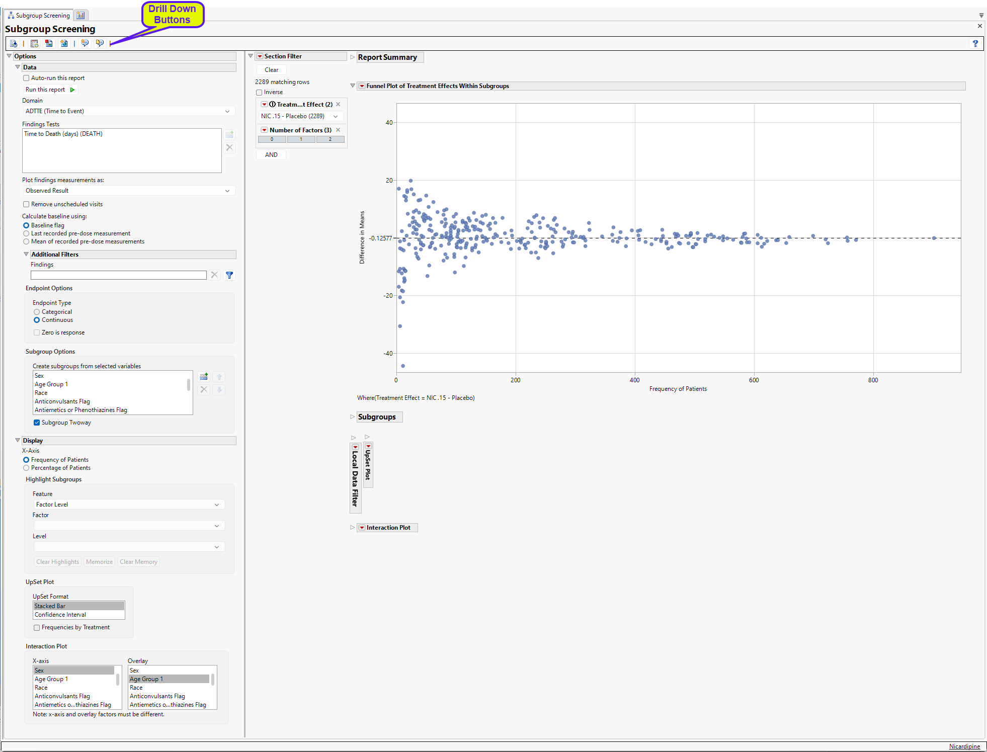
Report Summary
The Report Summary gives an overview of the number of subgroups. For this analysis, there were 12 factors that had a total of 26 levels. With Subgroup Twoway selected, this results in 334 possible subgroups, 333 which have at least 1 patient, and 1 of which is not observed.
Note: Not all available subgroups will produce a treatment effect – in multi-arm studies, at least 1 patient is needed in a subgroup for each treatment for a given treatment pair.
Section Filter
Enables you to subset subjects based Treatment Effect or additional variables. Refer to Data Filter for more information.
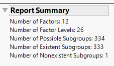
Funnel Plot of Treatment Effects Within Subgroups
The funnel plot displays the Difference in Means for NIC.15 – Placebo (shown in the Section Filter of the output) within each subgroup by the Frequency of Patients. The X-Axis can be modified to be the Percentage of Patients which divides the observed frequency for each subgroup by the total number of patients in the analysis population.
Note: As the Frequency of Patients gets smaller, there is greater variability in the observed treatment effects; as the Frequency of Patients gets larger, this variability reduces and begins to converge to the treatment response represented by the entire analysis population, which is represented by the reference line and the right most point (labeled “All”).
Here, the overall difference in mean Time to Death is -0.12577, implying that Placebo has a slightly larger mean Time to Death (by 0.12577 days, on average). If the Placebo – NIC.15 treatment effect is of interest, or other pairs of treatments depending on the number of arms available in the study, the presented treatment effect can be modified using the Section Filter. Generally, only one pairwise treatment effect is summarized at a time.
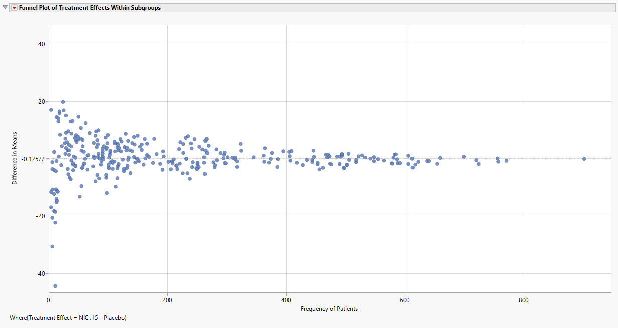
Subgroup Tables and Selection of Subgroups
Selecting points in the funnel plot highlights a particular subgroup and its parents; details are on these subgroups are summarized in the tabbed tables below the Funnel Plot (See below). These tables represent Highlighted Subgroups, Parent Subgroups, Filtered Subgroups, and Memorized Subgroups.
| 8 | Using your mouse, click on the highlighted point, as shown above. |
Here, the highlighted point (red) represents the Subgroup of Anticonvulsants Flag = N, Race = Black or African American. The parents (yellow) are the two subgroups Anticonvulsants Flag = N and Race = Black or African American. Given that the two parent subgroups have treatment effects not too different from the overall analysis population, the combination of these two factors showing a treatment effect of more than 40 days improvement in Time to Death for Placebo can be possibly interpreted as a function of the small sample size (n = 11).
Highlighting is maintained even after the points are no longer selected. Removing highlighting from a set of points can be accomplished in two ways:
| 8 | Select and highlight other points which will remove the previous highlighting. |
| 8 | Click the Clear Highlights button in the Highlight Subgroups area of the Display area |
While selecting individual points is straightforward in the Funnel Plot, use the Highlight Subgroups option to highlight multiple points according to on two Features.
Upset Plot
UpSet plots are used to communicate the frequency of subgroups produced according to one or more factors compared to the marginal frequencies of considering each factor alone.
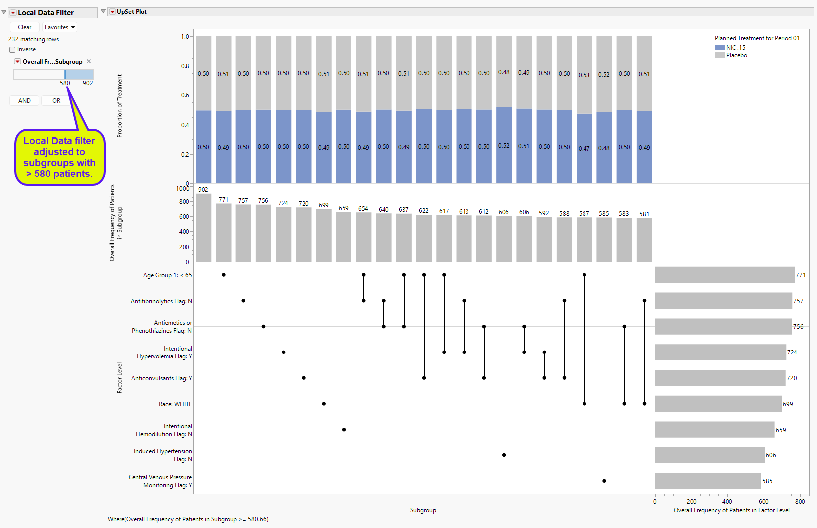
The Local Data Filter was adjusted to display subgroups with at least 580 patients to make it more
readable for this discussion.
Features of the Upset plot are listed below:
| • | The vertical and horizontal axes are ordered according to these frequencies so that the further right (or down) in the plot, the smaller the frequency. |
| • | The line and dots area of the figure illustrate the connections between factor levels along the Factor Level vertical axis and the Subgroup horizontal axis. |
| • | The bar chart present in the Overall Frequency of Patients in Subgroup vertical axis and Subgroup horizontal axis presents the frequency of each Subgroup, which will show individual and pairs (if Subgroup Twoway is selected) of factor levels. This bar chart is presented in decreasing frequency, left to right. |
| • | The bar chart present in the Factor Level vertical axis and the Overall Frequency of Patients in Factor Level horizontal axis presents the frequency of each factor level individually. This bar char is presented in decreasing frequency, top to bottom. |
| • | The top area of the figure, within the Proportion of Treatment vertical axis and the Subgroup horizontal axis is a stacked bar chart which shows the proportion of patients in each Subgroup that take a particular treatment for a particular treatment effect. This last point is important. For example, a 3 arm study with 1:1:1 randomization to treatments A, B, and C, will show that treatments A and B will be approximately 50% for the treatment effects of A-B or B-A. This part of the graph has an additional option that is discussed further below. |
For example, the left-most “subgroup” with no factors selected and the greatest frequency (n = 902) represents the analysis population. The next largest subgroup (or the largest actual subgroup) is for Age Group 1 < 65, with 771 patients. The next 6 subgroups are all based on individual factor levels. The largest subgroup based on two factors is Age Group 1 < 65 and Antifibrinolytics Flag: N (n = 654). This can be compared to the factor level sample sizes of 771 and 757 for Age Group 1 < 65 and Antifibrinolytics Flag: N, respectively. Of the 654 patients in this subgroup, 0.49 and 0.51 of the patients are on Nicardipine or Placebo, respectively. Marginal counts for each treatment are visible in the data table, or the user can click Frequencies by Treatment to change the bar charts to side by side bar charts with sample sizes for displayed for each treatment.
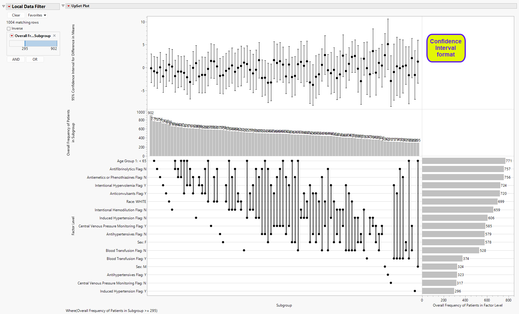
As mentioned above, the upper part of the UpSet Plot (the stacked bar chart summarizing the proportion of treatments) can be modified for other details. As seen above, the UpSet Format is selected as Stacked Bar, which is the default view. One other view is possible, Confidence Interval (shown below), which summarizes 95% confidence intervals of the treatment effect.
Interaction Plot
The final plot in the Subgroup Screening output is an Interaction Plot which displays the treatment effects within the levels of one factor with an overlay for the levels of a second factor. These variables can be modified using the Interaction Plot option.
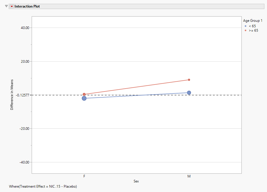
Points are sized according to the number of patients within each subgroup for the selected treatment effect.
Additional Details
| 1. | When the treatment effect is changed using the Section Filter, memorized subgroups will remain memorized even if they are not displayed. Returning to a treatment effect with memorized subgroups will display the memorized points in green and display data in the Memorized Subgroups table. Clear Memory forgets memorized subgroups across all treatment estimates. |
| 2. | For single arm studies, treatment effects for continuous endpoints are represented by the mean response based on the Plot findings measurements as selection. For example, if Observed Result is selected, the treatment effect is the mean for the endpoint based on the observed values. If Change from Baseline is selected, the treatment effect represents the mean change from baseline. For categorical endpoints, the treatment effect is the proportion of patients in response. |
| 3. | The treatment effects available for continuous endpoints represents all pairwise combinations of treatment arms. For categorical endpoints, the treatment effects include all differences between each treatment level and the control arm. |
| 4. | Create subgroups from selected variables accommodates continuous variables. These variables are split into 3 groups according to tertiles. At this time, Variable Importance is based on the original continuous variable in the bootstrap forest. |
| 5. | Interaction Plots are available if at least two factors are selected for analysis, and only if Subgroup Twoway is selected. |
| 6. | Parents are highlighted only if individual points are selected in the Funnel Plot. |
Options
Data
Auto-run this report
Check this box to auto-run the report upon launch. Previously saved settings are used.
Run this report
Use this widget to run this report after modifying any of the options. This option is not available when the Auto-run check box is checked.
Domain
Use this widget to specify whether to plot the distribution of measurements from either the Electrocardiogram (EG), Laboratory (LB), or Vital Signs (VS) findings domains.
Findings Tests
Use this widget to select specific Findings tests.
| 8 | Click  to open the Add window (shown below) that lists available test names (shown below). to open the Add window (shown below) that lists available test names (shown below). |
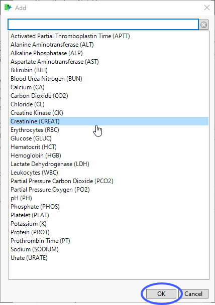
| 8 | Select the desired test(s) and click to add them to the text box. |
Plot findings measurements as:
Use this widget to specify whether to plot the results either as observed or how they relate to the baseline measurement. Refer to Plot findings measurements as: for more information.
Remove unscheduled visits
You might or might not want to include unscheduled visits when you are analyzing findings by visit. Check the Remove unscheduled visits to exclude unscheduled visits.
Calculate baseline using:
Use the widget to specify how the baseline is to be calculated. Refer to Calculate baseline using: for more information.
Additional Filters - Findings
This filter lets you restrict your analysis to only those subjects that meet specific criteria at the level of the specified Findings domain (EG, LB, or VS). See Findings for more information.
Note: To filter subjects with a specific event or finding, one could also use the Subpopulation Builder on any domain of interest. For example, filter to all subjects that exhibit cardiac failure ( :Customized Query 01 Name == "Cardiac failure" ) and run all reports on those.
Endpoint Type
Use this option to specify the endpoint type. See Endpoint Type for more information.
Zero is response
Check this option to invert the definition of a categorical response so that 0 will be considered a “response”, while > 0 is considered a “non-response”, such as when an ordinal scale represents different levels of severity and 0 indicates an absence of an ill effect.
Create subgroups from selected variables
Use this option to select variables from ADSL to use as factors for the analysis. Some demographic variables are selected by default, but any number of factors can be accommodated. Each level of each factor is analyzed as a separate subgroup.
Subgroup Twoway
Check this box to analyze the pairwise combinations of all individual factor levels as subgroups.
Display
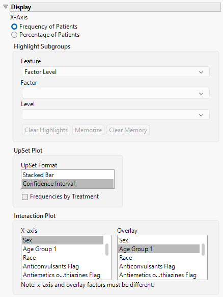
X-Axis
Use this option to specify whether to plot either the Frequency of the Patients in the subgroups or to plot the percentage of the patients. The percentage of patients is calculated by dividing the observed frequency for each subgroup by the total number of patients in the analysis population.
Highlight Subgroups
Use this option to specify the factor level, as well as, the individual factors and levels to highlight in the funnel plot. See Highlight Subgroups for more information.
Upset Format
The Upset plot can be displayed in various formats, the default being a stacked Bar Chart (shown above). Other options include , a range bar with confidence intervals. See UpSet Format for more details.
Frequencies by Treatment
Check this box to change the bar charts of the UpSet plot to side by side bar charts with sample sizes for displayed for each treatment.
Interaction Plot
Use this option to specify the factors to plot on the X and Y-axes of the interaction plot.
General and Drill Down Buttons
Action buttons provide you with an easy way to drill down into your data. The following action buttons are generated by this report:
| • | Click  to reset all report options to default settings. to reset all report options to default settings. |
| • | Click  to view the associated data tables. Refer to Show Tables for more information. to view the associated data tables. Refer to Show Tables for more information. |
| • | Click  to generate a standardized pdf- or rtf-formatted report containing the plots and charts of selected sections. to generate a standardized pdf- or rtf-formatted report containing the plots and charts of selected sections. |
| • | Click  to generate a JMP Live report. Refer to Create Live Report for more information. to generate a JMP Live report. Refer to Create Live Report for more information. |
| • | Click  to take notes, and store them in a central location. Refer to Add Notes for more information. to take notes, and store them in a central location. Refer to Add Notes for more information. |
| • | Click  to read user-generated notes. Refer to View Notes for more information. to read user-generated notes. Refer to View Notes for more information. |
Default Settings
Refer to Set Study Preferences for default Subject Level settings.